


- What is Showit? (And Why It’s The Best Website Platform)
- Inside Showit Templates: Strategic Website Layouts, and Built-in Sales Psychology
Have you ever bought a website template, uploaded your logo, and waited for the dream clients to come rolling in—only to hear crickets—yea….me too. The truth? Most templates are just digital brochures in disguise. Pretty, yes. Strategic? Not even close. So today, I’m pulling back the curtain on the website strategy baked right into my Showit templates—plus a few marketing secrets that most designers and web strategists won’t tell you.
Let’s go beyond pretty. Let’s talk performance and strategy.
Disclaimer: This post may contain affiliate links. If you click on them, I may earn a commission, at no additional cost to you. See my disclaimer page for more information.
Table of Contents
Secret #1: Strategic Website Layouts Come First, Aesthetics Comes Second
Most designers think of visuals first, and then just throw some random buttons and place copy at the end, where it fits. So their templates are designed so backwards! The key to designing with website strategy above looks is, to start with the end in mind.
➡️ Start with the End in Mind
Before you ever begin with any part of your design, ask yourself, “what do I want the visitor to do?”, and “what belief or emotion do they need to have in order to take that action?”. Keep in mind their journey from awareness to trust to action, and literally build your website layout to guide them step-by-step towards that outcome.
➡️ Write the Website Copy Before You Design
Draft your headings, CTA description, and other offer descriptions first. Then, wrap your design around that copy so it POPs-rather than getting buried. Try drafting copy with the PAS (problem-agitate-solution) method. By doing this, you’re designing your website around message hierarchy AND visual hierarchy.
➡️ Build the Layout like a Cognitive Pathway
Again, your content is a guided journey, where every step introduces a question/tension, answers/solves the problem and guides the reader to the next step. Think: “If they see this… they’ll want to know that… and then they’ll be ready to click this.”
Strategic trick: Place testimonials or proof points right before big CTAs. That removes doubt right when it starts to creep in.
➡️ Design for Mobile as a Primary Experience
64% of website traffic comes from mobile devices (Exploding Topics, 2025). So, it’s good practice to place CTA buttons in thumb-friendly zones, break long text into tap-friendly chunks, and reduce mobile load times. Mobile design should be the main event, not an afterthought.
➡️ Use Storytelling Structure on Key Pages
Use the about pages to position yourself as the guide, not a hero. You can do this through storytelling. On the services pages, use stories to make transformation tangible. And on the blog, you should include next steps to take in every blog post. Some tips for appealing to your readers’ emotions include using empathy-based openers (like “You’re Stuck. I was too.”), and presenting transformational proof
(“Here’s what happened when…”).
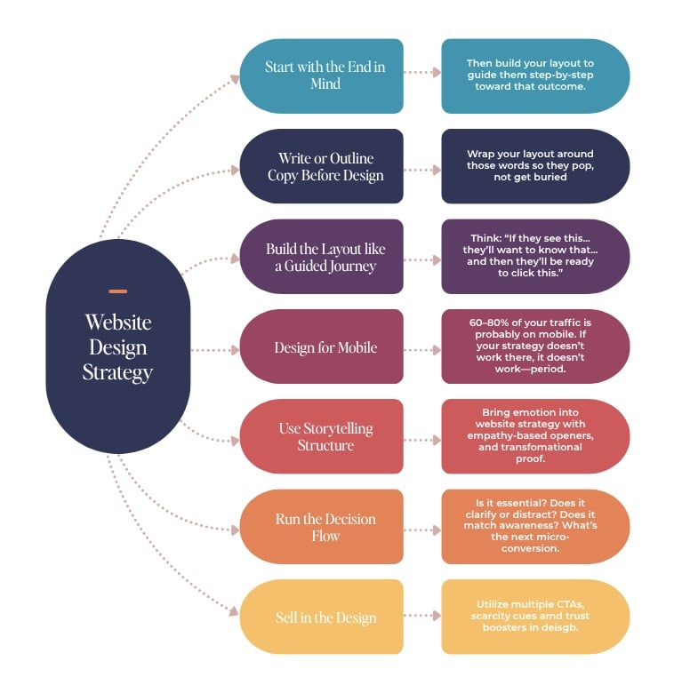
➡️ Run Every Section Through ‘The Decision Flow’
Ask yourself the following questions about each section of your website:
- Is it essential? If not, get rid of it.
- Does it clarify or distract? Only keep what moves them forward.
- Does it match their awareness level? Don’t pitch hard to someone you just met.
- What’s the next micro-conversion? Always have the next mini-goal (scroll, click, signup, etc.) in mind.
➡️ Don’t be Afraid to Sell in the Design
Include multiple CTA types like buttons, text links, and image blocks. Add scarcity cues (without being gross) to promote action, and supply trust boosters (like testimonials, logos and money-back information in the scroll path.
Secret #2: Modular Layouts Mean you can “Funnel Hack” Without Code
My Showit Templates aren’t just pretty and flexible templates. They were created to mimic the highest-converting landing pages in digital marketing. Each webpage in the template has mini sales funnels built into the service page, low ticket offer stacks, and quiz opt-ins with storytelling sections. I also just learned about this, but I think it’s significant enough to mention here: scroll-triggered CTA loops.
This is when a CTA appears when the reader is most engaged, and repeats in intervals (like every few scrolls or sections). It can also mean having a sticky or persistent CTA in a non-intrusive way (like a floating banner that updates as the reader scrolls).
Secret #3: Mobile Website Strategy is about Tap Logic, Not Just Looks
In my Showit templates, the mobile website designs are based on tap psychology. So the mobile design takes into account thumb zones (where people naturally tap), the cognitive load on a small screen, the sizing and spacing of the design elements on a small screen, and breaking up long forms of text for scroll-stopping moments.
Secret #4: The Wrightsville Showit Template Teaches You to Write Better Copy (Without Even Trying)
Let’s be real—writing your website copy is often the hardest part.
That’s why every heading and placeholder in Wrightsville is based on proven conversion copy frameworks.
We’re talking:
- PAS (Problem-Agitate-Solution)
- AIDA (Attention-Interest-Desire-Action)
- The Hero’s Journey (yes, for your About Page)
You’re not just filling in blanks. You’re walking through a psychological structure that gently forces clarity.
Copywriters pay thousands for these frameworks—I bake them into the design.
Secret #5: There’s Buyer Psychology in Every Scroll
Conversion is not an accident. It is architecture.
Each page inside my Showit templates is created to provide value before the price is shown, overcome objections right before the CTA, reduce risk with testimonials and social proof at strategic intervals, and mirror the natural thought patterns as people move from curiosity → trust → action.
Secret #6: ‘Vibe’ isn’t a Design Type, it’s a Trust Builder
There is a reason when you go to certain websites, you can’t stop scrolling. Lately, my favorite creator to binge-read is Hailey Dale from Your Content Empire. This isn’t by chance.
Emotionally aligned design builds trust.
My Showit templates walk the line with brand-neutral colors, flexible fonts, and layout prompts that encourage storytelling. You can inject YOUR voice—without starting from a blank canvas.
Your site should sound like you and sell like your best pitch.
Secret #7: The Website Strategy Template is JUST the Beginning
Most people buy a template, get stuck, and give up.
That’s why I include:
- Full walkthrough video tutorials (so you never wonder “what now?”)
- A Showit starter checklist
- Ongoing tips through email, blog, and social
Because the template is only step one—execution is everything.
And I don’t want your site to look good. I want it to change your business.
What is Website Strategy? (And Why do Most Designers Skip it?)
Sure, your home page layout has a little bit to do with website strategy. But that’s not what I’m really talking about here. Website strategy is anticipating user behavior, designing emotional momentum, and removing friction for users along the way.
Let’s break down each page of your website in terms of Website Strategy, so you know what to focus those pages on. I’m going to do it ICU nurse style.

1. Home Page: Your Digital Triage Desk
Here you want a clear headline and value statement. Direct users to where they need to be on your website from the home page, and make sure there is logical flow to a CTA. Deliver trust boosters here, early and often.
2. About Page: Your Empathy Engine
Here, you want to show your audience that you understand their story. You introduce yourself as their guide through their problem, and help them, transition into the next action step that you want them to take.
3. Services Page: Their Prescribed Treatment Plan
On the services page, you want to nail the problem readers are facing, and how your solution will lead to a TRANSFORMATION out of their problem. Nail explaining this transformation and the benefits to the reader, don’t just focus on the features of your service/product. They don’t care about the features. Here, you want to stack proof, give clarity on your value, and add a CTA.
4. Blog: Brain Trust
The blog is where you capture and answer all of the top-of-the-funnel questions. It is also where you build long-term SEO credibility and create bingeable next steps for your audience.
5. Contact Page: The Closer
Make the contact page an easy place for readers to get in touch with you and humanize your contact form. Don’t just put some generic form crap on there. Like add a simple FAQ section to build trust.

Hey, I’m Sarah Grace— registered nurse turned blogging mentor, mama, and founder of sarahgracevogler.com. As a certified digital marketer and graphic designer, I help aspiring bloggers (just like you!) cut through the overwhelm and turn their passions into profitable online businesses. I’ve been where you are—Googling how to start a blog at 2 a.m., wondering if anyone would ever read my posts—and now I teach others how to do it with clarity, confidence, and heart. Thank you for reading this blog post and make sure to pin it to Pinterest, so you can reference it later.
07
Jul


VIEW THE COMMENTS
Inside Showit Templates: Strategic Website Layouts, and Built-in Sales Psychology