


Sterile is out in 2026. Some graphic designs still look AI-perfect and convert like cold coffee.
2026 is rewarding brands that feel human, move with intention, and respect people’s eyeballs and time. If you’re building between school drop-off, Slack pings, and whatever your toddler just glued to the dog, this is your field guide.
The big idea graphic design trend for 2026: human-made warmth + AI-assisted speed. You keep the soul. Let the bots handle the grunt work. We’ll layer tactile textures over clean systems, use variable type so your brand stops playing font Jenga, add motion in exactly two places per page, and keep everything fast, readable, and ridiculously easy to act on.
Human-made warmth is what is in.
Disclaimer: This post may contain affiliate links. If you click on them, I may earn a commission, at no additional cost to you. See my disclaimer page for more information.
TL;DR
- Use AI for generating ideas and then add your personal human touch
- Accessibility is not an option in 2026. Create bigger text and bigger contrast.
- Graphics with motion are in for 2026, but don’t make your website look like a themepark.
Graphic Design Trends in 2026
Trend 01. Human x AI Co-Design
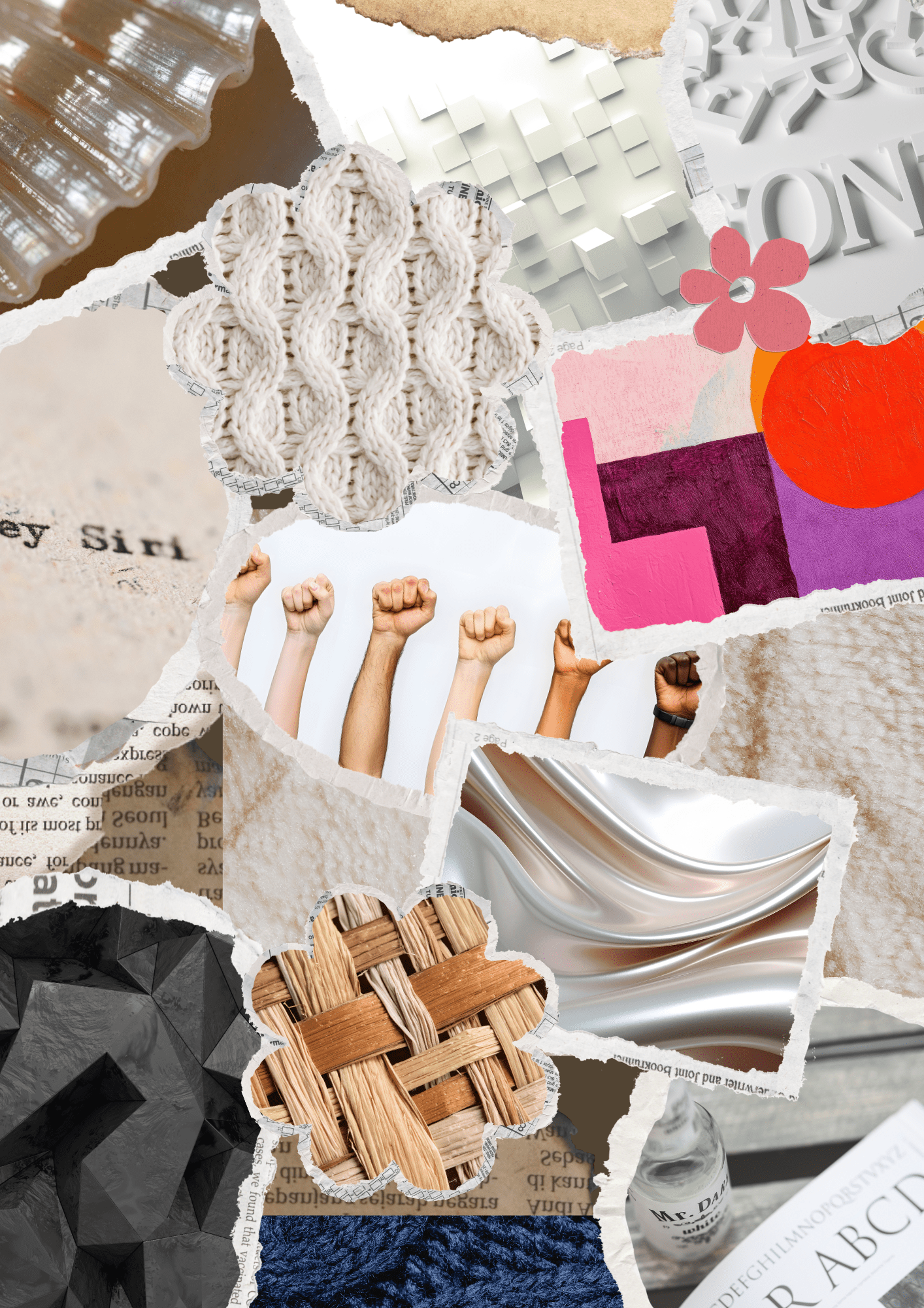
What it is: I’m a big fan of letting AI generate ideas for me, like to create an outline for a blog post, but then I write the blog post myself, giving it that non-robotic, human touch. Similarly, in 2026, AI can also be used to co-design graphics by generating design ideas for you. Then, you can add analog textures, imperfect edges, and hand made graphics, to give it soul that only a human can bring. People trust things that look like a human touched them and texture gives any design warmth and credibility.
Where to use it: Hero images on your website, video and lead magnet thumbnails, and course/product covers
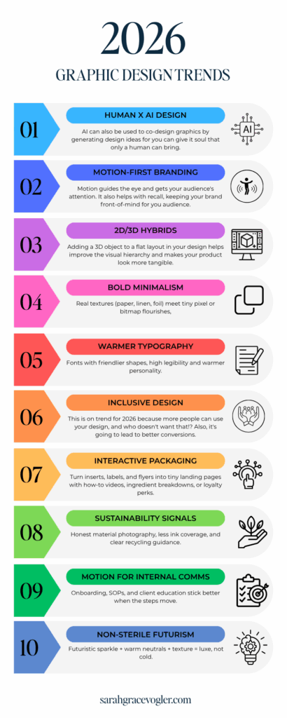
Trend 02. Motion-First Branding
What it is: Logos and headers that are designed to move with intention. Motion guides the eye and gets your audience’s attention. It also helps with recall, keeping your brand front-of-mind for you audience. Now I don’t mean go overboard and make your website look like a theme park. More like a pulse.
Where to use it: CTA hover state, email headers and homepage hero headlines.
Avoid: Motion that makes reading harder. Clarity should be the priority.
Trend 03. 2D/3D Hybrids
What it is: Makeup contour works by adding natural shadows to your face to increase definition. Similarly, adding a 3D object to a flat layout in your design helps improve the visual hierarchy and makes your product look more tangible.
Where to use it: Product mockups
Avoid: Twelve 3D objects battling for custody of your design space. If you use this technique, implement only one 3D element.
Trend 04. Bold Minimalism in Graphic Design
What it is: Using real textures like paper, linen, and foil. It includes big, readable type with clear heirarchy, decisive spacing (we’re talking generour line-heights and margins), high contrast (so the texture doesn’t mute your message) and fewer elements, used LOUDER. Less visual clutter means faster comprehension and fewer bounces. Clarity = speed. Sparse layouts also give a premium feel .
Use it for: Backgrounds, email banners and testimonial cards
Trend 05: Warmer Typography
What it is: fonts with friendlier shapes, high legibility and warmer personality. In 2026, its going to be popular to use a font that is like the Swiss-Army knife of typography ➡ one font family that allows for variations in weight, width and slant, without having to upload 5 different files to your design. This graphic design trend is going to rule 2026, because it allows for faster design, fewer decisions, better consistency and easier performance. HOORAH!
Where to use it: Use it everywhere. Headers, body, graphics, captions. ALL THE THINGS.
Related: The Best Adobe Fonts for Innovative Web Design in 2026
Trend 06. Inclusive Design
What it is: Alt text that says what the image ACTUALLY is, larger buttons and tap targets, color contrast and alternatives to graphics with motion. This is on trend for 2026 because more people can use your design, and who doesn’t want that!? Also, it’s going to lead to better conversions. Yes, please.
Non-negotiables in 2026: Body text that is at least 16 px, alt text that is useful to those with screen readers (not just for SEO) and tap targets that are at least 44 px. Use a contrast color checker to make sure your color contrast meets WCAG AA criteria.
Trend 07. Interactive Packaging Graphic Design
What it is: QR codes that can turn your print into tiny landing pages. You remove clutter from the packaging (which provides clarity), but still deliver depth after the scan.
Where to use it: Product inserts, labels, shipping post cards and event flyers. But make the QR large enough to see. Make it obvious.
Trend 08. Sustainability Signals
What it is: Spelling out what is eco-friendly about your product or process in way that’s clear, credible and quick to act on. Honest material photography, minimalist ink coverage, clear recycling information. This works because transparency builds trust with your audience.
Where to use it: Packaging labels, inserts, shipping boxes, product pages, materials, sourcing, care instructions, about/policy pages on sustainability, recycling and post-purchase flow emails like “how to dispose”.
Trend 09. Motion for Internal Communications
What it is: Onboarding, SOPs, client education and micro-demos, all done with tiny motion loops that teach.
Why it works: Motion increases recall and recall increases results.
Trend 10. Non-Sterile Futurism
What it is: Chrome, pearlescent or foil accents paired with cozy palettes and tactile textures. It’s giving luxury without the cold sci-fi dentist energy. Make your palette like 90% warm and 10% shiny (think highlighter to the cheekbones, not 2008 body glitter).
Where to use it: Borders, icons, buttons and headings.
FAQS Section on Graphic Design Trends in 2026
Do I need AI to keep up?
You need taste and a process. AI is your caffeinated intern. Let it pitch options and you make the final decision.
Are Metallics Still Cool?
Yes, as accents. Cozy base with a tiny bit of sparkle. Think “soft glam”, instead of “chrome-plated blender”. 🙂
How do I stay on-brand while using trends?
Trends are toppings and your brand is the pizza. Pick the trends that amplify your flavor and bake them into your system.
Listen here, you don’t need a brand-new personality, a 47-font stack, or a spaceship dentist aesthetic. You need human-made warmth + AI-assisted speed, clear type, tiny motion with purpose, and layouts that respect people’s time. That’s it. That’s the play.

Hey, I’m Sarah Grace— registered nurse turned blogging mentor, mama, and founder of sarahgracevogler.com. As a certified digital marketer and graphic designer, I help aspiring bloggers (just like you!) cut through the overwhelm and turn their passions into profitable online businesses. I’ve been where you are—Googling how to start a blog at 2 a.m., wondering if anyone would ever read my posts—and now I teach others how to do it with clarity, confidence, and heart. Thank you for reading this blog post and make sure to pin it to Pinterest, so you can reference it later.
13
Nov


VIEW THE COMMENTS
Top 10 Graphic Design Trends for Innovative Design in 2026