


Let’s be honest: you can spot an amateur Canva logo from a mile away.
Same three fonts. Same little abstract blob icon. Same layout you’ve already seen on six other Instagram accounts and a lash tech’s punch card.
What the actual fuck is going on in there.
The problem is not Canva. Canva is just a tool, and the process is what makes a logo professional. The problem is people skipping the process and running straight into “ooh, this template is cute.” I am guilty of this myself.
Graphic designers in Adobe use an actual method for logo design: strategy → concept → structure → typography → color → refinement.
You’re going to steal that process…and run it inside Canva. This is a real process you can follow step-by-step to create a professional Canva logo design, even if you don’t consider yourself “creative”.
Disclaimer: This post may contain affiliate links. If you click on them, I may earn a commission, at no additional cost to you. See my disclaimer page for more information.
Canva Logo Design Mistakes to Avoid
Mistake 01. Using a Canva Logo Design Template As-Is
This is a problem because you end up having a logo that looks like everyone else’s. They all have the same layout, use the same fonts and icons. You can’t stand out from the crowd like this.
I would only use the Canva logo template for layout inspiration, but still design your own from scratch. Choose all new fonts. If you want to go a step further and really stand out, don’t even use a free Canva font.
I have an obsession with Jen Wagner Co. fonts. Some of my favorite fonts include Ethic Serif, Editor’s Note, Perfectly Nineties, and Aperitif Serif. The headlines on this website are Editor’s Note font. Check out the licensing for exact terms and conditions, but a desktop license should cover font use in Canva and a logo. If you want one of these fabulous Jen Wagner Co. fonts, use coupon code ‘sarahgrace15‘ for 15% off.
Check out my blog post “The Best Adobe Fonts for Innovative Web Design in 2026” for the best Adobe fonts and my blog post “Typography for Design: How to Pair Fonts like a Pro” for the best free Google fonts to use in your logo.
Mistake 02. Too Many Fonts and Colors
Speaking of fonts, using too many fonts in your logo makes it look busy and cheap. Gross. The same goes for using too many colors. Professional logo design is intentional. I recommend limiting your logo to 1-2 fonts and colors to 2-3 brand colors. For a more timeless look, use primarily neutral colors in your logo and sparingly use an accent color for small touches.
Mistake 03. Thin lines + Light Fonts
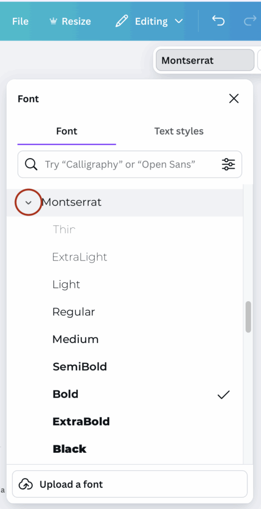
Using light fonts and thin lines in your Canva logo design may look good at full size, but it may be hard to see at smaller sizes. A professionally designed logo is scalable and looks clear and easily readable at all sizes. This doesn’t mean you can’t use the font you want to use, just select a font weight that is easily readable, even at small sizes. To select a different font weight in Canva, click the font name, then select the arrow beside the font in the drop-down menu that appears (see where to click in the image below).
What Actually Makes a Logo Look “Professional”
Key Principles Professional Designers Live By
- Clarity: the text is readable and matches your brand
- Scalability: the logo is clear and readable at any size, whether it’s 3000 px wide or as a tiny Instagram profile icon.
- Simplicity: the logo is able to be understood in a glance. There is no clutter or chaos.
- Versatility: versions of the logo for light and dark backgrounds.
- Timeless: the logo is not based on trends that are going to look dated in a few years from now.
- Consistent: spacing, alignment and font sizes are all consistent.
Get Stupid-Clear on Your Brand
If you jump into Canva without this step, you will waste time dragging things around like a digital raccoon. Ask me how I know. 🥴 I would recommend starting by deciding on 3-5 brand personality words. Ask yourself “how do I want my brand to feel?” and go from there. These personality words will guide every visual decision you make.
Then decide your target audience. Who are you trying to attract? If you’ve never determined who your target audience is, meet FRED👇. Answering the F.R.E.D. questions in the image below will help you find exactly who your target audience is. After you determine who they are, ask yourself, what design style do they respond more to? Fun and quirky? Clean and minimal? Your logo should feel like it belongs in their world.
Clarify what you do and who you do it for in one sentence. “I do ______ for ______ so they can ______.” Even if it’s messy, having this in mind will help you choose fonts and colors that match what you do.
Collect Inspiration Like a Designer
Create a mood board to collect inspiration (note: I didn’t say steal) for your own logo. Save other logos you like, fonts you’re attracted to, color schemes you’re drawn to, and logo layout styles that inspire you. I have a whole Pinterest board, dedicated to collecting designs that inspire me. You aren’t saving these design to straight up copy them.
I want you to analyze the images you saved and determine what it is you like about them? Look at spacing, font pairings, line weights, and simplicity. Are they simple or detailed? What kind of font do they use? Is there alot of white space or are the elements packed together right? Are there icons?
Write down what you like and note similarities and patterns among the designs you’re drawn to. These patterns and traits will become your design rules.
Choose Logo Structure and System
Designers don’t just make one logo. They make a logo system. First, you want to decide your main logo type. Then you’ll want to design a secondary logo, submart and favicon.There are different types of logos, so let’s get into it.
- Wordmark: A logo with just your brand name in a stylized text. This type of logo is perfect if your name is unique, or if you just want simplicity. My main logo is a wordmark logo (see the image below on the left).
- Lettermark/Monogram: A logo with initials or shortened letters. These logos are best used in favicons or secondary logos. My favicon logo is a lettermark logo (see the image below on the right, and also the icon on the tab of this browser window).
- Combination Mark: This logo combines an icon and text. This logo only works if the icon is clean and intentional. I don’t use this type of logo. I find that the two that I do use (pictured below) are enough for me as a blogger.
- Horizontal Layout: Icon on the left, text on the right
- Stacked: Icon on top, name below, tagline under
Design Your Logo System
- Primary logo (full, detailed logo)
- Secondary logo (a simpler version of the primary logo)
- Submark (icon, monogram)
- Favicon
Typography Like a Pro
I’ve got a full blog post on Typography for Design, but there are a few logo-specific typography tips I have for you here. Fonts are where most DIY logos go to die. But that’s not going to be you.
First of all, you need to understand that fonts have personalities. Serif fonts (have little feet on the letters, like in the headline of this section) are known for giving a logo an elegant, classic, editorial, or luxe feel. Sans-serif fonts (do not have little feet on the letters, like the body text of this blog post) give clean, modern, and minimal vibes. Script or handwritten fonts feel personal, playful, romantic, and creative.
Match these font personalities to your brand words. If your brand is friendly and playful, you might want to go with a rounded sans-serif font and maybe a script font for accent. You do not need 4 fonts. Pick one main font for your brand name, and one font for your tagline, if you choose to even have one.
There are also some type settings that help your Canva logo design look like a graphic designer made it.
- Letter spacing (also known as tracking): slightly increased spacing between ALL CAPS letters can look expensive. I use this technique on all of the buttons on my website.
- Line height: Don’t let lines of text be all up in each other’s business, and don’t let them be floating miles apart from each other either.
- Case: ALL CAPS can feel strong and clean, whereas sentence case feels softer and more conversational
Color
Like fonts, colors also have personalities that you need to consider when choosing colors to match your brand words. First, design your logo in black and white. If it looks good in one color, you’ve got a good structure for your logo. When the time comes to add colors, select 2-3 colors maximum. Use brand colors that you’ve already selected, but here are some ideas of color personalities if you don’t have brand colors yet.
- Minimal, modern: cool grays, soft beiges, muted accents
- Playful, bold: brights colors + strong neutrals
- Luxe, editorial: off-black, champagne, muted hues and deep tones
Avoid coloring everything. Subtlety looks expensive. A clown palette is not it. Some options may be keeping the logo text neutral and add color to a small detail, like a line, dot or icon. Or you can make one word of your brand name in an accent color. Make sure to create color variations of your logo for light and dark backgrounds–you’ll thank yourself later.
Polish: Tiny Tweaks That Make it Look Expensive
- Fix spacing RUTHLESSLY: make sure there is equal padding (white space) around the whole logo and that it isn’t hugging the edges. Make sure there is consistent spacing between lines or text and that your icon and text aren’t awkwardly far or uncomfortably close.
- Check optimal alignment: I feel like this subtle facet of design sets the designers apart from the non-designers. Does the logo look visually off? Look for heavy shapes or letters that make one side heavier. Check for spacing around letters, A, V and W that may create weird visual gaps. Make sure the tagline is center under the main text.
- Test at multiple sizes. Make a tiny version to mimic social icons, to see if the logo is still legible. If you can’t read it or recognize it, it’s time to simplify.
So, here’s the deal:
It was never about “Canva vs. Adobe.”
It was always about process vs. chaos.
When people say “you can tell that was made in Canva,” what they’re really seeing is:
- No brand clarity
- Random fonts and colors
- Zero attention to spacing, hierarchy, or scale
- A template swapped with a new name and called a day
You just did the opposite of that.
You:
- Defined your brand vibe and who you’re actually talking to
- Collected intentional inspiration instead of copying someone’s logo
- Picked a clear logo structure and built a mini logo system
- Chose fonts on purpose and used typography like an adult
- Created simple, scalable versions that work everywhere
That’s not “Canva logo dabbling.” That’s actual brand design.
Your first logo from this process might not be your forever logo, but it will be:
- Clean
- Cohesive
- Professional
- And very much not giving “amateur Canva energy”
From here, your job isn’t to obsess over pixels forever. Your job is to let this logo show up consistently while you build the thing it represents: your actual brand.

Hey, I’m Sarah Grace— registered nurse turned blogging mentor, mama, and founder of sarahgracevogler.com. As a certified digital marketer and graphic designer, I help aspiring bloggers (just like you!) cut through the overwhelm and turn their passions into profitable online businesses. I’ve been where you are—Googling how to start a blog at 2 a.m., wondering if anyone would ever read my posts—and now I teach others how to do it with clarity, confidence, and heart. Thank you for reading this blog post and make sure to pin it to Pinterest, so you can reference it later.
09
Nov


VIEW THE COMMENTS
Canva Logo Design: What you Need to Know