Design
FILED IN
FEATURED
READ MORE
TL;DR: When it comes time to choose a color palette, it isn’t about finding “pretty” colors — it’s about giving every color a job. Grab a primary, a secondary, 1-2 neutrals, and one accent color (that’s it, that’s the whole palette). Use the 60-30-10 rule to know how much of each to use. Start with […]
READ THE POST
TL;DR: When it comes time to choose a color palette, it isn’t about finding “pretty” colors — it’s about giving every color a job. Grab a primary, a secondary, 1-2 neutrals, and one accent color (that’s it, that’s the whole palette). Use the 60-30-10 rule to know how much of each to use. Start with […]
READ THE POST
TL;DR: Your website can look cute and still be quietly losing you money. The most common website design mistakes are: unclear messaging, confusing navigation, slow load times, inconsistent branding, weak calls-to-action, text walls, non-mobile-friendly layouts, hidden contact info, generic stock photos, zero social proof, and copy trying to talk to everyone at once. None of […]
READ THE POST
TL;DR: Your brand colors aren’t decoration — they’re doing a job, and most people are picking them like throw pillows (“ooh, pretty!”) instead of like strategy. Up to 90% of a first impression is based on color alone, before anyone reads a single word, so every hue is quietly telling visitors Trust me, buy from […]
READ THE POST
TL;DR: Your fonts talk before your words do — people decide if your brand feels legit or chaotic in 0.2 seconds; no explanation needed, they just bounce. Canva’s got like 9,000 fonts and zero guidance, so this post hands you 20+ ready-to-steal pairings grouped by vibe: editorial serifs, modern minimal sans, classic bookish, bold and […]
READ THE POST
TL;DR: You’re not bad at design — you just don’t know the 9 rules that make things look intentional. This post breaks down Balance, Contrast, Emphasis, Hierarchy, Alignment, Proportion & Scale, White Space, Repetition & Rhythm, and Unity & Harmony — plus the top beginner mistakes and a 10-minute checklist to fix whatever’s “feeling off” […]
READ THE POST
TL;DR: Sterile, AI-perfect design is out — 2026 wants brands that feel human, move on purpose, and respect people’s time. The big theme: human-made warmth + AI-assisted speed. Let AI pitch ideas, then add the texture, imperfect edges, and soul only a person can bring. Top trends include tiny “pulse” motion (not theme-park chaos), 2D/3D […]
READ THE POST
TL;DR: You can spot an amateur Canva logo design a mile away — same three fonts, same blobby icon, same layout as six other Instagram accounts. But it’s not Canva’s fault, it’s a process problem: people skip straight to “ooh, cute template” instead of following real design steps. The fix: get stupid-clear on your brand […]
READ THE POST
TL;DR: Fonts are a design sandbox, and 2026’s Adobe Fonts library just got a whole lot bigger (1,500+ new fonts added in 2025 alone). This post rounds up the 12 best Adobe fonts, each with a pre-tested pairing and a “who’s it for” so you won’t be stuck guessing. Whether your brand is sleek and […]
READ THE POST
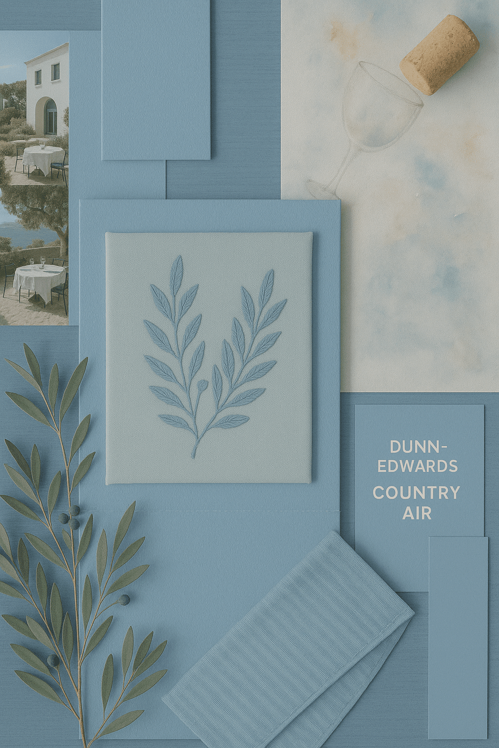
A look at the 2026 Color of the Year trends. Each shade has a matching color palette for ideas on how to implement these color into your web design in 2026.
READ THE POST
TL;DR: Typography for design isn’t just about “looking pretty” — it’s strategy, and your audience notices whether they clock it consciously or not. Know your three main styles: serifs (classic, credible, great for headers), sans serifs (clean, modern, best for body text), and scripts (feminine, high-end, use sparingly as accents only — never for long text). […]
get the course
Learn how to start a money-making Wordpress blog with these step-by step tutorials. Don't worry if you aren't tech savvy. This course is for beginners, and is what I wish I had when I started my blog. Get it today at only $7 while this offer lasts!
