


TL;DR: When it comes time to choose a color palette, it isn’t about finding “pretty” colors — it’s about giving every color a job. Grab a primary, a secondary, 1-2 neutrals, and one accent color (that’s it, that’s the whole palette). Use the 60-30-10 rule to know how much of each to use. Start with your brand personality before you touch Pinterest. Make sure your text is actually readable. And don’t stress about getting it perfect on the first try — mine started out full peach farm, and look at us now.
- Every color needs a job. A standard palette is just a primary, a secondary, 1-2 neutrals, and one accent. You should only have 5-7 colors max, and each one should have a job to do.
- The 60-30-10 rule does the thinking for you. 60% dominant neutral, 30% secondary, 10% accent. You don’t have to guess how much of each color to use — just follow the ratio and trust it.
- Your palette will evolve throughout your business, and that’s fine. When creating your color palette, start with your brand personality, test before you commit, and give yourself permission to change it later.
In the ICU where I work, I constantly hear alarms ALL. DAY. LONG. Each machine has its own alarm sound, and some machines have multiple alarms with varying intensities, which tells me how to prioritize them and which alarms to respond to first. You won’t find a single nurse on our unit who is confused about what an alarm means. Every machine and every alarm has a job to do.
That’s how a color palette works for your website and brand. Every color has a job to do, and none of them should be competing for the same attention.
By the end of this post, you’ll know exactly how many colors you actually need for your color palette, how to use them (there’s a formula, and it’s easier than you think), and how to avoid the embarrassing color era you’ll want to delete screenshots of later. Per usual, I’ve already made the mistakes so you don’t have to.
Disclaimer: This post may contain affiliate links. If you click on them, I may earn a commission, at no additional cost to you. See my disclaimer page for more information.
Why Your Color Palette Matters More Than You Think
First of all, a color palette isn’t just about combining pretty colors that you like. It’s about psychology, meaning colors can influence human behavior. So, ignorance about color psychology isn’t going to be helpful to you in this situation. Decide what emotions you want your audience to feel and what actions you want them to take, then use the associated colors to achieve that.
Visitors form an opinion in less than one second about your website (50 milliseconds to be exact, according to studies), and a lot of that opinion is influenced by the colors that you use.
When your color palette is off, it can make your whole website, brand, and business feel unprofessional and disjointed, and it can make visitors bounce without even knowing why. If you want a cohesive color palette made easy, sign up for my color palette collection in the form below. I will send you a curated collection of color palettes right to your inbox.
A Standard Color Palette
Each color in a standard color palette has a job to do, and nobody does everybody’s job. Just like in your role at your job, you don’t do the tasks of the owner, the manager, the back office, and the customer service position. You do one of them. Each person is assigned their own duties at your job, and that’s how they work together. It’s the same thing with color palettes. A standard color palette should contain only 5-7 colors; otherwise, you’re going to end up with a chaotic mess.
Make sure you have the following when you are deciding what colors you want to use:
- Primary Color: Your primary color is your main character of the color palette. It’s the color most people associate with your brand identity. The primary color usually shows up in your logo, headers, and anywhere you want instant recognition.
- Secondary Color: The secondary color complements your primary color. It can be used for supporting elements like section backgrounds and icons. It should not compete with your primary color.
- Neutral(s): You have 1-2 neutrals in your color palette (one light and one dark). They are the workhorses of the world palette. They are used for backgrounds, body text, and borders. These do the most work on the page even though nobody notices them — exactly the point.
- Your Accent Color: This is the color in the palette that really pops, so use it sparingly for CTAs, buttons, links, and “look here” moments. This is the one color that should visually shout without you needing to say a single word. If everything else is calm and neutral, this is what makes someone actually click “buy now.”
Steal This 60-30-10 Rule to Choose Your Color Palette
The 60-30-10 rule is a classic design ratio that tells you how often to use each color in your palette.
60% of the design: use your dominant/background color
30% of the design: use your secondary color for sections and backgrounds
10% of the design: use your accent color that pops for buttons, links, and “look here” moments
A Case Study: My Own Color Palette
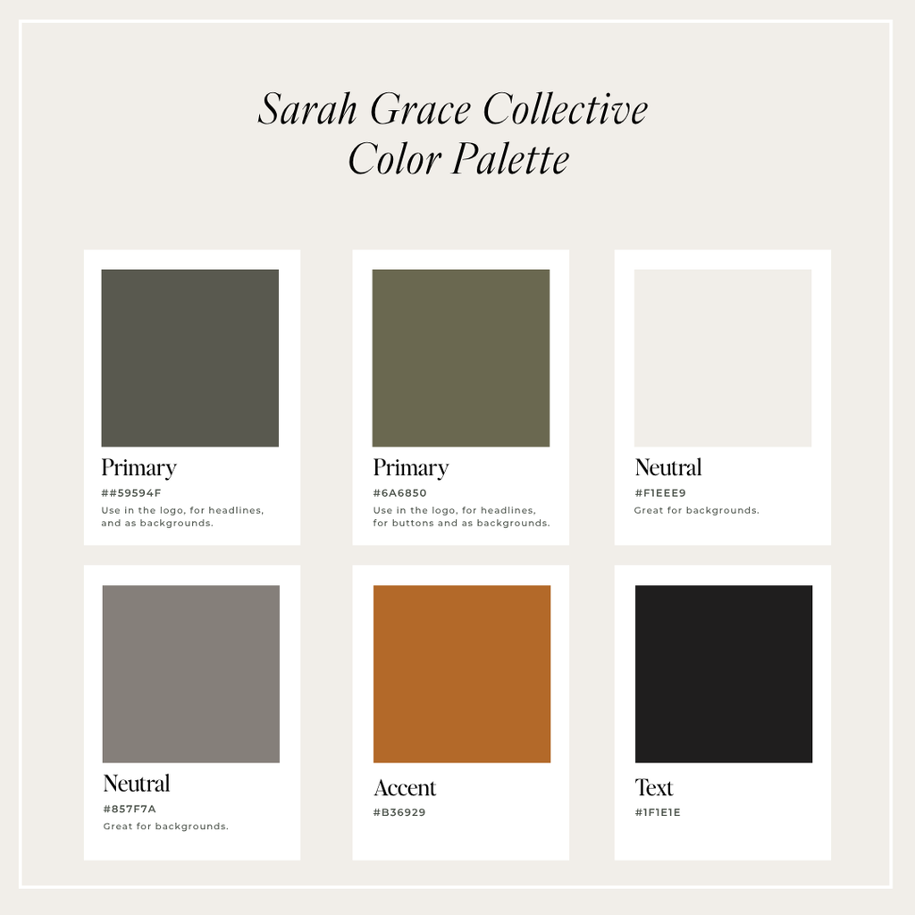
Primary/dark anchor: #59594F is a deep charcoal-olive. This is the color of my headline text because it provides strong contrast.
Secondary/supporting: #6A6850, a muted sage-gray. This color shows up in smaller supporting spots like dividers, secondary text, little details that add depth without demanding attention.
Neutrals: #857F7A and #F1EEE9 — a soft cream and a warm greige. These two are the background of basically everything. Every page background, every card, every “let the content breathe” moment — this is doing that job. Nobody’s supposed to notice these colors. That’s the whole point.
Accent: #B36929. This shows up on buttons, links, and my pop-up because I want them to catch your attention.
Why this works: the neutrals let the content do the talking, and the terracotta shows up exactly when I need someone to take action. The neutral colors give the spotlight to Nothing’s fighting for attention. Nothing feels random. Every color has a job, and every color is doing its job — which, per usual, is the whole secret. It’s not about finding “pretty” colors. It’s about giving every color a purpose and then trusting the system.
Start With Your Brand Personality First, Not Pinterest
What kind of vibe do you want your website and brand to exude? Do you want modern and moody? Clean and minimal? Feminine and classy? Pick the direction and feeling you want for your website, and stick to that palette.
For the “Modern Moody,” go with black, white, a neutral color, and an accent color.
For the “Clean Minimalist”, choose white, creams, and soft neutrals.
For the “Classy Feminine,” go with soft pinks, blush, and sage.
Do any of these themes speak to you, or do you prefer another direction? Tell me in the comments below.
| color | Possible emotions | where to use |
|---|---|---|
| Red | Passion, Warning, Urgency | Sales, Advertising |
| Orange | Value, Innovation, Confidence | CTA Buttons, Navigation |
| Yellow | Warmth, Happiness, Creativity | Grab Attention Elements |
| Green | Calm, Health, Freshness | Dark Areas |
| Blue | Trust, Security, Serenity | Calming Elements |
| Purple | Royalty, Luxury, Wealth | Areas of Sophistication |
| Black | Serious, Sleek, Refined | Outlines, Text |
| Brown | Reliable, Dependable, Warm | Softer Areas Than Black |
| White | Clarity, Simplicity, Minimalism | Text on Dark Background |
Where To Find Color Palette Inspiration
- Canva: find an image that you like the colors of and use Canva to extract those hex codes to create a color palette that you already know works together, because it does so in the image. This can be images from nature, your own clothing, professional art, etc.
- Color Palette Generators: There are a few color palette generators online, and I have never personally gotten any useful output from one of them, but they are there as an option if you want to try them. I prefer Adobe’s Color Palette Generator over something like coolers.co.
- Check Pinterest mood boards for color combinations you like.
- Competitor Research: not to copy them, but to figure out what is overdone in your niche or what is attracting customers.
- My Color Palette Collection: have a curated collection of cohesive color palettes sent right to your inbox. Just complete the form below, and I’ll send it to you in a jiffy.
Accessibility: Don’t Skip This Part
The ADA (Americans with Disabilities Act) requires your website to comply with WCAG (Web Content Accessibility Guidelines), which ensures your text, images, and videos are easy to access and understand for everyone (ADA, 2022). When choosing your color palette, ensure your text color has high contrast against the background color so it is easy to read (website accessibility includes many components beyond text readability). You can read more on website accessibility in my blog post, “How to Blog Legally in 2026: The Complete Blogger’s Guide.”)
Common Color Palette Mistakes
- Too many accent colors: If you have more than one accent color, they are going to compete for attention. This shoots your visual hierarchy right in the foot and leaves your website looking like a chaotic mess. Choose one accent color and stick with it.
- Inconsistent Color Palettes: Once you decide on your brand’s color palette, use those colors consistently across your website, social media platforms, email marketing, and more. Not using your color palette consistently will confuse your audience and make it look like a different business, especially if you use different colors on different platforms.
- Choosing Trendy over Timeless: Do you remember those horrendous light pink bridesmaids’ dresses in the 1980s with the puffy sleeves?
This is an example of why you shouldn’t always follow design and color palette trends. I encourage you to stick to more timeless designs and colors, for one thing, so you aren’t having to change the whole design and website every few years. But also so you can avoid your embarrassing pink puffy sleeve dress era on your website.
Your Color Palette Can Evolve
Listen, you’re probably not going to get your color palette right on the first, second, or even third try. My first color palette was various shades of peach because I liked a peach-themed Elementor template, and I ended up basing my whole brand off that (I do not advise doing this). What in the Georgia peach cobbler was I thinking?!
Another color palette I tried (once again based off a website template I chose) was various shades of blue. Blue aligns a little more with the vibe I want my brand to have. Blue is associated with trustworthiness, traditionalism, and loyalty. But it still lacked the professionalism and sophistication that I wanted for my brand to have. So I finally switched over to a color palette that I created on my own based on what I wanted my brand vibe to be.
There were other colors I tried in the messy middle of those three main color palettes that I mentioned. They obviously didn’t make the final cut for my current color palette, but I wanted to share that with you so you know your color palette is going to evolve with your brand and your business, and that’s okay.
If you’ve already gone through the embarrassing 1980s pink era equivalent on your website, drop me a screenshot in the comments. I wish I had a screenshot to show you my first color palette. Trust me, we are in this together.
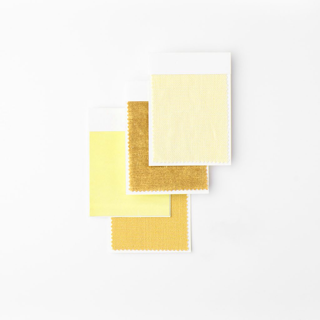
Here’s the truth nobody tells you when you’re 45 tabs deep into Coolors.co at midnight: picking a color palette isn’t about finding the “perfect” colors. It’s about picking colors that actually have a job to do — and then trusting them to do it.
Figure out your personality first. Keep it to 5-7 colors, max. Make sure people can actually read your text. And for the love of all things holy, test it somewhere before you build your entire website around it — ask me how I know; see: peach farm era.
Your palette doesn’t have to be perfect on the first try. Mine sure wasn’t. It just has to feel like you, work hard in the background, and make it painfully obvious where you want someone to click. That’s it. That’s the whole assignment.
FAQs
How Many Colors Should A Website Color Palette have?
Stick to 5-7 core colors: one primary, one secondary, one to two neutrals, and one accent. Each color has a specific job to do.
What Colors Increase Website Conversions?
High-contrast, attention-grabbing colors on your CTAs — think orange, red, or a warm terracotta like mine — tend to perform best because they visually interrupt the page and say “look here.” The goal isn’t picking a “lucky” color; it’s picking one accent color and using it consistently every single time you want someone to take action.
How Do I Know If My Website Colors Are Accessible?
Run your text and background colors through a free contrast checker (WebAIM’s is easy and does the job) before you commit to anything. If your text is hard to read, none of the rest of your beautiful color choices matter, because nobody’s sticking around to see them.
Can I Use More Than One Accent Color On My Website?
I would advise against this, because multiple accent colors compete for attention, which turns your visual hierarchy all to shit. Pick one accent color and let it do its job.
What Tools Can I Use To Create A Website Color Palette?
Canva is great for pulling hex codes straight out of a photo you already love. Adobe’s Color Palette Generator is solid too. Pinterest mood boards can help you spot patterns in what you’re drawn to. And don’t skip competitor research — not to copy anyone, but to see what’s already oversaturated in your niche.
Make sure you sign up for my free color palette collection ebook in the form below. ⤵️

Hey, I’m Sarah Grace—an ICU registered nurse, and I bring the same no-BS problem-solving to blogging. I’ve been blogging since 2020, and I’ve also earned certifications in digital marketing and graphic design since then.
I help bloggers turn their hobby blog into actual income with my How to Start a Blog online course. I also design Showit website templates and specialize in custom web design for bloggers and creatives.
I’ve been where you are and I learned how to blog for income the hard way, so you don’t have to. Now I teach others how to do it with clarity, confidence, and heart. Grab my free Website Blueprint to see what elements your website needs to increase conversions.
Like this post or want to save it for later? Use one of the images below to pin to your Pinterest board. ⤵️
03
Sep


VIEW THE COMMENTS
Add A Comment