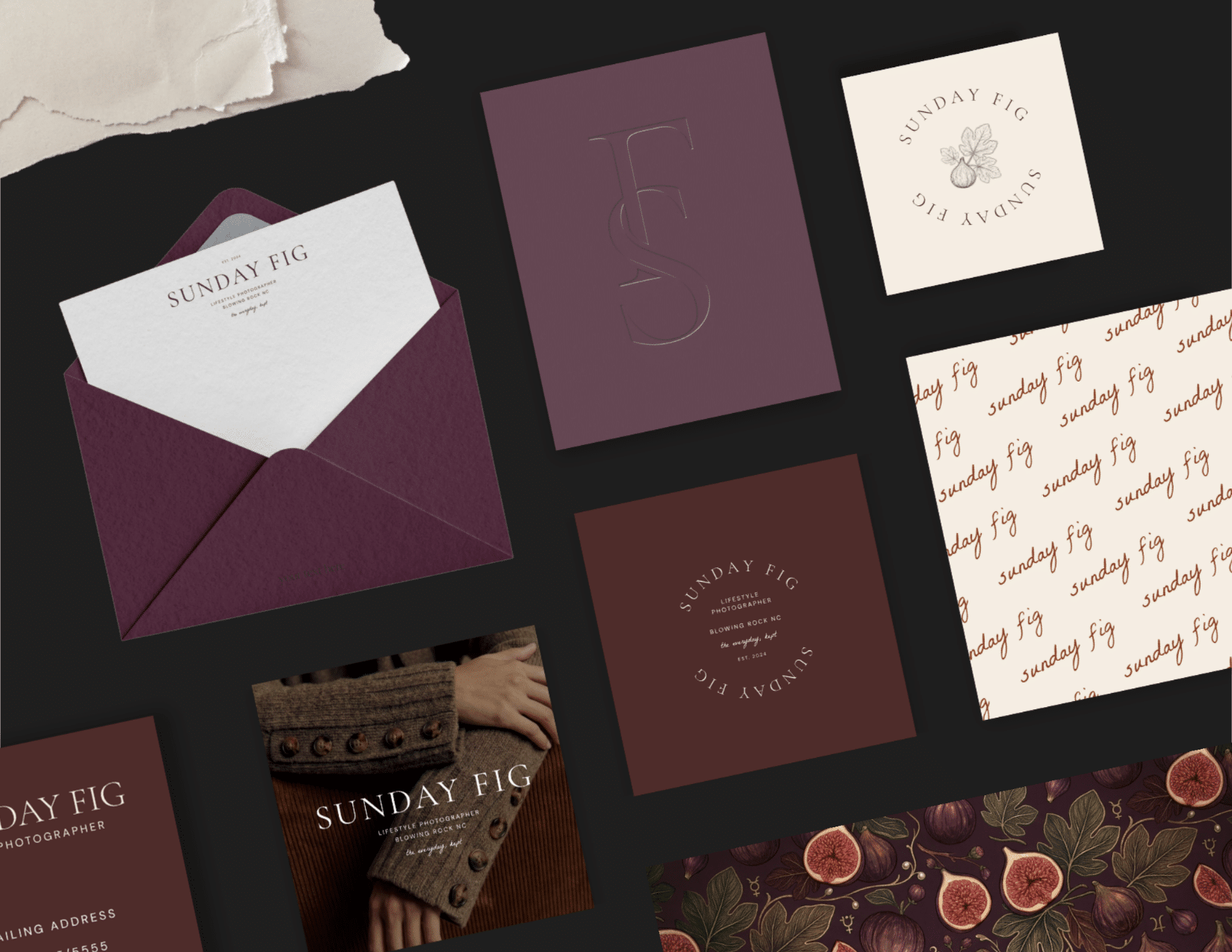



Sunday Fig is a semi-custom brand suite for photographers and entrepreneurs who want a warm, inviting brand with a nod to luxury.
Sunday Fig feels like a slow Sunday morning. Its rich browns, soft neutrals, and a refined serif wordmark make it moody without being heavy and elegant without being stiff. It’s designed for businesses that want to feel inviting from the very first impression.
The result is a complete brand you can open in Canva and make yours. This case study reviews the design process, backstory, challenges faced, and the strategy behind creating this semi-custom brand.
Disclaimer: This post may contain affiliate links. If you click on them, I may earn a commission, at no additional cost to you. See my disclaimer page for more information.
| Project | Semi-Custom Brand Suite |
| Concept | Sunday Fig Passion Project, a Lifestyle Photography Studio |
| Designed For | Photographers and Cozy, Friendly Lifestyle Brands |
| My Role | Concept, Logo suite, Color and Font Palettes, Templates |
| Format | Fully Editable Canva Files |
The Backstory
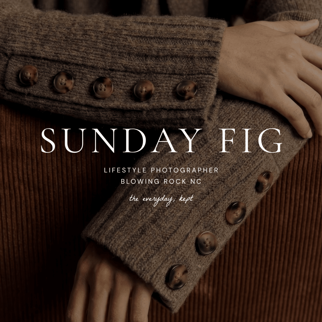
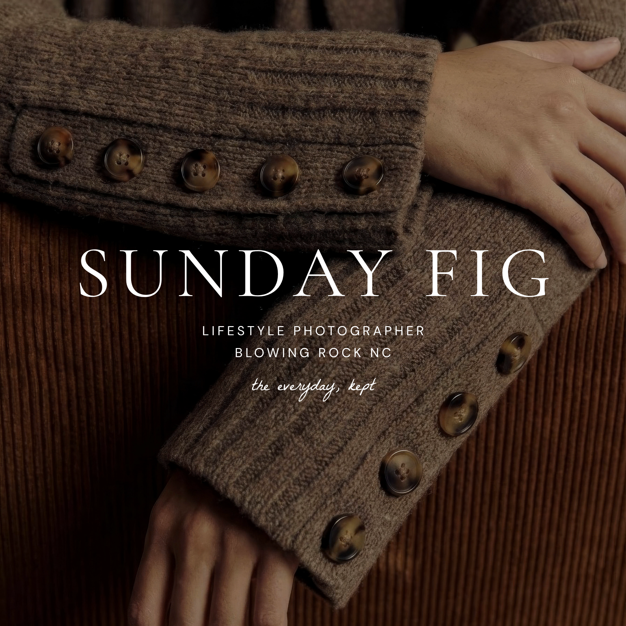
Sunday Fig started out when I found this image of a cozy sweater.

And I thought, heck, who DOESN’T want to find a brand that fits them like a cozy sweater when they are shopping for a product?! Let’s make a semi-custom brand out of it! I wanted to showcase that cozy and premium can exist in the same logo. Photography felt like the perfect industry to test this passion project, because people often choose a photographer based on a feeling before they even look at pricing packages.
I’d like to say I was clever enough to come up with the studio name on my own, but AI helped me choose it after I explained I was doing a passion project and the aesthetic I was going after with this brand suite.
The Challenge
The coziest pair of shoes I’ve ever owned were a pair of 10-year-old UGG boots that I wore until the soles fell off. That’s the thing about cozy items. They aren’t the new shiny item off the shelf; they are the item that has formed to its owner. This worn-in aesthetic doesn’t exactly match a luxury product, and that’s the challenge of Sunday Fig’s branding. Sunday Fig was created to be warm enough to feel like an invitation, but polished enough to charge real money.
Sunday Fig’s clients are showing their real, unstaged life moments, so the brand needs to feel like an invitation from a best friend, not a velvet rope blocking the entrance.
The entrepreneur who buys this suite has their own version of the problem. They want an established, trustworthy brand, but don’t have the timeline or the budget for a custom brand project. Sunday Fig becomes the solution to all of these problems.
The Strategy
I initially started in the wrong direction for this brand. I started by looking up dainty, feminine fonts that looked very elegant. They gave a very polished, black-tie event kind of feel. But it was so elegant that it felt rigid and cold. Like a pair of high heels that can dominate a room, but also kill your feet at the same time.
So I started with a simple, cozy image of a sweater, and from there, every choice had to pass the sweater test. If it didn’t feel like something cozy you’d pull on during sweater weather, it was out.
For example, even with no sweater images in sight, the autumnal color palette reminds you of the time of year when you reach for that cozy sweater to wrap around you for warmth.
The Process
The Type
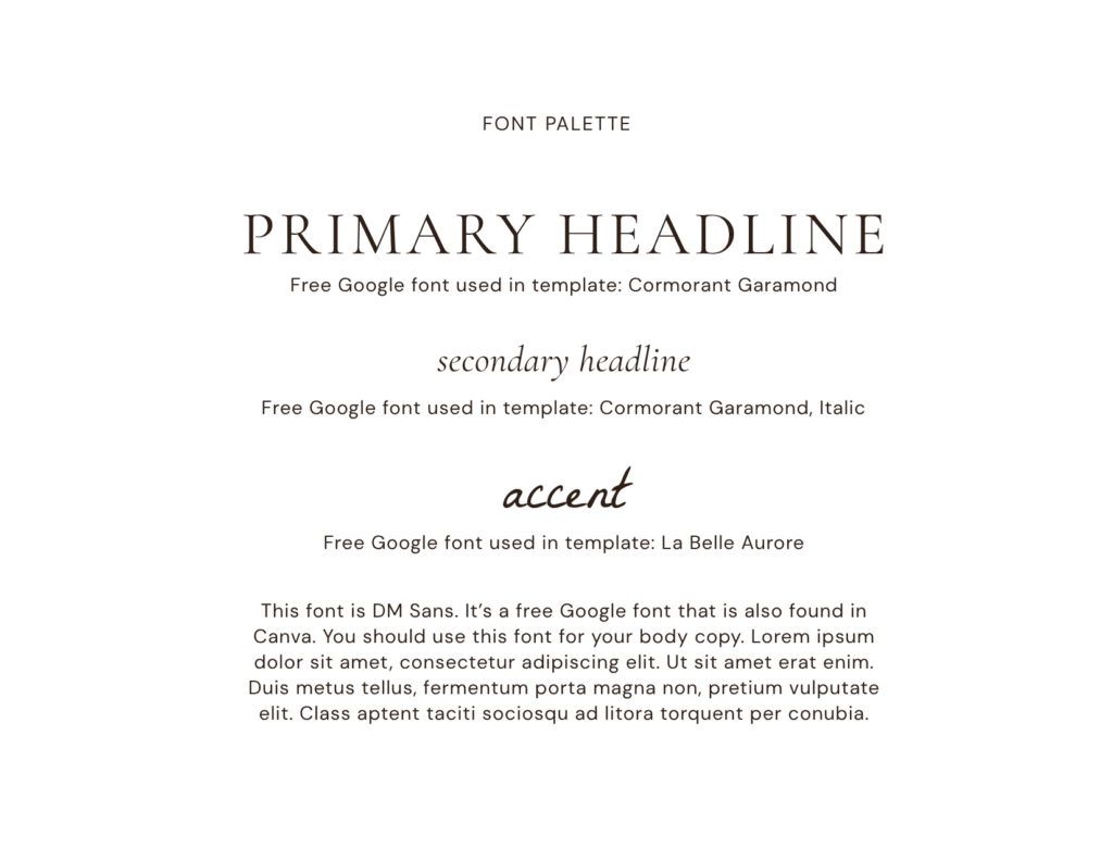
At first, I played around with fonts like Silk Serif, Made Canvas, and La Luxes Serif, but none felt right for the aesthetic I wanted for this brand. I ultimately went with a free Google font, Cormorant Garamond, because it felt like the font should be a familiar old friend, not a premium font with an added expense.
I ultimately decided to use Cormorant Garamond for the subheadlines as well because I think the lowercase, italic lettering gives it the femininity I was originally going for, while staying in the same font family for a friendly, cohesive look.
DM Sans was selected as the body copy because its soft, round letterforms give it a warm and inviting feel, but it still stays out of Cormorant Garamond’s way as the star serif. DM Sans is also a free Google font, because a close friend wouldn’t charge you, so neither does this font.
I definitely wanted to include a script with this semi-custom brand, because the last brand I did, Birch Haus was too industrial to have a script font. I chose the free Google font La Belle Aurore, because it looks like handwriting with a fountain pen. The script font matches the comforting, personal aesthetic, without feeling like a formal wedding invitation.
The Colors
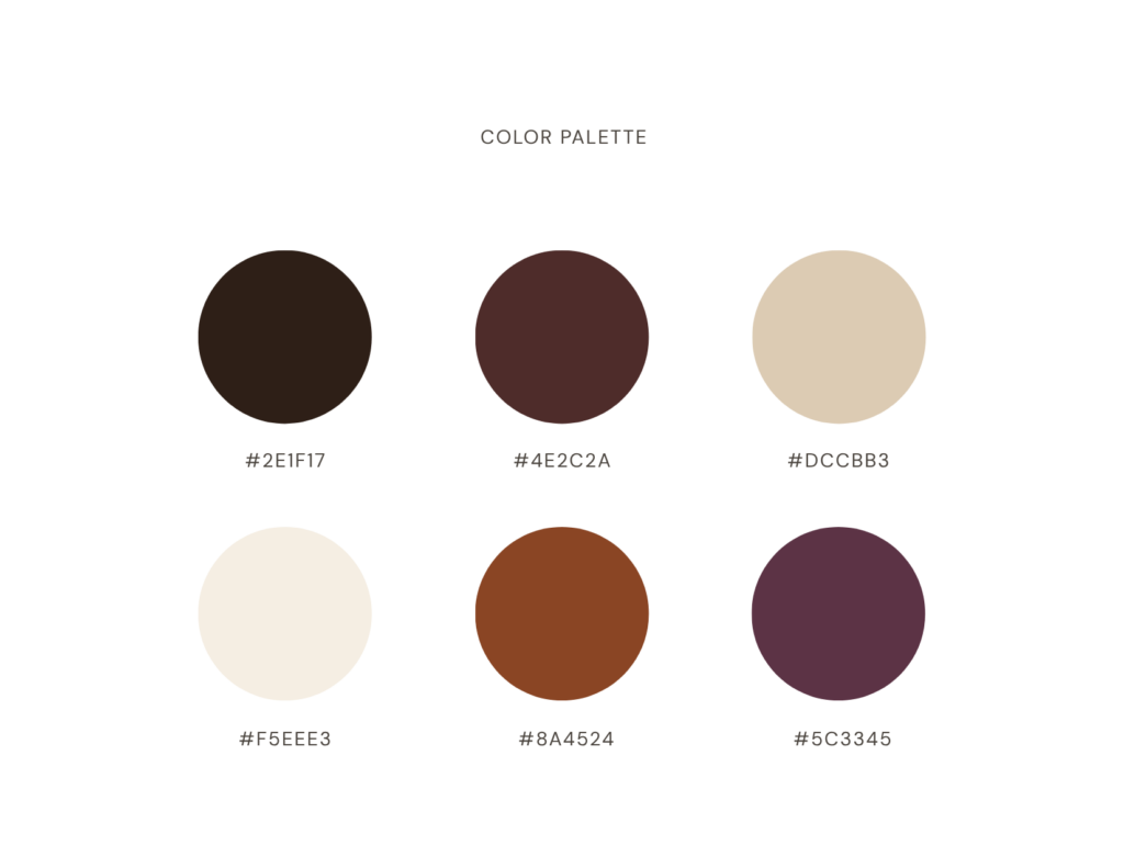
Again, I wanted the autumnal color palette to remind you, on its own, of that time of year when you reach for your coziest sweater, like it’s an old best friend that fits you like a glove.
Espresso: Primary
#2E1F17
This shade is primarily used in text. This brand uses no pure black; instead, a softer espresso shade serves as the brand’s dark text color.
Cocoa: Primary
#4E2C2A
This primary shade works well in captions and footers.
Oat: Neutral
#DCCBB3
This neutral shade works well for section backgrounds to add depth and emphasis.
Cream: Neutral
#F5EEE3
This neutral shade is meant to be used as the main background. The cream softens the color palette instead of using pure white.
Rust: Accent
#8A4524
An accent shade that can be used for buttons and links.
Fig: Accent
#5C3345
The shade used in the logo mark and for special occasions. It was honestly my favorite shade in the palette, so I used it in many of the secondary logos.
The Wordmark
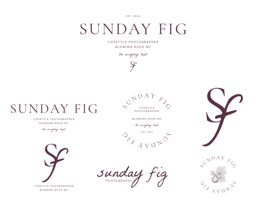
After selecting the fonts and color palette, I designed the brand’s wordmark. A wordmark logo includes only the company name, with no additional icons, symbols, or elements. Sunday Fig’s wordmark is created with Cormorant Garamond font, in all capital letters, with wide letter spacing. That breathing room between the letters keeps the moody palette from feeling too heavy.
The Logo Suite
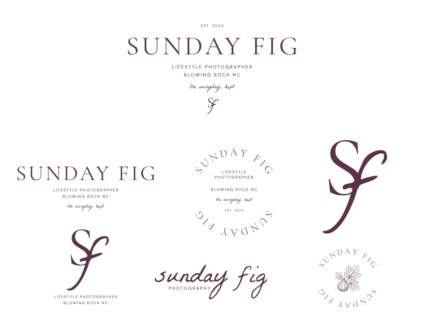
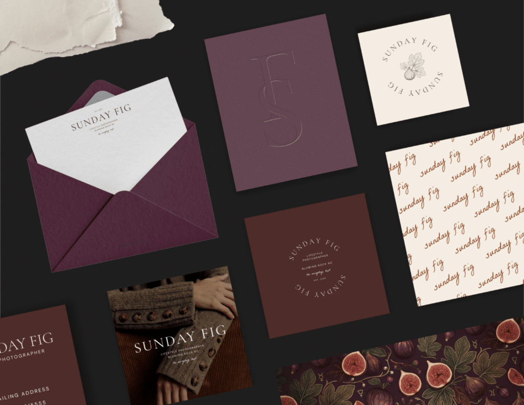
The Sunday Fig brand suite is a curated collection of logo styles that can fit any size or situation. This flexibility is a must-have for semi-custom brand design, because you want to know what you are buying can be used without limits.
The Final Brand
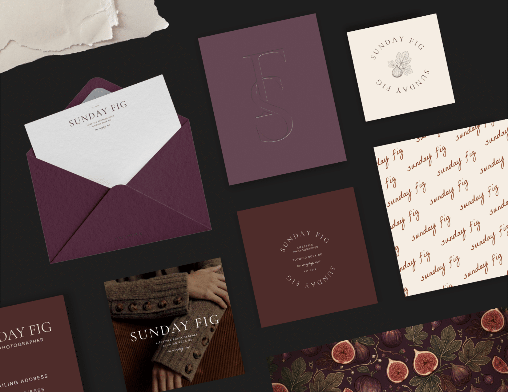
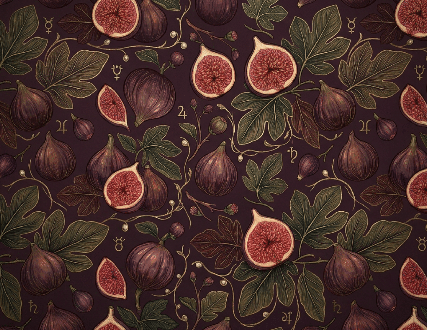
Every piece of this brand collection was designed to work with other elements of your branding, like your website, your social media, and your printed brand cards, so they all look like they came from the same person. Here’s what’s included in Sunday Fig’s brand suite:
- Primary and Secondary Logo Designs
- Files for Both Print and Web
- Coordinating Business Card and Note Card Designs
- Recommended Color and Font Palettes
- Every file fully editable in Canva
What I Learned
Pretty isn’t the same as right. The original fonts that I was considering for this brand were lovely. And made for a different brand entirely. The sweater test worked for this project because it made sure every element of the design felt “warm and comforting.”
I haven’t nailed down my exact branding process, like should I start with the font first or an image that determines the direction of the whole brand? I need to figure out my design process and write it down so I can streamline it for the future.
Make It Yours
Sunday Fig was designed for a photographer that doesn’t exist. Which means it can belong to anyone that does.
As soon as you purchase the Sunday Fig semi-custom brand, the files are instantly delivered to your inbox. From there, you can open your brand templates in Canva, edit your brand name, and pick the logo versions you like best. Edit the colors and fonts if you want to. In no time at all, you’ll have a brand that looks custom, without the timeline or the price tag.
Purchase Sunday Fig
07
Oct


VIEW THE COMMENTS
Add A Comment