


The fact is, fonts communicate before your words do. They tell people if you’re brand is casual, modern, classic, premium, trustworthy or unfortunately, chaotic. And you can bet your bottom dollar that your audience is picking up on the vibes your fonts are giving off in 0.2 seconds. They won’t give you grace and think “oh the typography lacks contrast”, they’ll just bounce off your site because it feels off.
To add to the confusion, there are graphic design programs like Canva, which have like 9000 beautiful fonts and absolutely no guidance on how to pair them.
So this is your shortcut. Your official guide. In this post, I’m breaking down Canva fonts that go together using real pairings you can straight up steal. They are grouped by style so you can find your vibe fast, whether you want clean and modern, editorial and elevated, bold and punchy, or soft and feminine.
None of that “trust your eye” rubbish. These are actually font pairings that you’re going to want to steal.
Disclaimer: This post may contain affiliate links. If you click on them, I may earn a commission, at no additional cost to you. See my disclaimer page for more information.
Table of Contents
Editorial & Elevated Serifs-Canva Fonts
I love a good editorial serif. Like I for real love them. Let’s take a look at some editorial serif Canva fonts that go together.
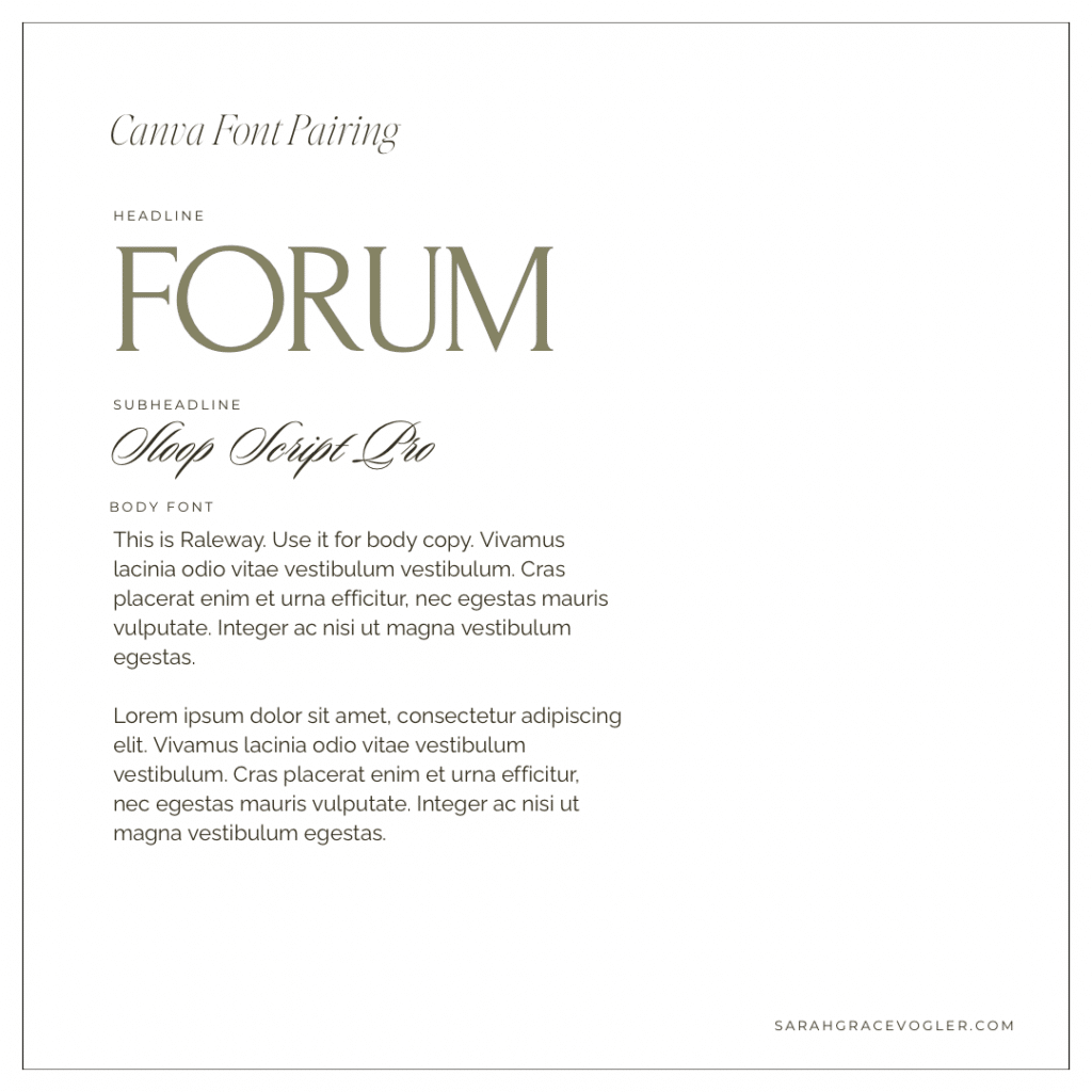
01 // Forum + Sloop Script Pro + Raleway
Forum brings the editorial, high-end headline drama with those elegant, classic serifs. Sloop Script Pro adds a soft romantic accent that feels like a signature, not a second headline. Raleway keeps the whole system grounded and readable, so that the pairing feels elevated but still clean and modern.
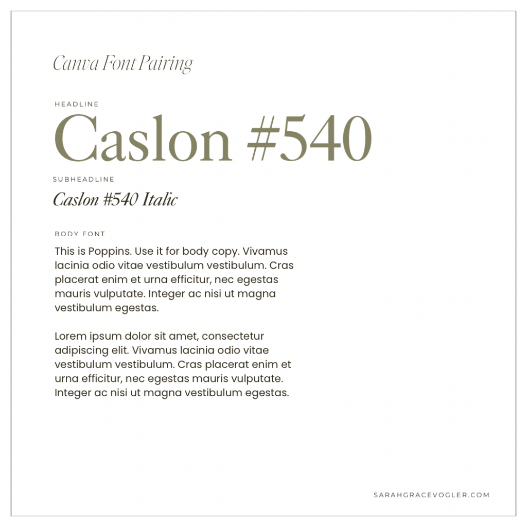
02 // Caslon #540 + Caslon #540 Italic + Poppins
Caslon #540 is timeless and classic serif that instantly reads “credible” and “expensive”. The italic version gives elegant subheadline style without changing fonts, so it stays cohesive. Finally, this trio is rounded out with Poppins as the body text. It is the perfect modern counterbalance: clean, readable and simple. This whole combination is giving old-money headline + modern-day clarity.
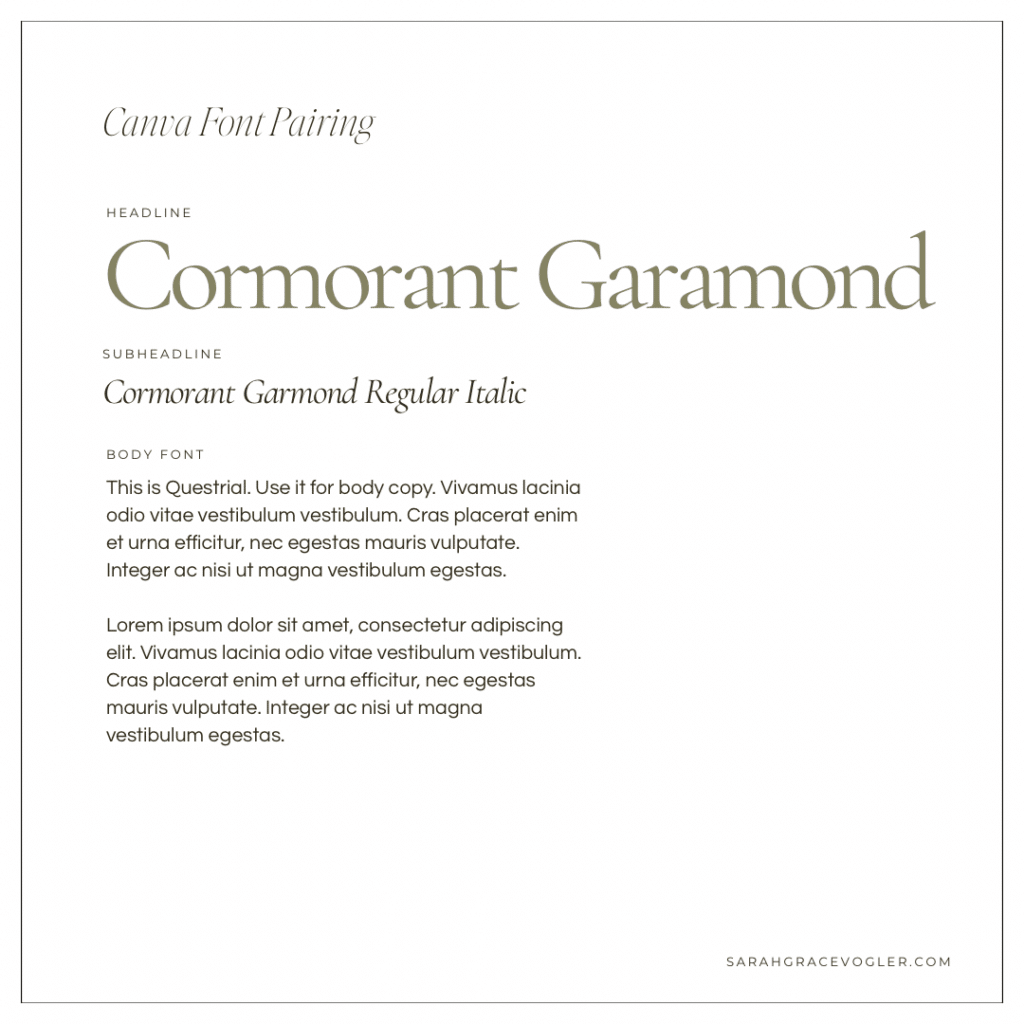
03 // Cormorant Garamond + Cormorant Garamond Italic + Questrial
Cormorant Garamond is one of my favorite editorial serifs. It is dramatic, high-contrast and stylish in a way that you would see in a magazine spread. Again, the italic version adds a refined accent that feels elevated without having to switch fonts. I love this serif paired with Questrial for the body font. Questrial is super clean, understated and that’s exactly what you want next to a statement serif like Cormorant Garamond. It lets the headline shine while keeping the body copy easy on the eyes.
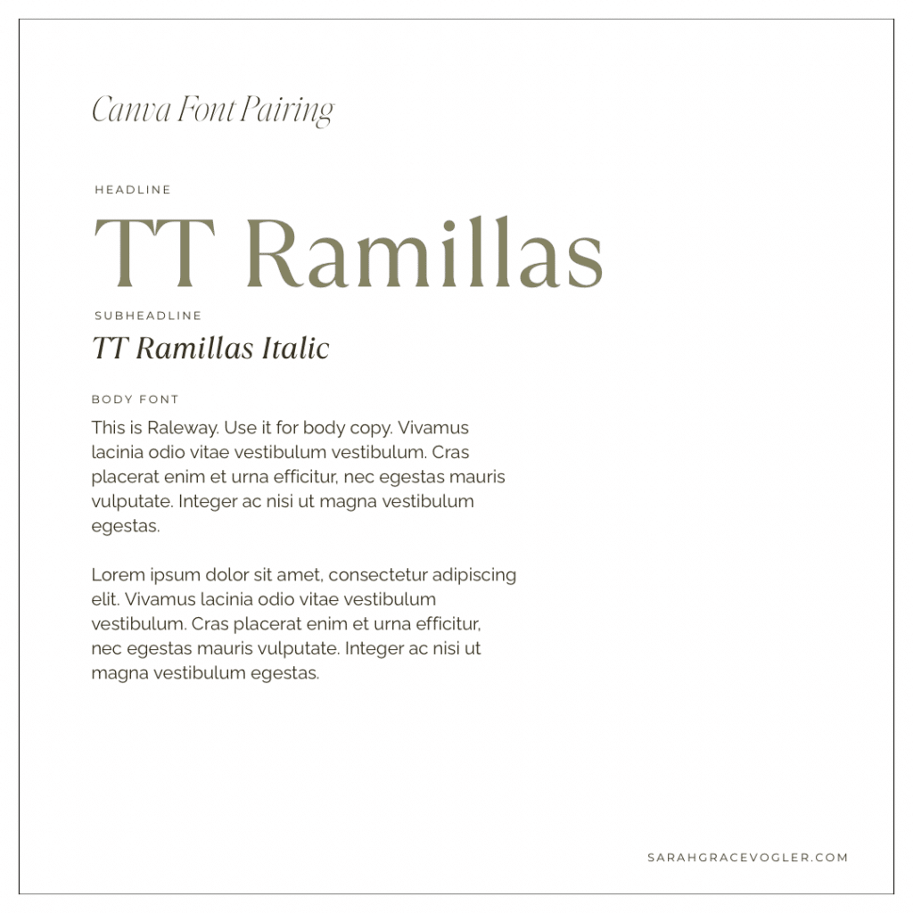
04 // TT Ramillas + TT Ramillas Italic + Raleway
TT Ramillas is a confident, modern serif that feels upscale and editorial without being overly traditional. The italic version in the subheadline adds elegance and variation while staying in the same font family, making your font hierarchy feel smooth. Raleway is the perfect clean partner for body copy. It’s giving legibility and modern contrast so the whole pairing feels premium and practical.
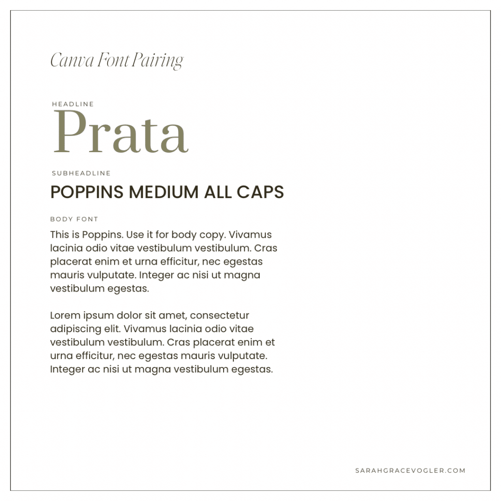
05 // Prata + Poppins Medium All Caps + Poppins
Prata is an elegant serif that is slightly dramatic and has a high-fashion feel, so it instantly elevates anything it touches. Poppins Medium in all caps provides a clean modern contrast that keeps your design from looking too traditional. Poppins Regular for the body font keeps it readable and cohesive, making this combination a great “luxury headline + modern clarity” for websites and lead magnets.
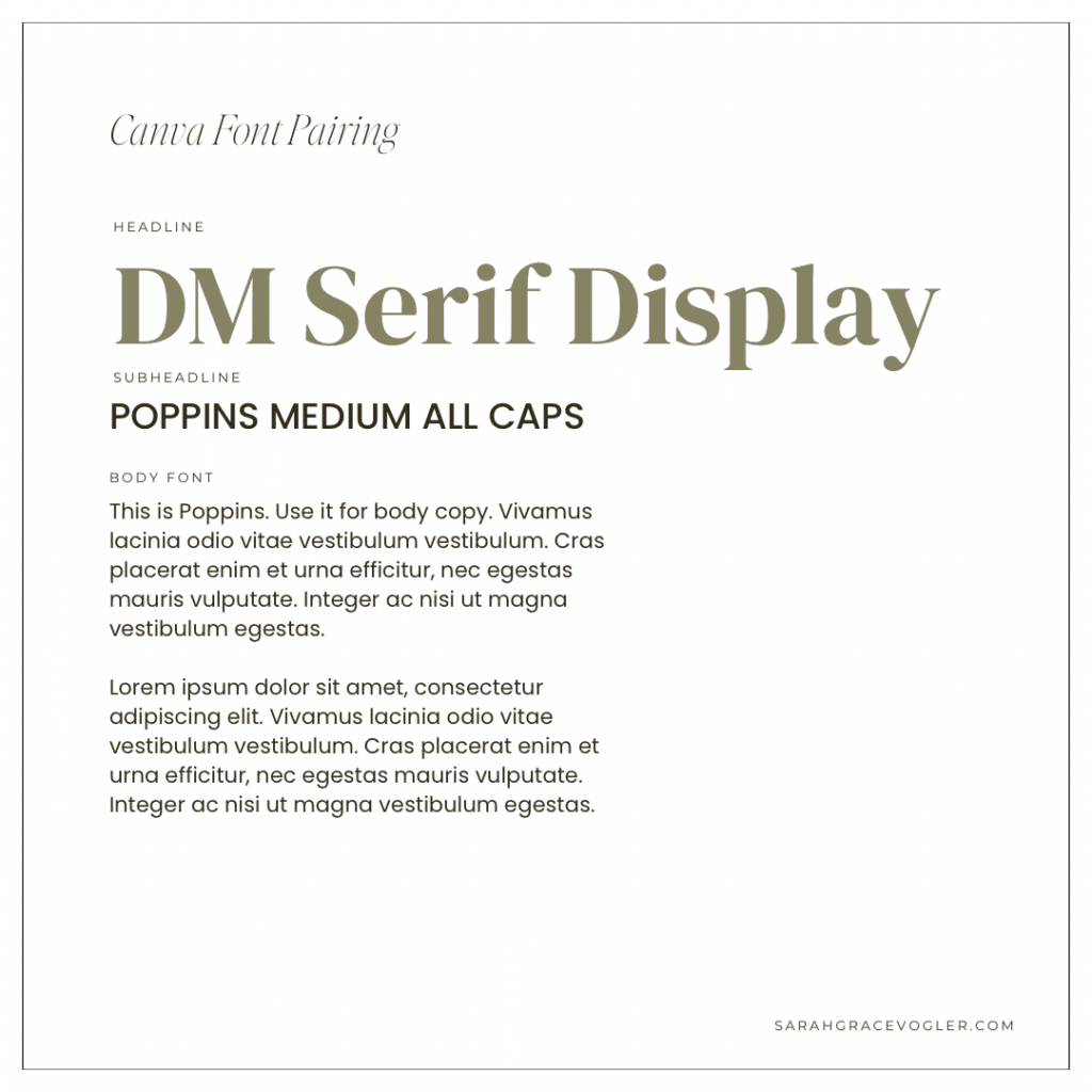
06 // DM Serif Display + Poppins Medium All Caps + Poppins
DM Serif Display has that classic editorial feel with enough personality to feel premium and stylish. Again, this pairs beautifully with Poppins Medium All Caps, which gives this font pairing modern structure and crisp contrast in shape. Keeping Poppins Regular as the body font make it feel cohesive and easy to read, so you get that “fancy headline, clean support text” combination that looks expensive, even when you’re designing in sweatpants (ask me how I know).
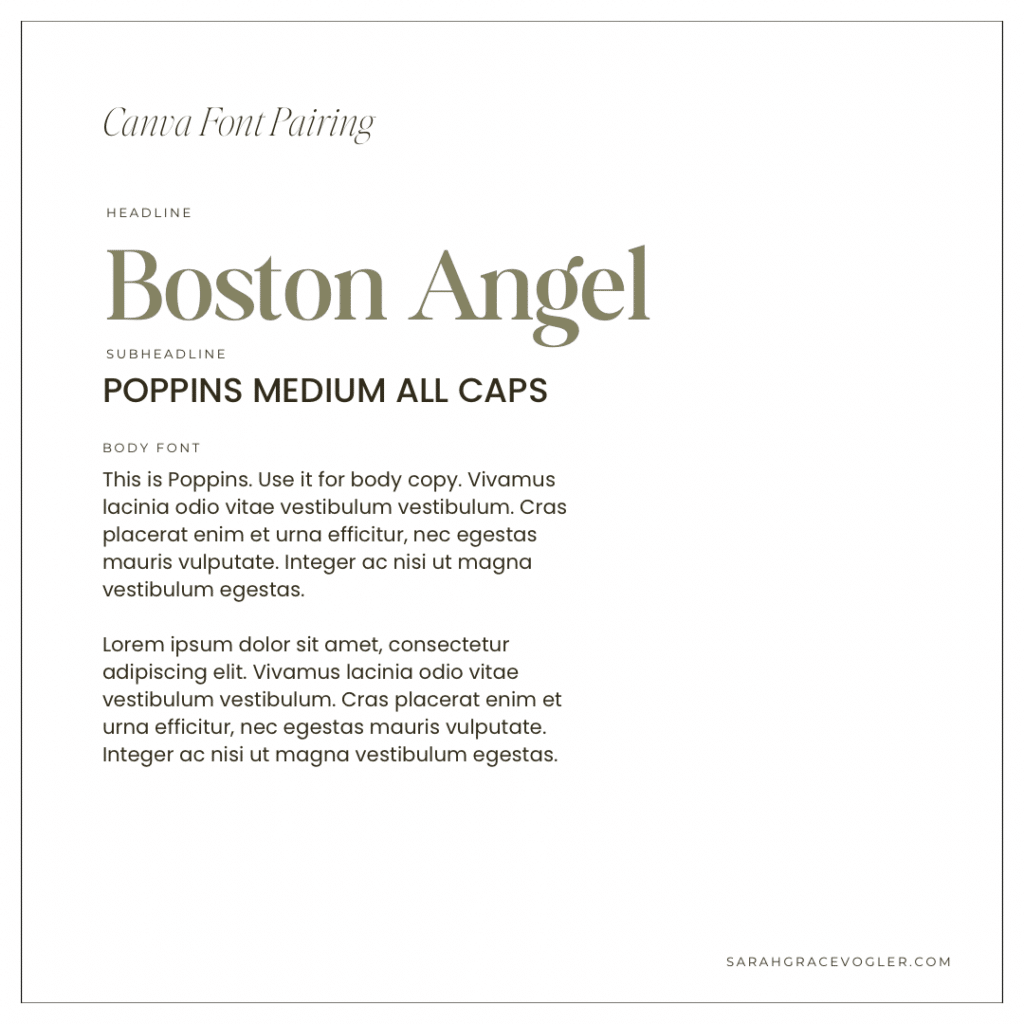
07 // Boston Angel + Poppins Medium All Caps + Poppins
Boston Angel is a soft, elegant serif that feels romantic and editorial without being too dramatic. This serif also pairs well with Poppins Medium All Caps, which gives the pairing a clean, modern anchor that sharpens the look and creates font hierarchy. Using Poppins Regular for the body font keeps everything legible and consistent across your subheadline and body copy.
Modern Minimal Sans-Canva Fonts
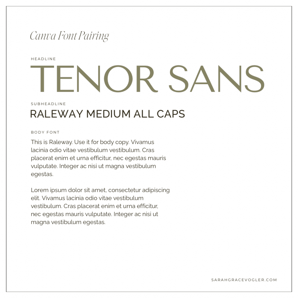
08 // Tenor Sans + Raleway Medium All Caps + Raleway
Tenor Sans is sleek and minimal, so it creates that “quiet luxury” vibe without trying too hard (which is gross). Raleway Medium in all caps adds contrast through format (both with the capital letters and the weight), not competing style, which keeps the pairing cohesive. Using Raleway again for the body font makes the system feel intentional and consistent.
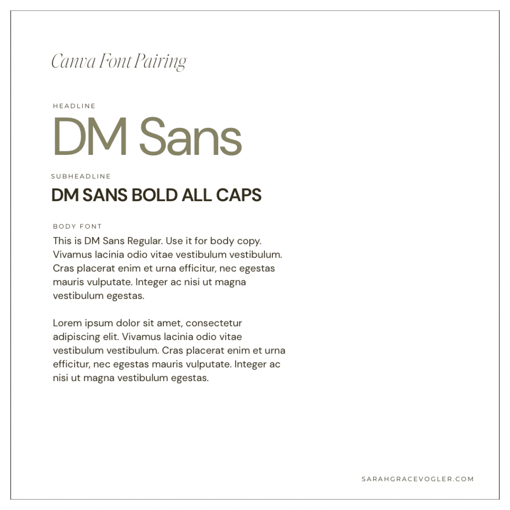
09 // DM Sans + DM Sans Bold All Caps + DM Sans Regular
This pairing works because it’s one family with strong internal contrast. DM Sans Regular is friendly and readable in the headline, while DM Sans Bold All Caps adds punch and hierarchy without introducing a new font. It’s giving clean, modern and consistent, which makes it perfect for brands that want to look polished.
Classic Bookish Serifs-Canva Fonts
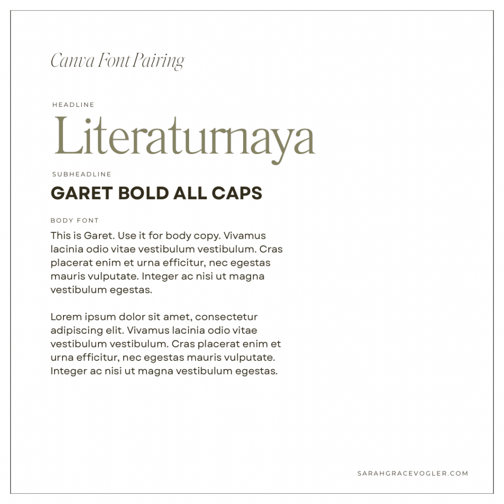
10 // Literaturnaya + Garet Bold All Caps + Garet
Literaturnaya is a gorgeous editorial serif with classic sophistication, so it makes your headline feel elevated and established. Garet Bold All Caps adds modern structure and a strong, clean hierarchy without stealing the spotlight. Using Garet again in the body makes it readable and consistent, so the pairing nails balance.
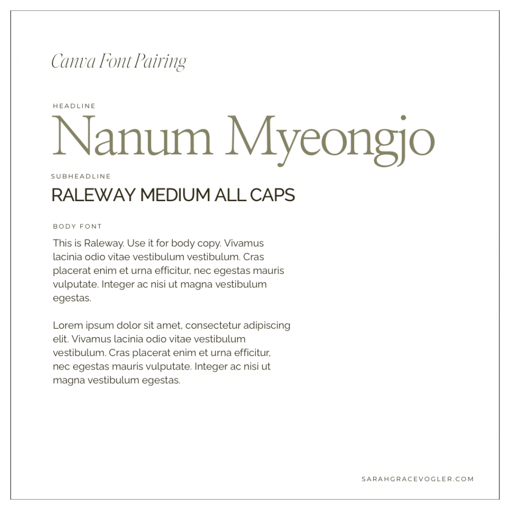
11 // Nanum Myeongjo + Raleway Medium All Caps + Raleway
Nanum Myeongjo has a soft, classic serif shape that feels bookish and elevated, but not overly fancy. Pairing it with Raleway Medium All Caps adds modern structure and sharpness, which keeps the pairing from looking too “old library”. Then Raleway in the body keeps everything cohesive and readable, giving you a warm serif headline with a crisp, modern support team.
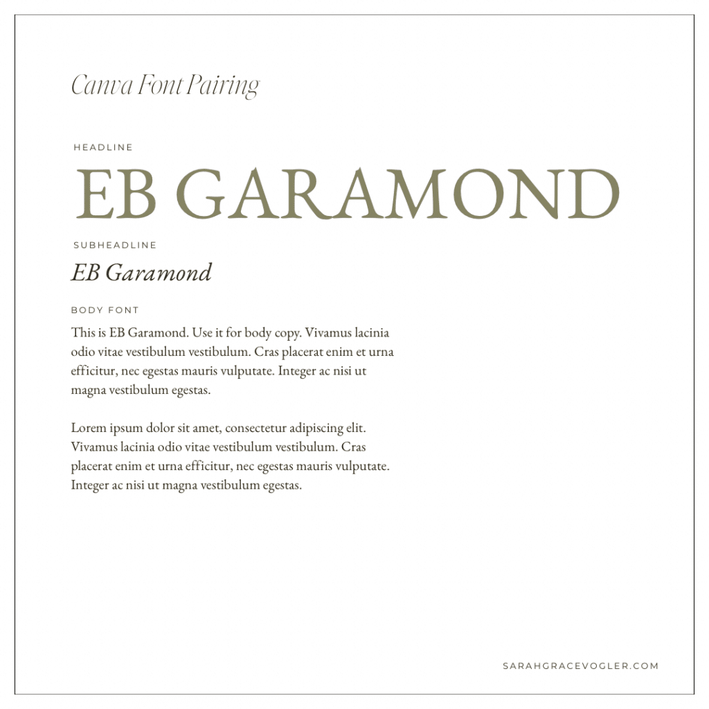
12 // EB Garamond + EB Gramond Italic + EB Garamond
This is the monochrome outfit of font pairings. It works because EB Garamond has enough range (in both weights and italics) to create hierarchy while staying cohesive. The consistent serif voice gives it a classic, literary feel that’s perfect for long-form or editorial layouts. It’s subtle and timeless.
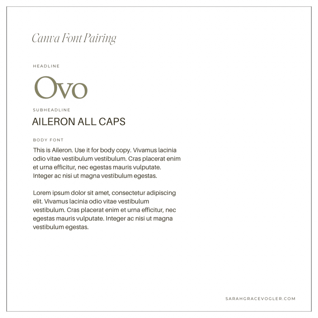
13 // Ovo + Aileron All Caps + Aileron
Ovo has soft, rounded serifs that feel charming and slightly vintage, but still clean. Aileron All Caps brings modern structure and simplicity which keeps this font pairing from feeling dated. Using Aileron again for the body copy maintains consistency, so the overall look is “tasteful and modern with a hint of classic”.
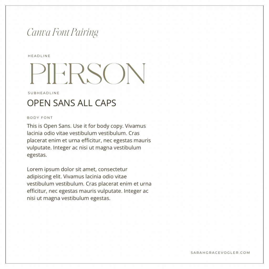
14 // Pierson + Open Sans All Caps + Open Sans
Pierson is a stylish serif with a refined, high-end look, so it makes an immediate “designer” impression. Open Sans All Caps creates a clean, simple subhead that supports instead of competing. Open Sans for the body font keeps the pairing super readable and approachable, which makes this pairing great for brands that want to give a “elevated but not intimidating” vibe.
Bold and Punchy Headlines-Canva Fonts
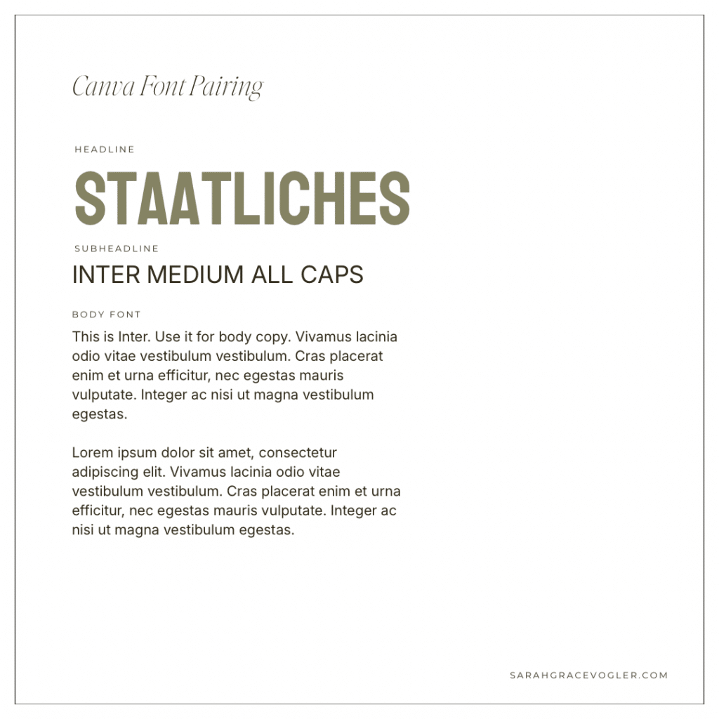
15 // Staatliches + Inter Medium All Caps + Inter
Staatliches is bold, condensed and punchy. It’s built to grab attention fast, which makes it an amazing choice for headlines, pins or promo graphics. Inter is the calm, neutral counterpart: clean, modern and readable in smaller sizes. Together, these Canva fonts get you high impact up top with no readability sacrificed.
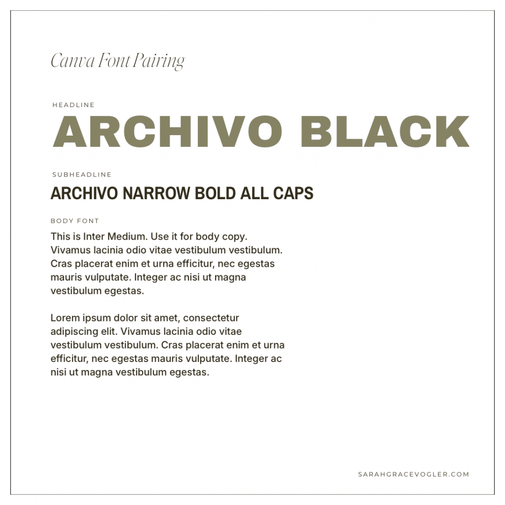
16 // Archivo Black + Archivo Narrow Bold All Caps + Inter Medium
Archivo Black is heavy, bold, and built to headline like it means it. Archivo Narrow Bold All Caps perfectly compliments the headline font, because it stays in the same family vibe, just slimmer and more structured. Inter keeps the body text clean and readable, so you get impact + clarity.
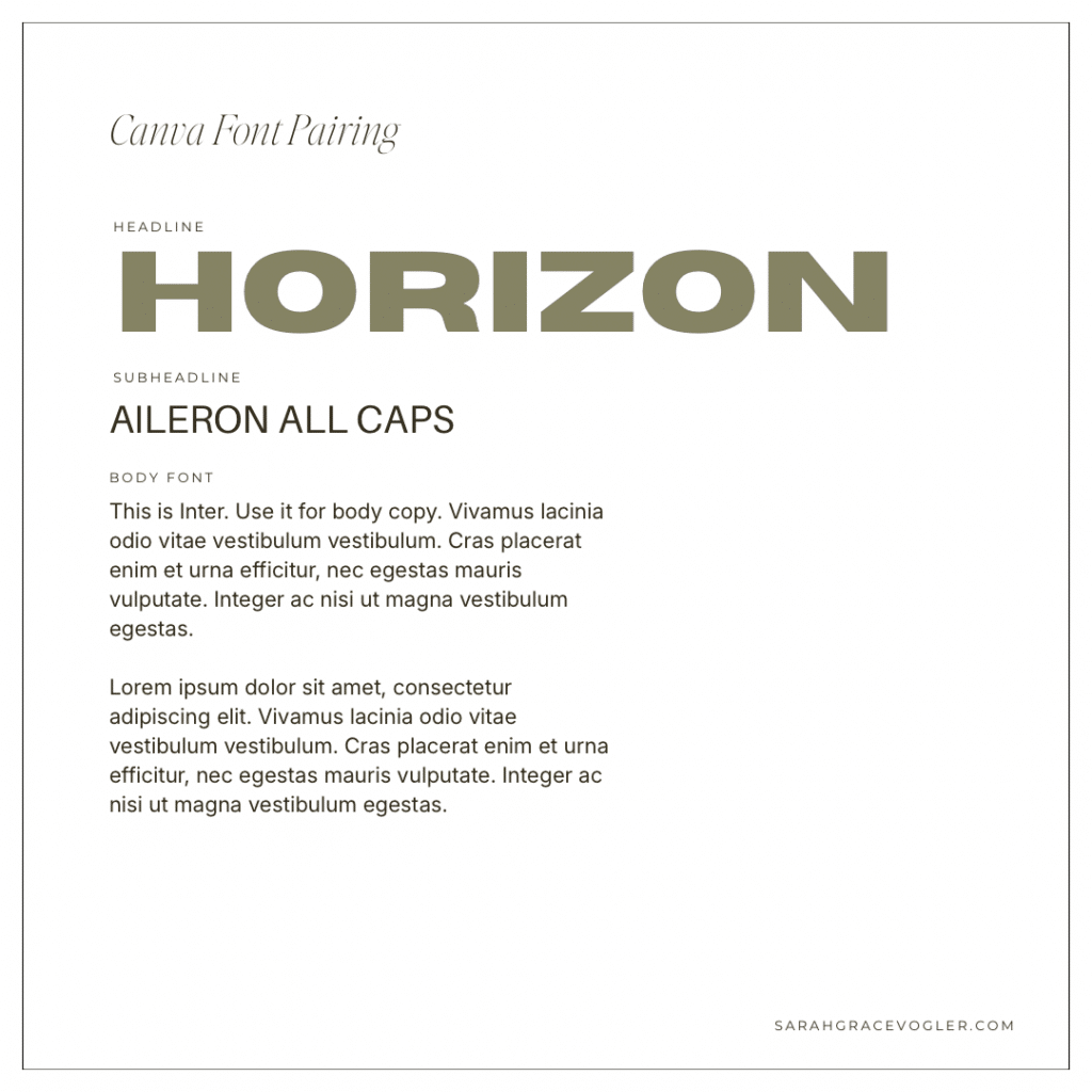
17 // Horizon + Aileron All Caps + Inter
Horizon is loud in the best way: bold, wide and attention-grabbing. Aileron All Caps keeps the supporting text modern and clean, and Inter makes the body readable and neutral. This pairing works because the headline is the star, while the other fonts are the stage crew. They don’t compete. They support.
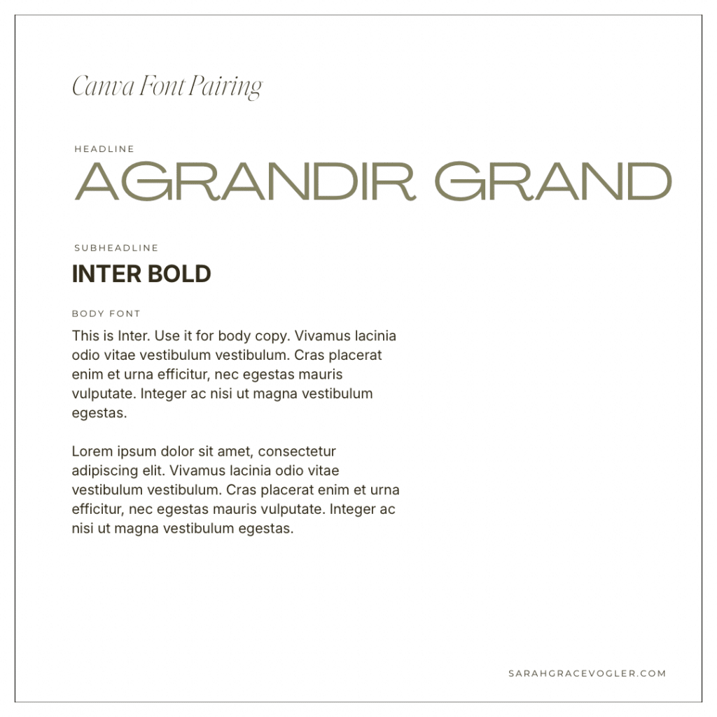
18 // Agrandir Grand + Inter Bold + Inter
Agrandir Grand is geometric, modern and sleek, which makes it feel current and design-forward. Inter Bold adds a strong supporting layer without introducing another style, and Inter for the body keeps it ultra readable. This system screams “modern brand system” because it balances personality (headline) with neutrality (supporting + body).
Script Accent Font Pairings-Canva Fonts
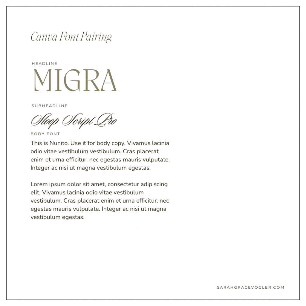
19 // Migra + Sloop Script Pro + Nunito
Migra is a statement serif with a refined editorial vibe, so it instantly elevates the design. Sloop Script Pro adds a delicate feminine accent that feels intentional when used sparingly. Nunito keeps the body text approachable and readable, so the whole system feels like “luxury with warmth”.
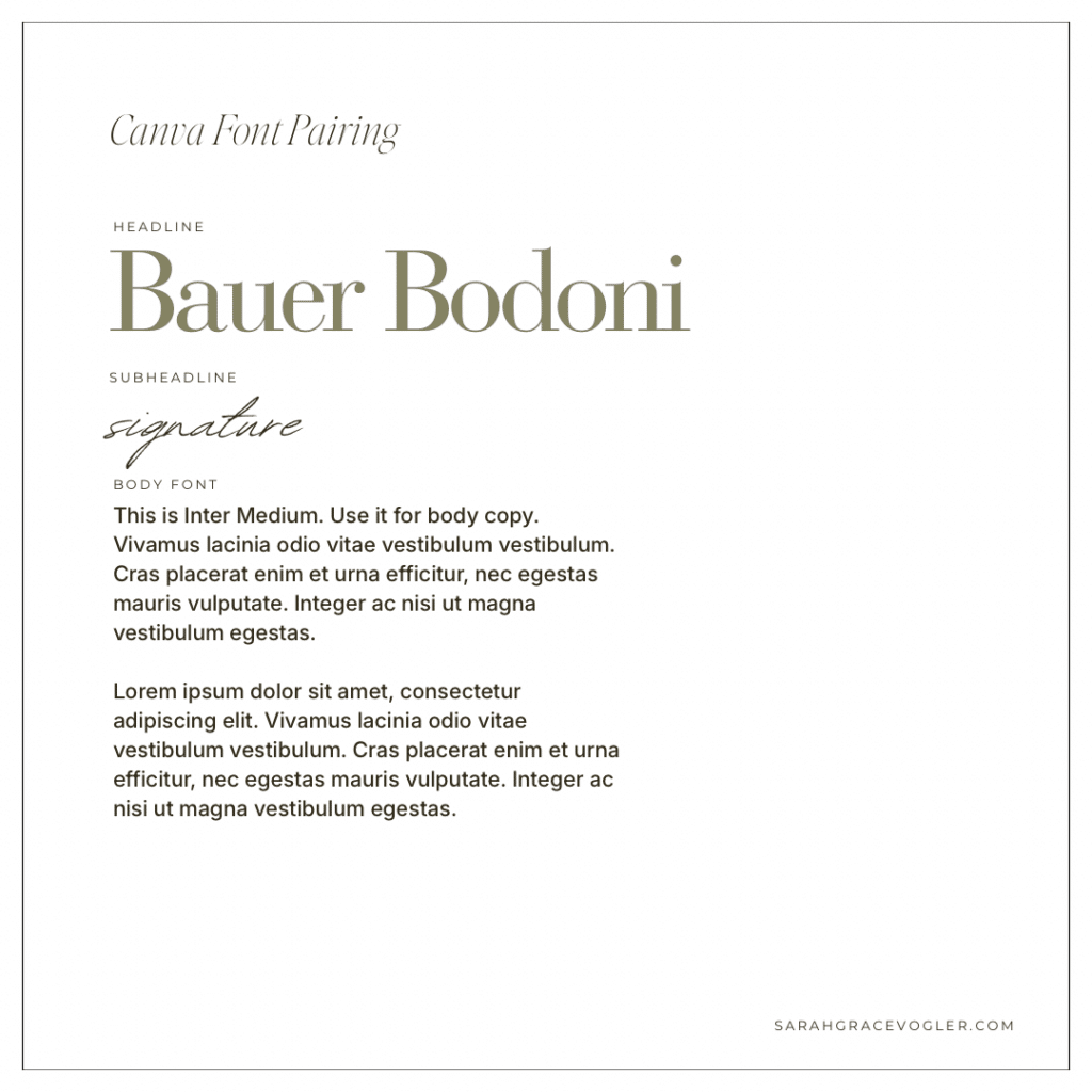
20 // Bauer Bodini + Signature + Inter Medium
Bauer Bodini is a classic fashion serif. It’s dramatic, high contrast and instantly screams “editorial”. Signature script adds a personal, handwritten accent, but because it’s only used as a small detail, it feels intentional instead of messy. Inter is the idea body copy font here: it’s neutral, modern and extremely readable, so it balances the glam without killing it.
Friendly & Approachable-Canva Fonts
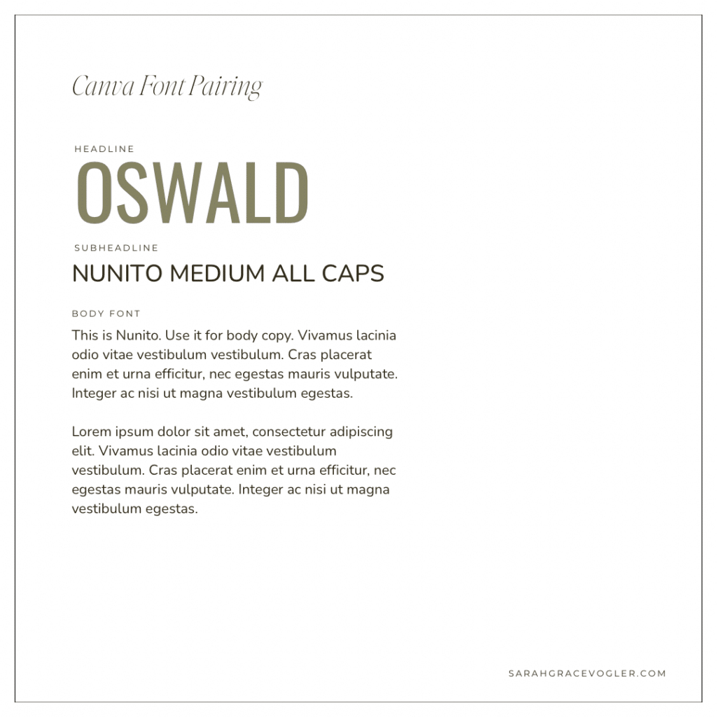
21 // Oswald + Nunito Medium All Caps + Nunito
Oswald is condensed and bold, which makes it great for headlines that need to feel strong and clear. Nunito is friendly and rounded, so it softens the overall tone and keeps it approachable. Nunito Medium All Caps adds hierarchy without changing fonts, and the body stays super readable. These Canva fonts paired together is “confident but not aggressive”.
If you take one thing from this post on Canva fonts, let it be this: fonts are not a tiny detail. They’re the first impression. And now you don’t ever have to do the Canva font scroll of doom ever again.
You’ve got a list of Canva fonts that go together, grouped by style, so you can pick the pairing that matches your brand in minutes, not hours. Use one of these combinations consistently across your graphics, pins, lead magnets and headers and you’ll instantly look more polished and trustworthy, without changing anything else.
Now go steal a pairing from above, swap it into your next Canva design how fast everything starts looking legit.
03
Mar


VIEW THE COMMENTS
20+ Best Canva Fonts That Go Together: The Complete Pairing Guide