


You’re not bad at design. You’re just missing the rules that make things look intentional.
The difference between, “wow, this feels expensive” and “what in the actual fuck is happening here?” isn’t talent. It’s principles of design. Principles of design are the invisible rules that make a design feel clean, clear, and intentional.
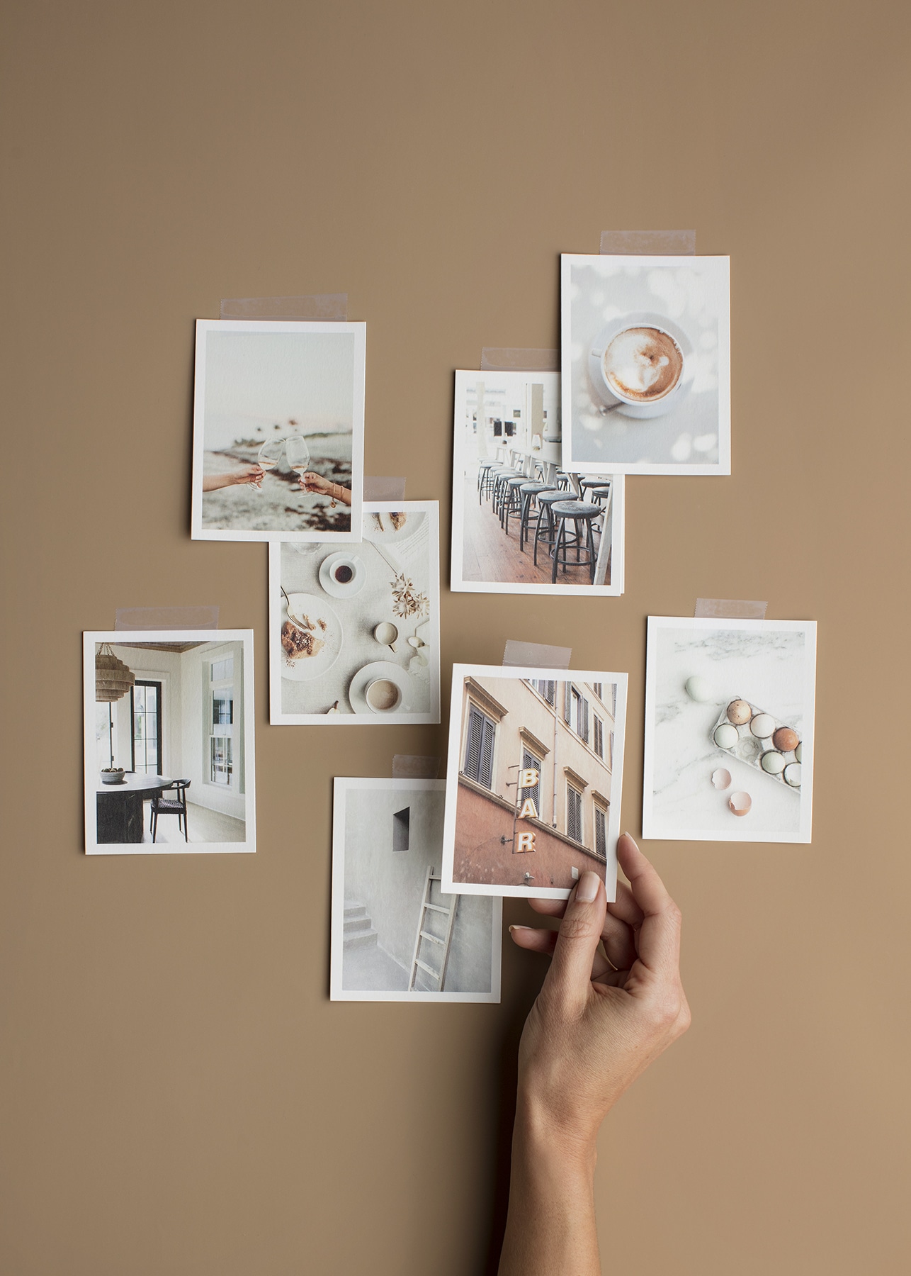
And once you learn them, you’ll be able to detect when something “feels off”, so you can correct it. Here are the 9 principles of design you can use on your blog, website, or even Canva graphic-without needing a design degree.
Understanding the principles of design will enhance your creativity and help you produce better designs.
Disclaimer: This post may contain affiliate links. If you click on them, I may earn a commission, at no additional cost to you. See my disclaimer page for more information.
Table of Contents
The Principles of Design
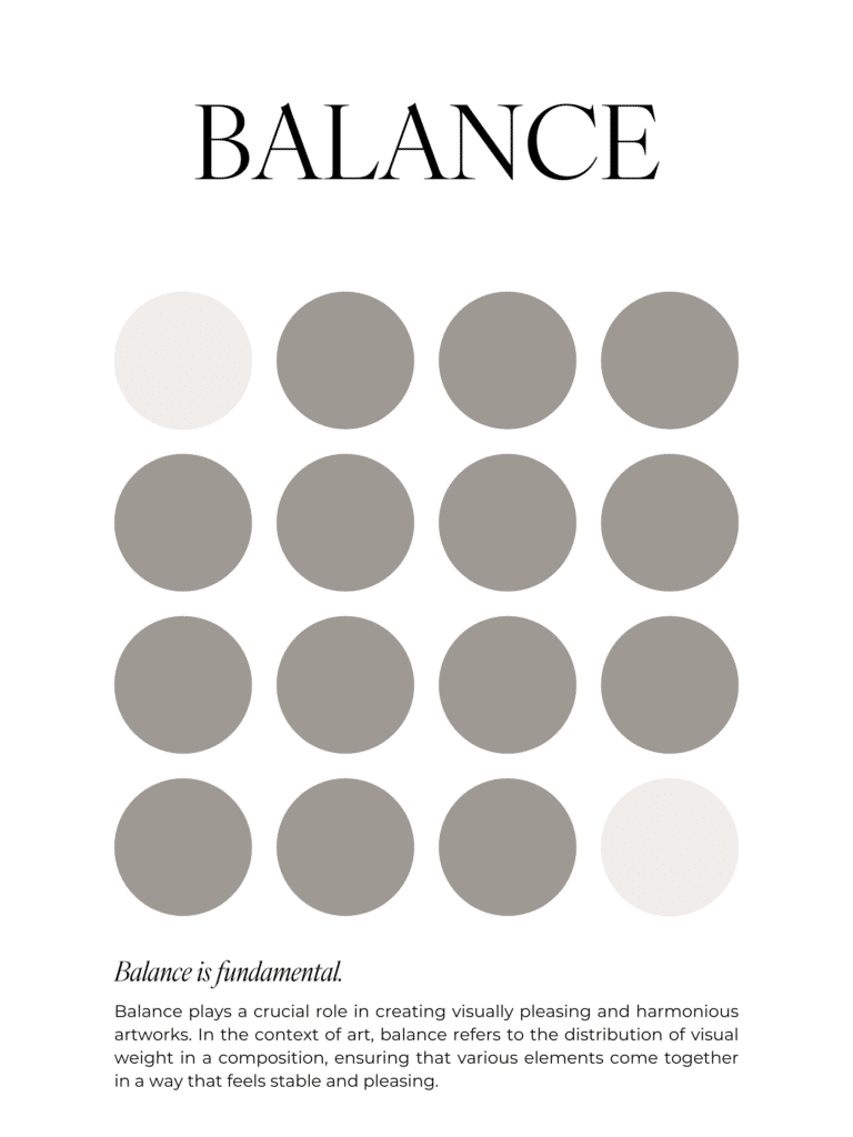
No. 1 / Balance
Using the principles of design can drastically improve the user experience of your website or graphics.
Definition: Balance is visual stability. It is the even distribution of visual weight in a design (like text, images vs. white space), so it doesn’t feel like it’s about to tip over. Like dark colors, big images, bold text and crowded areas all feel heavier, so you want to find balance for these heavier elements.
Purpose: The purpose of balance is to make sure your layout doesn’t look lopsided. 🤪. Where people go wrong with balance is when people try to cram everything on one side of the page.
Imagine your design is sitting on a seesaw. If all of your bold text, bright colors and big images are sitting on one side of the seesaw, it’s going to feel off, right? Pro tip to make your design look balanced: take a step back and squint at the layout. If one side feels heavier, adjust the size, placing or placement to balance it out more evenly.
Types of Balance:
- Symmetrical balance: where both sides mirror each other, like a simple centered quote graphic on the Instagram, with a border around it.
- Asymmetrical balance: the sides aren’t identical, but they feel evenly weighted.
- Radial balance: the elements radiate from a center point. I’m not doing this nonsense in my graphics. Maybe you’ll see it in a background image or logo.
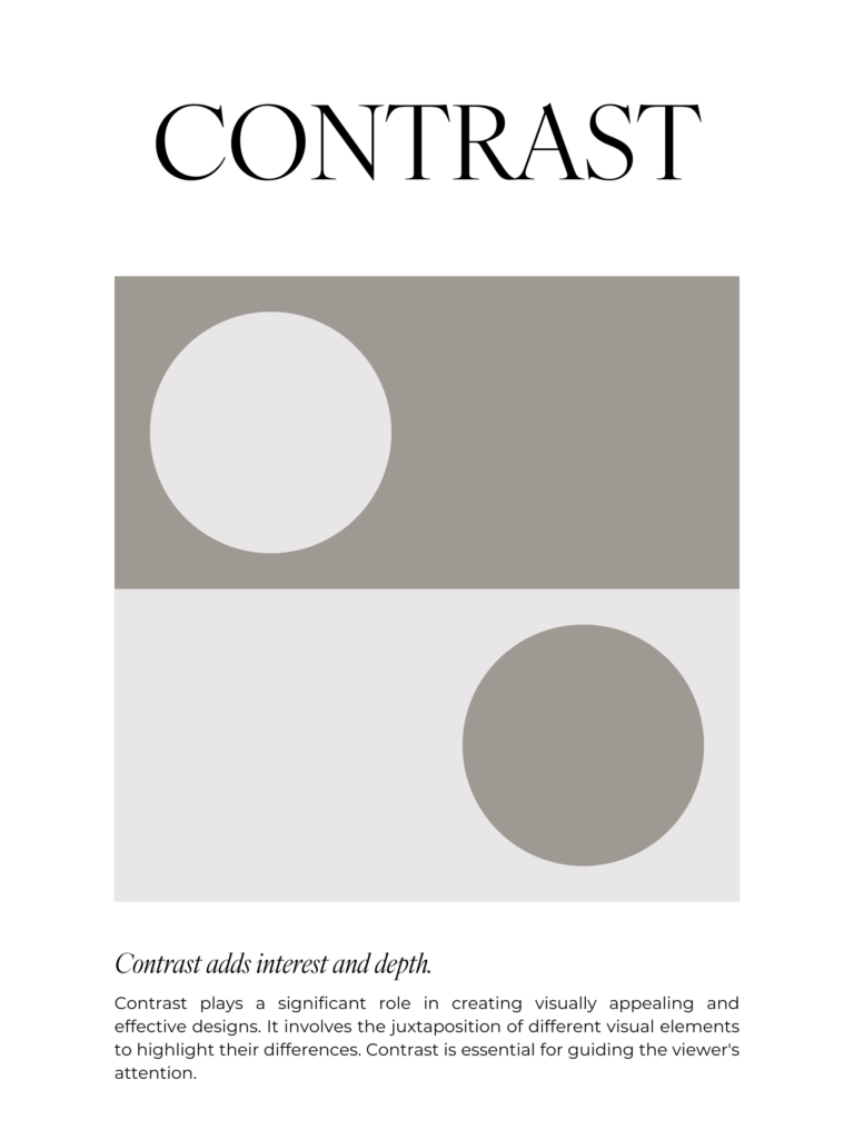
No. 2 / Contrast
Definition: Ever notice how when you’re looking at a website, you read the larger headline text, before you read the smaller, paragraph text? That’s because of contrast. Contrast is about differences. It’s the difference between elements, in relation to one another, that helps the viewer notice what matters.
Types of contrast may include:
- color contrast (light vs dark, like dark text on a light background)
- size contrast (big vs. small, like headline vs. body text)
- weight contrast (bold vs. thin, like bold vs. regular fonts)
- shape contrast (sharp vs soft or solid vs. outline)
Purpose: Contrast helps guide the viewers eye, enhances readability and creates visual interest.
Avoid rookie mistakes like using light text on a light background (use a contrast checker to be sure), or making everything the same size and weight.
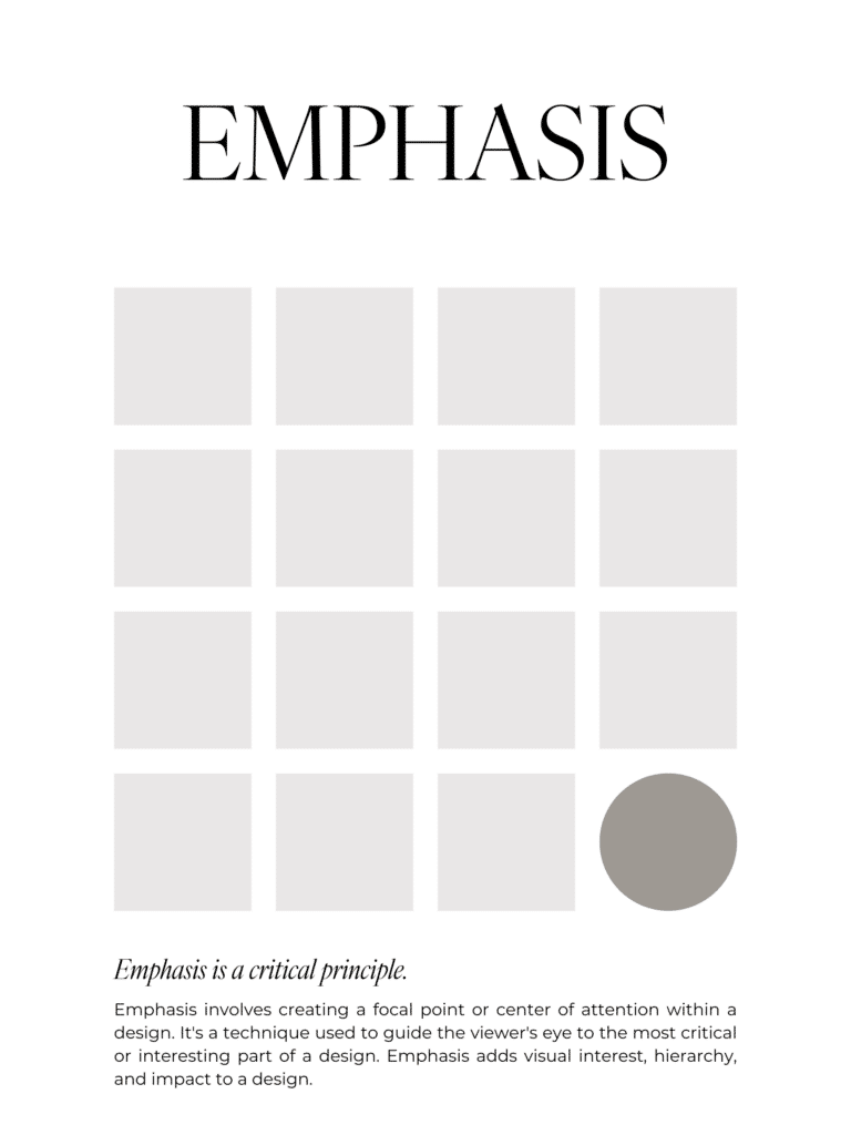
No. 3 / Emphasis
If everything in your design is screaming for attention, none of it is being heard.
Definition: Emphasis answers “what is the main point of this design?”. You can create emphasis to make an element stand out by changing the size (make it bigger), the color (make it bolder or different), or placing it in the center, where the eye naturally lands).
Purpose: Emphasis makes the most important thing in a design, impossible to miss. It’s like the design equivalent of tapping someone on the shoulder and going, “Hey, This part. Right here.” It prevents overwhelm, creates clarity and guide action from your audience.
Understanding the principles of design further enhances your ability to create impactful visuals.
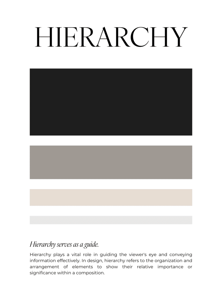
No. 4 / Hierarchy
Definition: Visual hierarchy is the order that the reader’s eyes moves among elements.
Purpose: Your design should answer the following questions: 1. What do they notice first? 2. Then what? 3. What do you want the viewer to do?
Hierarchy is one of the vital principles of design that guides the viewer’s attention seamlessly.
For example, a clear headline is the biggest text, then the supporting sub-headline is medium text and the body copy is the smallest text. Again, CTA buttons should be obvious and easy like the headline, so you can make this stick out with contrasting colors, etc.
The way to keep your hierarchy in check is to give each page one main job, and make the design reflect that. So don’t go making rookie mistakes like making the text all one size, or using 4-5 different font sizes randomly. You need a clear, visual “path” so everything doesn’t compete for attention, and instead, guides your viewers eye to the most important elements.
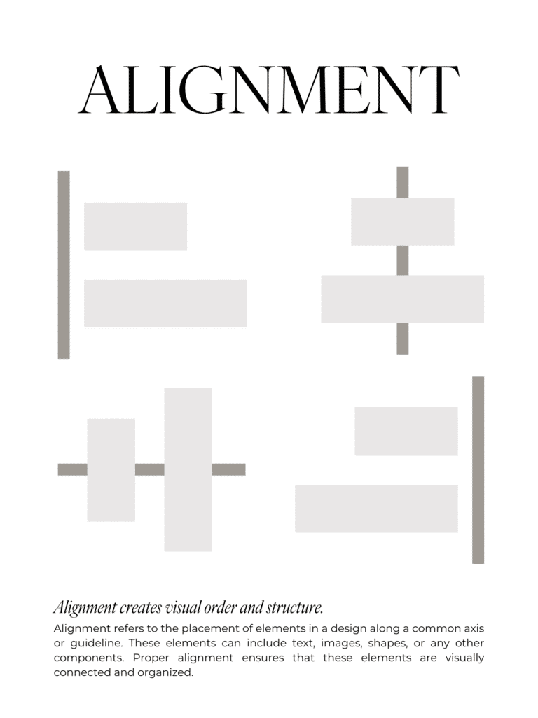
No. 5 / Alignment
Once you learn alignment in design, you can never unsee it. Like the damn frames in my therapist’s office — they are not aligned and that’s all I stare at the whole appointment. Argh!
Definition: Alignment describes how elements line up with one another to create order and connection in design. Elements can be left-aligned, centered, right-aligned or justified. For example, this blog post is left-aligned, like most website copy, because it’s the easiest to read.
Mastering the principles of design can set you apart from others in the field.
Purpose: Alignment makes a design look organized, tidy and intentional. It creates invisible connections. Elements that are not aligned make the layout feel messy.
To use alignment correctly, use the same margins on every page/slide/canvas, so that the elements align. It’s also important to use consistent padding and margins around your content too. Showit has a grid feature (that you can use or remove) that makes aligning elements easier.
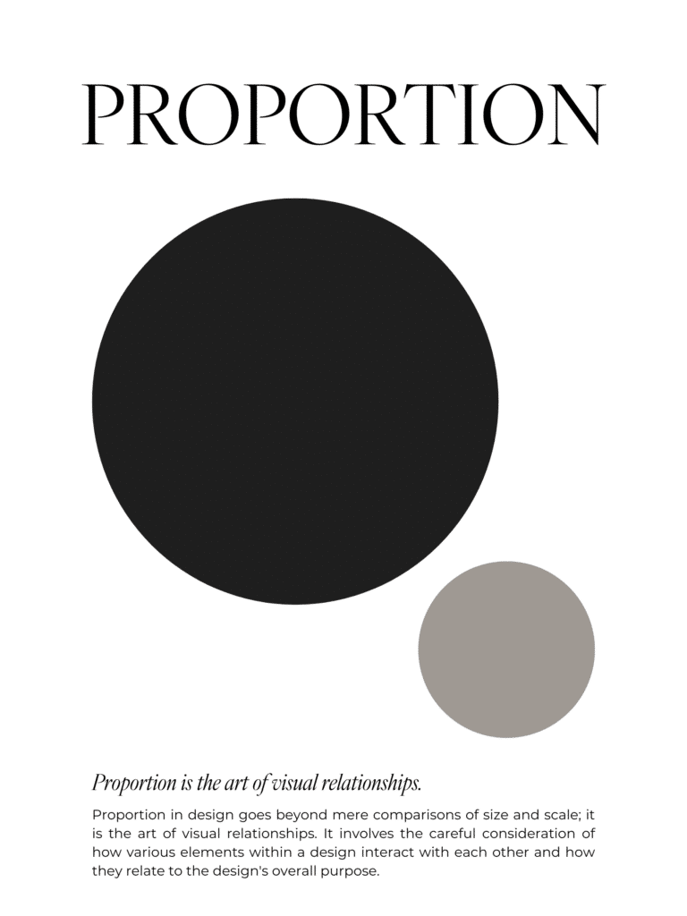
No. 6 / Proportion & Scale
Definition: Proportion is how the sizes of different elements relate to each other. Scale refers to how big or small something is on purpose to draw attention to it (like the dark, large circle in the image below is the one that you see first).
Purpose: The purpose of proportion and scale is to once again to guide the eye to what you want the viewer to pay the most attention to. Make key things bigger and make the supporting elements smaller.
This is another principle that you can use the squint test on. Step back and squint your eyes. What stands out to you first? If it’s not your main message, or image that you want to stand out, adjust the sizes and/or the color.
The key principles of design will guide you in your creative journey, ensuring your designs convey the right message
Incorporating white space as a principle of design gives your content room to breathe and shine.
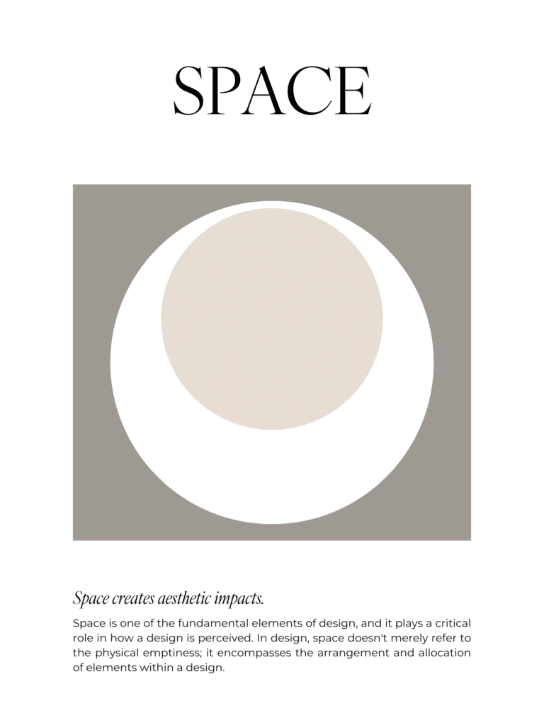
No. 7 / White Space
White space is NOT wasted space. It’s oxygen. It gives design elements space to breathe.
Definition: White space is the empty space around elements. The color doesn’t matter so much, as much as the fact that no other elements exist in the “white” or “negative” space.
Purpose: White space makes a design feel modern and high-end. It helps viewers focus on what actually matters and keeps the layout from being too cluttered. Gross.
Repetition and rhythm, as important principles of design, create a cohesive experience for your audience.
Avoid rookie mistakes by overstuffing anything (slides, pages, graphics, pins, etc.) and not leaving enough padding between sections. I have a “spacer”, which is just a filler of white space, before and after every image in this blog post, so that the text and images are not too crowded. Have you ever stood in line and the person behind you didn’t know the meaning of “personal space”? Gross. Design elements need personal space, the same way humans do.
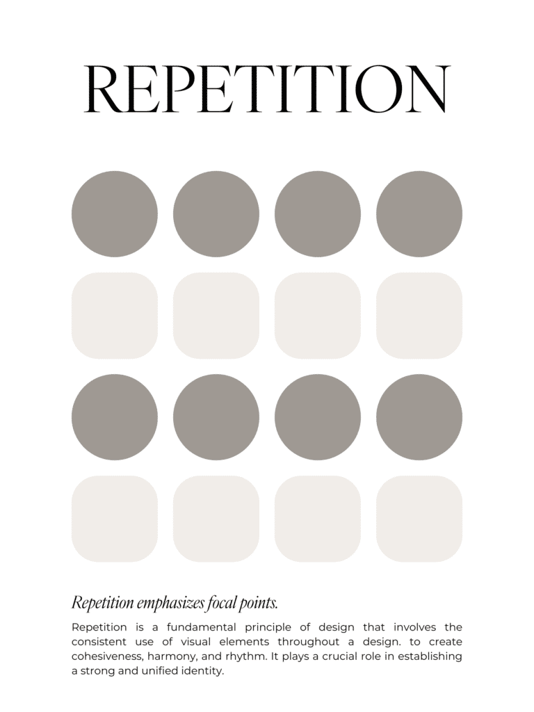
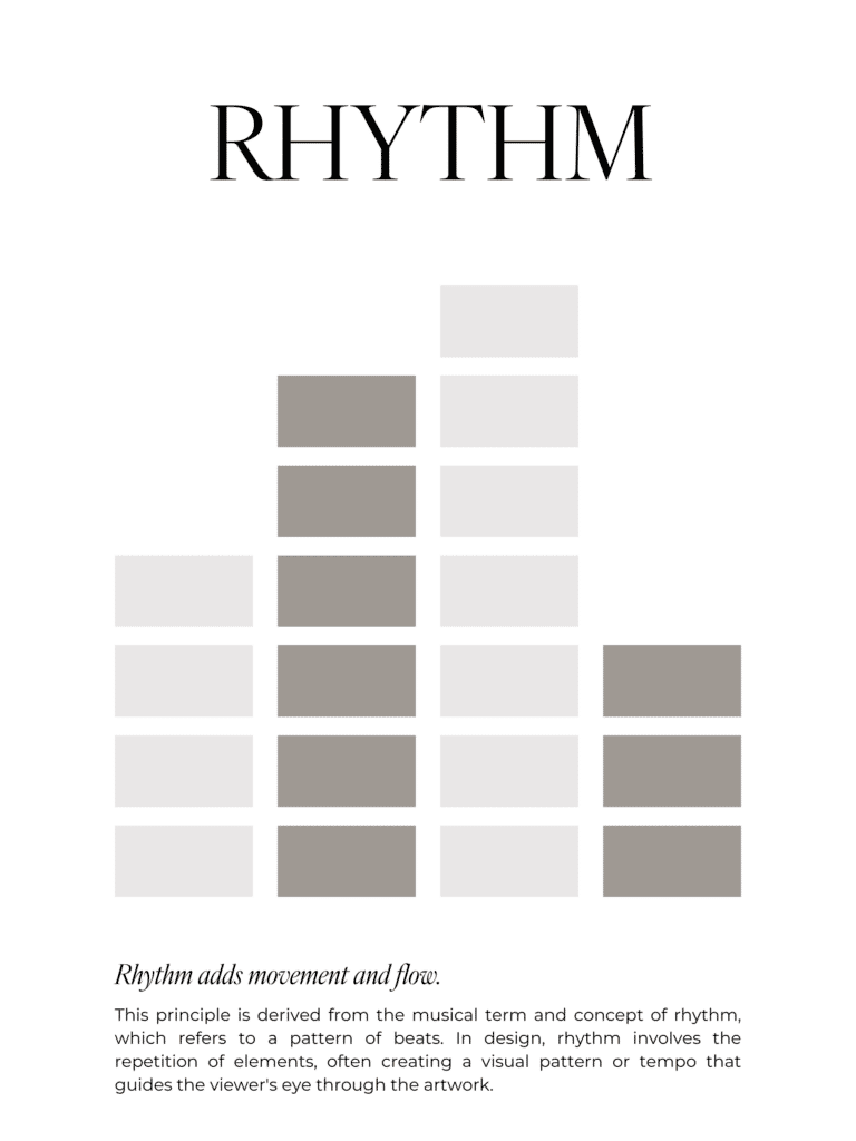
No. 8 / Repetition & Rhythm
Definition: Repetition is reusing the same design elements over again throughout a design (like same colors, fonts, shapes, button styles, etc.). Rhythm is the pattern that creates a “flow” as people move across your content or through your design.
Purpose: Repetition is consistency. And consistency=trust. If your buttons, fonts, and colors change every five seconds, your website or design is going to feel unreliable, even if your content is solid.
Don’t change up fonts or colors, buttons, just because you’re bored (ask me how I know). Decide on your branding “defaults” and reuse them everywhere to build trust with your audience.
Finally, unity and harmony in the principles of design help your work feel complete and well thought out.
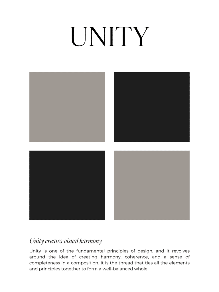
No. 9 / Unity & Harmony
I’m not talking about sitting around the fire and singing kum ba yah. Embracing all the principles of design will elevate your design skills to new heights.
Definition: Unity in design is when all the parts of a design feel like they’re part of the same whole. Harmony is when the elements work together visually and don’t clash.
Purpose: Unity and harmony make a page or design feel cohesive and calm, instead of like you copy and pasted pieces from 6 different mood boards in Canva. Unity helps build trust (cohesive=professional=legit), strengthen brand recognition and reduce the readers mental effort. Harmony keeps the readers attention on the message and makes the design feel polished and “easy”, even if it wasn’t.
Design has unity and harmony if the fonts and colors complement each other, and the layout feels consistent across pages and graphics.
The Principles of Design: How to Fix Common Beginner Mistakes
- Too many fonts: Stick to 2-3 font families, (one for headings, one for body text and one for accent text if you want it).
- Low contrast text: Use dark text on light backgrounds or light text on dark backgrounds. If you make it hard for your audience to read your content, they simply won’t read it.
- Centering EVERYTHING: listen, you can center-align special elements, like quotes, but most body text needs to be left-aligned.
- No white space: Add spacing and padding around text and graphics. Seriously. More space.
- Inconsistent designs: Reuse layouts, colors, and styles that are unique to your brand, in every instance. Repetition is your friend.
The “Fix my Design in 10 Minutes” Checklist
Use this quick and easy checklist to help you figure out what “feels off” in your design:
- Can I tell what matters most in 3 seconds (Hierarchy)
- Does anything stand out? (Contrast)
- Does everything line up cleanly? (Alignment)
- Are styles consistent across the page? (Repetition)
- Does the layout feel stable and even? (Balance)
- Is there enough breathing room (White Space)
- Do my sizes make sense together? (Scale/Proportion)
- Does it all feel like one brand? (Unity)
So, the moral of the story is, design isn’t a mystical gift bestowed to a chosen few. It’s a set of rules. Principles. And the best part? You don’t have to overhaul your entire website to make it work for you. You just need to start noticing what’s happening, and then make small, strategic tweaks. Because when your site is clear, your audience feels safe…they click, they stay, they buy, they come back. Yes, please.

Hey, I’m Sarah Grace— registered nurse turned blogging mentor, mama, and founder of sarahgracevogler.com. As a certified digital marketer and graphic designer, I help aspiring bloggers (just like you!) cut through the overwhelm and turn their passions into profitable online businesses. I’ve been where you are—Googling how to start a blog at 2 a.m., wondering if anyone would ever read my posts—and now I teach others how to do it with clarity, confidence, and heart. Thank you for reading this blog post and make sure to pin it to Pinterest, so you can reference it later.
20
Dec


VIEW THE COMMENTS
This is the 9 Principles of Design: The Ultimate Guide for Beginners