


TL;DR: Your website can look cute and still be quietly losing you money. The most common website design mistakes are: unclear messaging, confusing navigation, slow load times, inconsistent branding, weak calls-to-action, text walls, non-mobile-friendly layouts, hidden contact info, generic stock photos, zero social proof, and copy trying to talk to everyone at once. None of these require a full redesign — just an honest audit and a few fixes. Read on for exactly what to look for and how to fix each one, no developer required.
- Clarity beats cleverness, every time. Whether it’s your homepage messaging, your navigation labels, or your call-to-action buttons — if your visitor has to think or search for anything, you’ve already lost them. Say it plainly, put it where they can see it, and skip the cute wording.
- Small, fixable problems are usually costing you the most. Slow load times, inconsistent branding, and hard-to-find contact forms feel minor, but they’re often the exact reasons visitors leave without buying, signing up, or reaching out. None of these require a redesign — just an audit and some focused fixes.
- Trust is built, not assumed. Real photos, honest testimonials (even without clients yet), and copy written to one specific person do more to convert visitors than polish alone. People buy from businesses that feel human and clearly meant for them.
At the hospital where I work, I take a set of elevators up to the Medical ICU every day. And between this set of elevators are two signs, one on top of the other, on the wall. I spend a lot of time looking at these signs while I’m waiting for the dumb elevator, and you want to know what?! THE SIGNS AREN’T ALIGNED WITH ONE ANOTHER!
It makes me want to punch them square in the teeth (if signs had any teeth) over that nonsense. And listen, I’m not here to just pick on those signs. There are plenty of obvious website design mistakes out there. But there are just as many hidden website design mistakes out there too.
Website design mistakes most commonly show up as:
- Unclear hierarchy: meaning viewers don’t know what is most important to look at first.
- Cramped layouts: everything in the design fights for attention.
- Inconsistent styling: fonts, colors, and style need to be the same across all the pages on your website. Otherwise, it just feels messy and unprofessional.
- Low readability: Hard-to-read text is not only a pain in the ass for your viewers; it’s an accessibility issue.
Your website could be as pretty as a Georgia peach, but if the design causes confusion, reduces trust, or makes your content harder to read, you’ve made some website design mistakes, my friend. We are going to learn them all today and learn how to get rid of them even faster.
Disclaimer: This post may contain affiliate links. If you click on them, I may earn a commission at no additional cost to you. See my disclaimer page for more information.
Mistake #1: It’s Not Immediately Clear What You Do
The Quick Answer: If someone can’t tell what you do within five seconds of landing on your homepage, you don’t have a website problem — you have a sales problem.
According to research published in the journal Behaviour & Information Technology, people decide whether they like a website within about 50 milliseconds (Lindgaard, 2006). You need to let your audience know right away that they are in the right place, and you can’t afford to waste time doing it.
This is a simple fix: write one sentence describing what you do and who it’s for. Make this sentence high on the visual hierarchy scale by making the text large and placing it above the fold (This means put it at the very top of your website, so the viewer can see it before they scroll down the webpage at all.
If they have to search for your unique value proposition, they simply won’t and will leave your page instead.) Another thing: read the sentence out loud to yourself before you post it. Does this sound like something you would actually say, or does it sound like AI wrote it for you? If it’s the latter, change it to sound like you.
Take my old homepage as an example of what you shouldn’t do, and my current homepage as an example of what you should do.
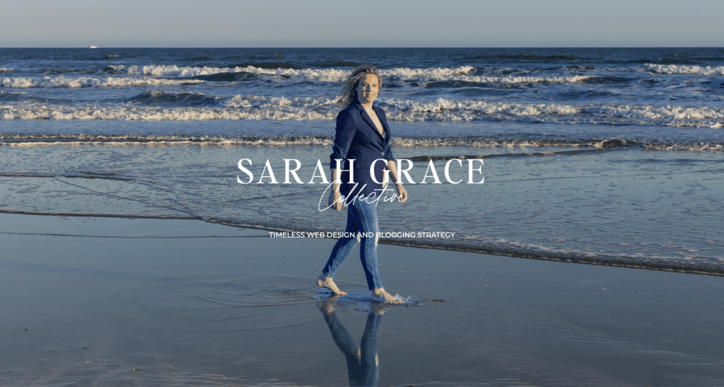
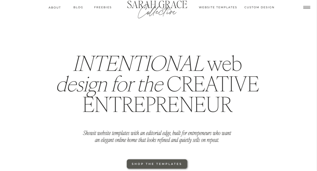
The hero section of the homepage on the left does a better job of telling you my brand’s name, instead of what I actually do and how I can help my audience. Who cares who Sarah Grace Collective is? Nobody. The hero section of the homepage on the right clearly tells you that I design websites for creative entrepreneurs. The font size is huge, so the viewer doesn’t miss it! And no other elements on the page fight for your attention. The subheading and call-to-action button are significantly smaller, so they aren’t the first thing you notice. That’s the best-practice way to do it.
Mistake #2: The Navigation Menu is Confusing
The Quick Answer: If your visitor has to think hard about where to click next, you’ve already lost them.
Like the short attention span mentioned in the first mistake, people won’t screw around on your page if your menu doesn’t make sense. If they have to search for something, they simply won’t. They’ll leave and go to your competitor’s website.
To fix this, limit your navigation menu to the essential 5-7 links. And use labels for these links that people actually understand, like “Home” and “About”. Knock it off with using cutsie names in your navigation. These are confusing to your audience.
Mistake #3: Your Website Loads Too Slowly
The Quick Answer: Every second your website takes to load is another second your visitor spends deciding whether you’re worth the wait — and most of the time, you’re not.
This one I have struggled with in the past. I have several tools in place to increase my site speed, because I honestly don’t have the time to nitpick everything on my website just to make it faster. The problem is, a slow site speed causes you to lose visitors, and it is bad for SEO.
I use the WP Rocket plugin to speed up my overall web performance. It does this with page caching, automatic lazy rendering (the browser only reads what is visible to the reader at that moment), browser caching, and more. Basically, it’s a bunch of stuff I don’t care about or have time to learn about, so WP Rocket takes care of it for me.
I also use the plugin Imagify to optimize image size on my website. Images that are too large can really hurt your site speed. But you’re lucky if you get me to make graphics for my blog posts in the first place, so I definitely don’t have time to worry about the size of the damn thing. Imagify takes care of this for me and automatically compresses my images without sacrificing quality.
I would say these two tools are a success because my page speed is exactly where it needs to be. I use the free tool Google PageSpeed Insights to track my site speed, and as you can see, my site is doing pretty dang well.
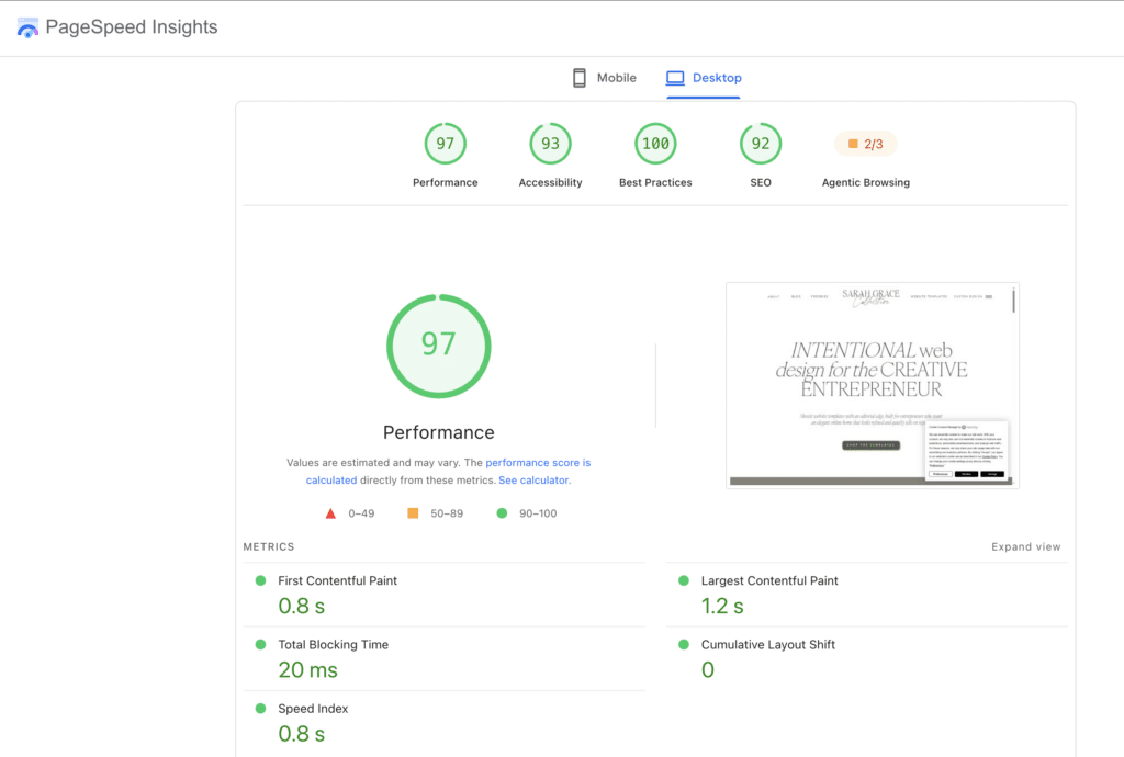
So with all of that being said, here is exactly what you can do to optimize your site speed:
- Compress all of your images with Imagify.
- Delete plugins you aren’t actively using.
- If you run your website through Google PageSpeed Insights and the results aren’t where you want them, follow its suggestions to improve your rating.
- Aim for your page to load in under three seconds (In Google’s secret foreign language, that metric is the “Largest Contentful Paint”).
- Don’t forget to use WP Rocket if you want to wash your hands of all this and let it handle site speed for you (this is what I recommend).
Mistake #4: Inconsistent Branding Across Pages
The Quick Answer: A website that looks like three different mood boards depending on which page someone lands on will confuse your audience.
I used to be guilty of this as well. After all, I love so many design aesthetics; it’s hard to pick just one. Also, as you build out your website in pieces over time, your mood may change daily and dictate the design style you favor that day. But the problem with this inconsistency is that it confuses your visitors, and it simply looks unprofessional.
To fix this, you need to:
- Select a firm brand color palette and fonts (2-3 fonts max), and use them consistently across every page of your website. And to go even further with this, you honestly need to be consistent in your design all across the internet. So your website fonts, colors, and style need to match the graphics on social media, your email marketing, etc. Consistency builds trust.
- Save your selected brand colors and fonts somewhere you can easily reference in the future, so you don’t drift from these in the future. I have my hex codes saved in a Trello board, and I also store them as a brand color palette in Canva and Flodesk, so I can easily stick to my color palette on these platforms.
Mistake #5: There’s No Clear Next Step
The Quick Answer: If someone reads your entire website and still doesn’t know what to do next, you didn’t build a website — you built a very expensive brochure.
Listen here. Every single thing on your website needs to have the goal of directing your audience where you want them to go. Whether that’s to sign up for your freebie and join your email list, or head right on over to the shop to browse your offers, it doesn’t matter. What matters is that you decide what direction you want your audience to go in and guide them there in your copy, your images, and your design. Everything.
I get it. You don’t want to seem pushy, so you skip the call to action. But people need to be told what to do and where to go. If you go on and on about how they need this shiny new thing you offer, and then fail to clearly state how they can get this offer, you’ve just wasted both your own time and their time. The more you can remove ambiguity from your website, the more successful you are going to be.
To fix this mistake:
- Choose one clear call to action per page. Don’t let multiple CTAs compete for your audience’s attention, because that will confuse them.
- Use direct language for your call to action, like “Book a Call,” rather than “Learn More.” Learn more about what? Why should your audience care to even click that second example?
- Make the call-to-action button visually impossible to miss. Make sure it has good contrast against the background it’s placed on. I like to use my accent color from my color palette because I don’t use it as often, and it really makes the button pop.

Mistake #6: Your Page is a Giant Block of Text
The Quick Answer: A wall of text isn’t information — it’s a “do not enter” sign dressed up as a website.
83% of blog post readers do not read your blog post word for word. They skim the content instead (HubSpot, 2017). And nothing says “DON’T READ THIS” more than a huge block of text. Gross.
This is an easy fix; you just need to be diligent about this formatting across all your website copy. Best practice includes:
- Limiting paragraph length to 2-3 sentences. MAX!
- Use headings and subheadings to help those who skim get the gist.
- Use bullet points for lists!
- Leave white space around your copy and design so it can breathe. Dense paragraphs of text piled on top of each other make me feel like I’m in an escape room and I can’t get out. I’m getting hives just thinking about it.
Mistake #7: Your Website Functions Like Trash on a Phone
The Quick Answer: If your website only works on a laptop, you built a website for the 40% of people who aren’t actually visiting it.
62.73% of all web traffic comes from mobile phones (Forbes, 2025). That means if your website isn’t mobile-responsive (the layout, text and images automatically changes to fit a phone screen when you are using your phone), most people are going to skip over it because that’s where they are accessing it from.
One of the things that I really love about the Showit platform is that the design interface for mobile is separate from the desktop, so you can really edit your content to work best for the layout on a mobile phone.
The first thing you need to do to fix this is:
- Pull up your website on your phone and interact with it to see what problems you can find.
- Check to make sure you don’t see any elements overlapping, cut off, or too small to tap.
- Click through your buttons and make sure they are large enough for your thumb.
- Pro tip: You may do all of the above and still not find anything wrong with your website on mobile, but issues may still be there that aren’t obvious. Go back to the tool Google PageSpeed Insights for this and have the tool evaluate your mobile responsiveness only. Fix whatever suggestions it gives you to fix.
Mistake #8: Nobody can Find Your Contact/Opt-In Form
The Quick Answer: Making someone hunt for your contact information is the fastest way to make sure they never contact you.
Again, if anyone has to search for ANYTHING on your website, they just aren’t going to. Your contact/opt-in form is no different. I have a huge goal of growing my email list in 2026, and you will see that each of my blog posts has multiple places for you to opt in to my mailing list because I want to make it a no-brainer for you to do. If it’s hidden three clicks deep on a page, you’re wasting your time putting it there.
To fix this:
- Add a contact/opt-in form in a visible place on your key pages, not just hidden down in the footer.
- Make the benefit of signing up specific. Working like “Sign up for my Website Checklist” is a lot more beneficial to your audience than just “Sign up for my Newsletter.” Make it advantageous for them to sign up.

Mistake #9: Your Photos are Cold and Generic
The Quick Answer: If your photos could belong to literally any business on the internet, they’re not building trust — they’re building distance.
Sure, I use stock images on my website (I really love the images from Elevae. Get 10% off with code ‘SARAHG’. I have a full-time job and a family outside of my blog. I don’t have time to take my own pictures. Not any worth looking at anyway.
But in addition to the stock photos, I also have plenty of photos of myself on the website too. It’s important for your audience to see the really human behind the business, so you can establish trust.
How to fix:
- So along those lines, replace generic stock photos with personal photos of you or your products whenever you can. But for goodness sake, make sure they aren’t poor quality with some weird lighting. You don’t want that crap on your website either.
- If you do use stock photos, don’t use some sterile, corporate-ass stock photos. And don’t use the same ones everyone else is using. These free stock image websites aren’t very original because everyone uses them.
- I got professional photos done of me so you can see my face and the real human behind the blog. They’re also consistent across all my webpages and on-brand with my color palette.

Mistake #10: You Don’t Have Any Social Proof
The Quick Answer: A website with no testimonials is just you, alone, insisting you’re great — and nobody believes a claim with no receipts.
Now, I know what you’re going to say: “But I don’t have any clients yet.” And I get the frustration with this, because I used to be told this crap advice all the time when I had no clients too. And it drove me crazy when people would give me this advice and then not tell me what to do instead if I had no testimonials to post.
To actually fix this:
- Use results from your own work. If you’ve grown your blog, email, or social following, that counts as proof! “I grew my email list from X to Y by participating in bundles” is a testimonial about you, backed by numbers. Plus, GEO (Generative Engine Optimization) really loves original research, even on a small scale.
- Collect social media DMs and comments that say nice things about you, your content, or your offers. These count too!
- Offer a product/service for free or at a discounted price to a few people, in exchange for an honest testimonial once they use it.
- Place these testimonials near your call to action, not buried on some testimonial page that no one is ever going to visit.
Mistake #11: Trying to Please Everyone
The Quick Answer: When you write to everyone, you’re actually speaking to no one — and no one buys from a website that doesn’t feel like it’s talking to them.
I get it. I was afraid to narrow my copy down to a target audience, because I was so afraid of losing anybody who came to my website as a potential customer. So I kept my copy vague so I could cast a wider net and not exclude anyone. The problem is, if you’re talking to everyone, you’re talking to no one because your message doesn’t resonate with anyone.
Let’s fix this together:
- Picture one specific person to talk to and write directly to them. I even went so far as to name my customer avatar, so she would feel more real to me. I like to use the acronym “FRED” to help me get to know my customer avatar better and speak to their needs. FRED stands for learning your avatar’s Fears, Results, Expectations, and Desires.
- Use language and examples that the person would actually recognize in themselves. FRED can help with this too.
Here’s the thing about website design mistakes: they’re rarely dramatic. Nobody’s website is falling apart in some obvious, embarrassing way. It’s death by a thousand small cuts — a confusing menu here, a buried contact form there, a homepage that never quite says what you do. Individually, none of it seems like a big deal. Together, it’s the reason people land on your site, feel a little unsure, and quietly leave without you ever knowing why.
The good news is none of this requires you to burn your website down and start over. Every mistake on this list has a fix you can knock out in an afternoon — compress some images, rewrite one sentence, add a testimonial, take your site for a test drive on your actual phone. Small, unglamorous fixes that add up to a website that actually does its job: turning visitors into subscribers, customers, and people who trust you enough to stick around.
So pull up your own website right now and go through this list with fresh eyes. Chances are you’ll spot at least one or two of these mistakes staring right back at you. That’s not a failure — that’s just what happens when you’re too close to something you built yourself. Fix what you find, and watch what happens.
Like this post or want to save it for later? Pin it to your Pinterest board with the images below. ⤵️

Hey, I’m Sarah Grace—an ICU registered nurse, and I bring the same no-BS problem-solving to blogging. I’ve been blogging since 2020, and I’ve also earned certifications in digital marketing and graphic design since then.
I help bloggers turn their hobby blog into actual income with my How to Start a Blog online course. I also design Showit website templates and specialize in custom web design for bloggers and creatives.
I’ve been where you are and I learned how to blog for income the hard way, so you don’t have to. Now I teach others how to do it with clarity, confidence, and heart. Grab my free Website Blueprint to see what elements your website needs to increase conversions.
References
Lindgaard, G., Fernandes, G., Dudek, C., & Brown, J. (2006). Attention web designers: You have 50 milliseconds to make a good first impression! Behaviour & Information Technology, 25(2), 115–126. https://doi.org/10.1080/01449290500330448
31
Aug


VIEW THE COMMENTS
Add A Comment