


Color trends in 2025 were marked by desires for simplicity and comfort in a high-tech, fast-paced world. This resulted in a trend towards warmer neutral colors that offered cozy comfort. This blog post explores 11 emerging color palette trends that will influence design, branding and web design in 2026. Color trends in 2026 will be moving towards more personal, authentic and expressive palettes, with moody, rich colors. The color marketing manager at Sherwin-Williams, Emily Kantz, says “this year’s color forecast encourages individuals to more beyond trend-following and instead embrace colors that reflect who they are-culturally, emotionally and aesthetically” (Veranda, 2025).
2026 color trends are a return to real. People are craving colors that feel human and emotionally honest. It’s where grounded luxury meets gentle optimism. Designs with these shades whisper, instead of shouting-which is exactly what we need in an overstimulated, overworked and overconnected world. These 2026 colors and palettes feel more timeless and can grow with the consumer as they change and age. They will likely all have an impact on web design color palettes in 2026, so pin this article for later to reference it again.
Disclaimer: This post may contain affiliate links. If you click on them, I may earn a commission, at no additional cost to you. See my disclaimer page for more information.
Table of Contents
Prefer to watch? Check out my YouTube Video Here:
Emerging Color Palette Trends for 2026
Reddish Browns
Reddish Browns are definitely making an appearance in 2026. These trending chestnuts and auburn browns give off an air of sophistication, but also offer warmth and trust, preventing them from feeling too heavy. Think like heat-kissed earth or terracotta with red undertones. The reddish browns make design feel handcrafted, and deliver signals of quality, that consumers want in a wobbly economy. Marketers can use these hues as a trust-anchor for brands.
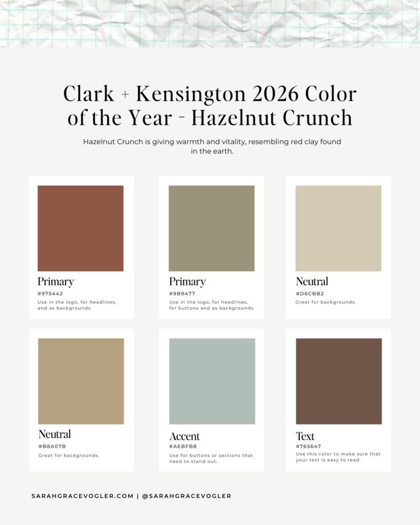
01. Clark + Kensington: Hazelnut Crunch
Mood: comforting, artisanal, earthy luxury
The Clark + Kensington Color of The Year in 2026 is Hazelnut Crunch. Hazelnut Crunch is all about comfort and earth luxury. The red-browns in this palette give off warmth, security and connection, while the muted aqua accent modernizes the palette with feelings of trust and restoration. You can expect this palette in kitchen design, packaging, and cozy, luxury brands.
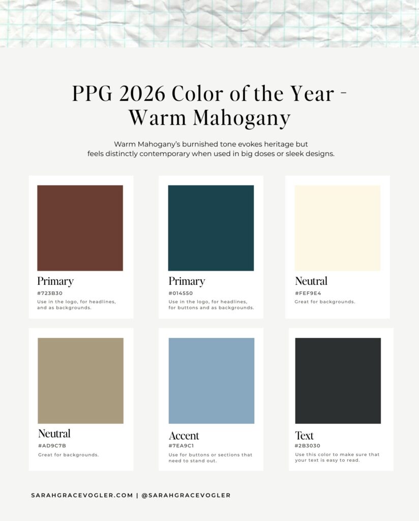
02. PPG/Glidden: Warm Mahogany
Mood: heritage meets modern minimalism
The PPG/Glidden Color of The Year in 2026 is Warm Mahogany. The strength and craftsmanship that mahogany exudes is why this color is best to convey durability and emotional warmth. The shades of teal keep this palette innovative, symbolizing renewal and intelligence. I expect you’ll see this color palette in dark wood interiors, fashion branding and elegant editorial layouts.
Nature-Inspired Greens
Nature-Inspired Greens will also be present in the 2026 color landscape, and I don’t just mean everything is going to be sage. In fact, the sage trends are going to fade away and be replaced with more complex and dimensional greens. Think mossy, sea-glass, teal-green shades, instead. Green colors give off a feeling of recovery, growth and health, making them the best brand colors for those that want to convey restoration and renewal. These shades can position products as being “fit for the future”, without being cold and techy. In branding, you’ll likely see these 2026 shades of green in wellness niches, outdoor niches, finance and sustainability.
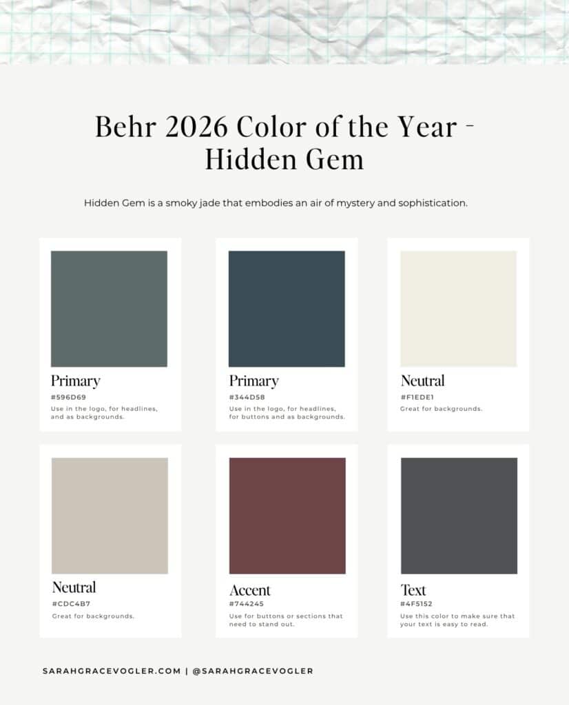
03. Behr: Hidden Gem
Mood: mysterious, elevated and introspective
The Behr Color of The Year for 2026 is Hidden Gem. This jade green is giving wisdom and renewal. The plum red accent color helps this palette to evoke creativity and depth. This whole color palette just gives off the feeling of emotional richness. Doesn’t it look like a Zen garden!? It would be perfect for luxury interiors, wellness brands, and AI-driven tech aesthetics.
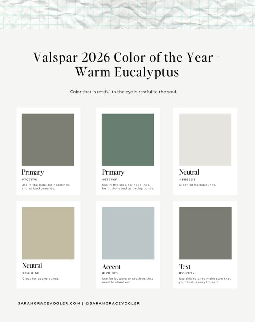
04. Valspar: Warm Eucalyptus
Mood: organic tranquility and renewal
The Valspar Color of The Year for 2026 is Warm Eucalyptus. When I think of eucalyptus, I think about when people hang it from their shower head (the nurse in me just has to tell you that doing this can reduce inflammation, improve respiratory health, and boost energy levels (Silva et al., 2003). Anyway, I digress.) This green is a nod to the biophilic trend for wellness, health and mindful design. I expect these colors to be popular in wellness, clean beauty and homes that want to channel simplicity.
Sunshine Yellows
Sunshine Yellow color palettes pull their inspiration directly from the French village, and its warm stone architecture. Yellows give off feelings of friendliness, fresh starts and intelligence. These shades are showing up in interiors as creamy, buttery walls for sun-washed elegance. Fashion editors are styling these yellows against bold blues for Spring 2026. And branding design for education, lifestyle, and boutique customer-packaged goods will likely be seen with this 2026 color trend.
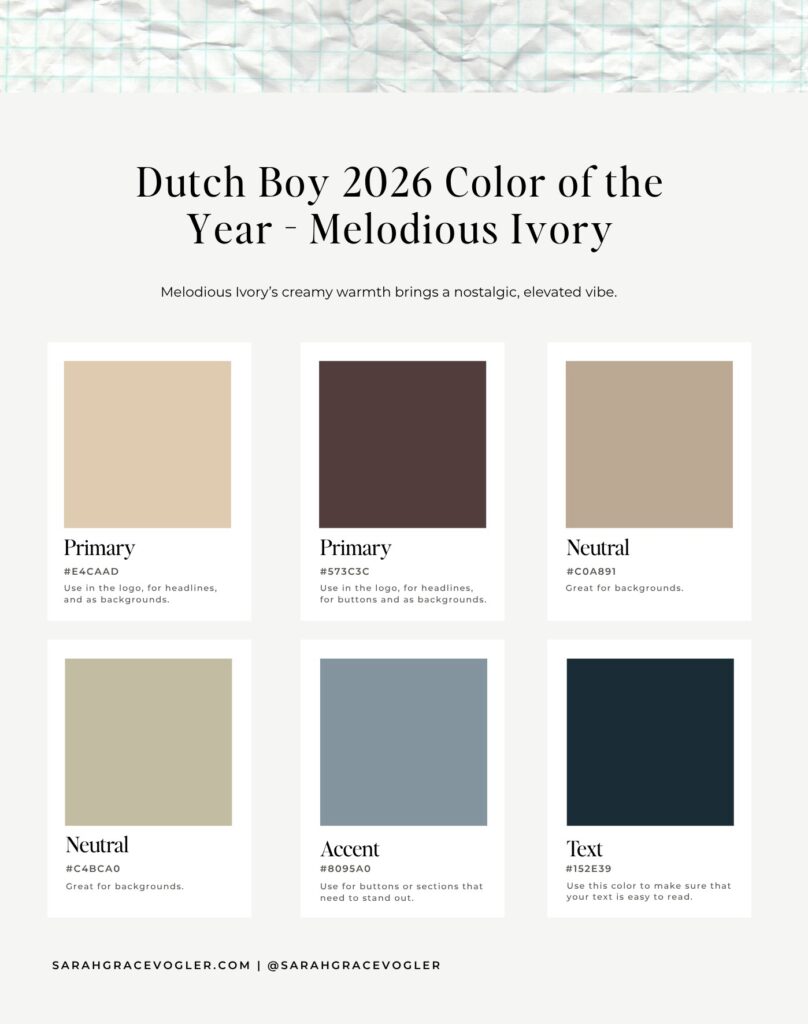
05. Dutch Boy: Melodious Ivory
Mood: warm nostalgia with modern grace
Dutch Boy’s Color of the Year 2026 is Melodious Ivory. The ivory is giving comfort and dependability, while the plum and mauve shades exude confidence. The blue accent shade cools this whole palette down, evoking a sense of vintage meets modern effect. Together, this dream team color palette gives off “calm, capable and creative” vibes (and that’s exactly the kind of business you want helping you brand your website, right?). Home decor, boutique studios and brands that focus on heritage/storytelling aesthetics would be the ideal creatives to utilize this color palette in their designs.
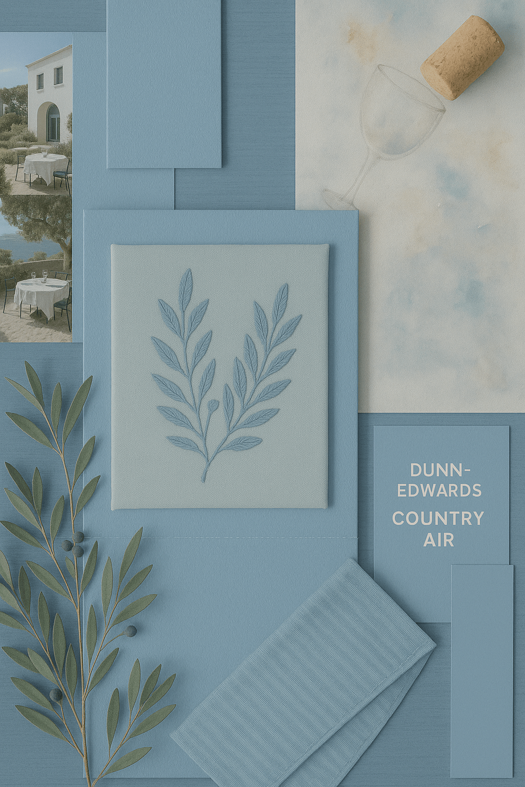
06. Dunn-Edwards: Country Air
Mood: nostalgic serenity and rural optimism
The Dunn-Edwards Color of the Year 2026 is Country Air. Although this shade is a soft blue (known to bring mental clarity and calm), it is paired with buttery neutrals, so that’s why I put it in the yellow color palette section. These yellow shades give feelings of contentment and slower living. Finally, the red gives human connection to ground the whole palette. Industries that may utilize this color palette may be lifestyle photography, wellness branding and chic interiors (think cottage vibes).

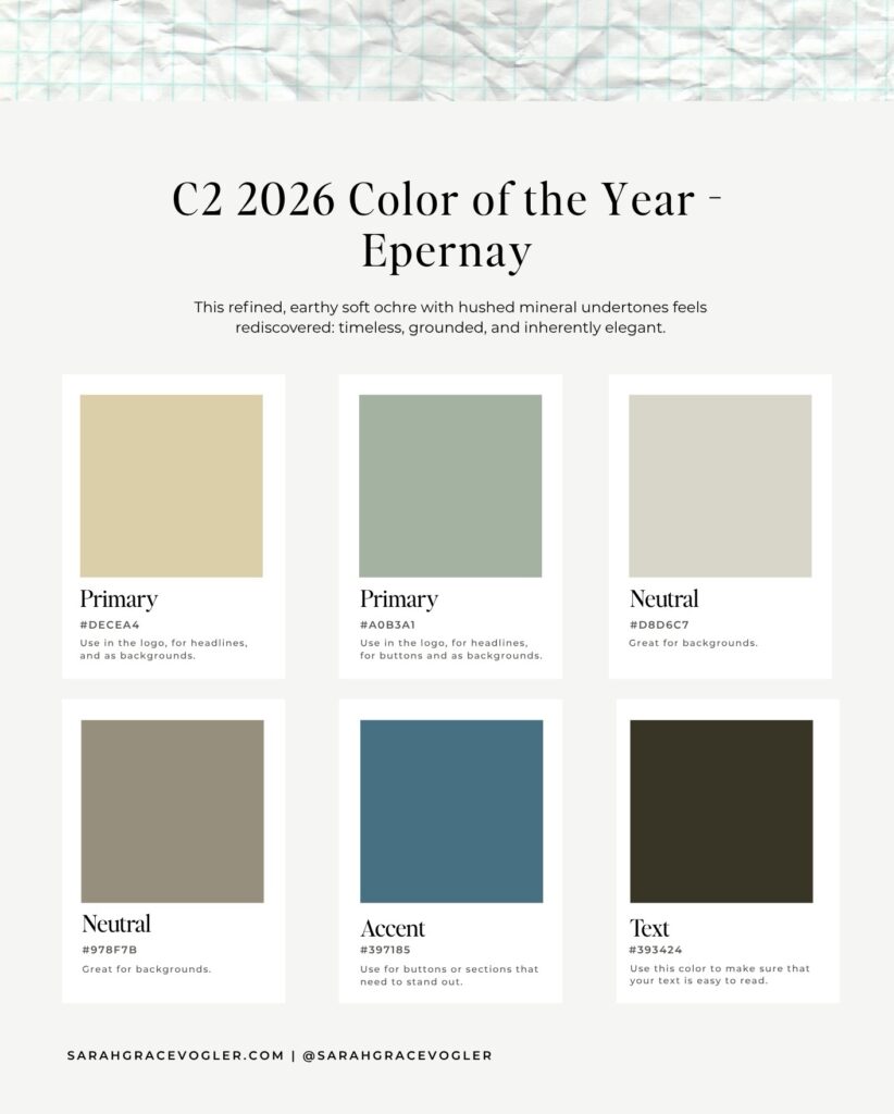
07. C2: Epernay
Mood: grounded, timeless and effortlessly elegant
The C2 Color of the Year 2026 is Epernay. Yellow ochres (um, what?! An ochre is an earthy pigment that contains iron oxide, giving it a yellow, brown appearance. Epernay is a yellow ochre.) are known for giving optimism and nostalgia. The green in this palette restores emotional balance, while the blue adds depth. All together, this palette is giving calm prosperity and French refinement. Theses shades would be ideal to use in hospitality, artisan brands and lifestyle products like textiles, ceramics and travel storytelling.
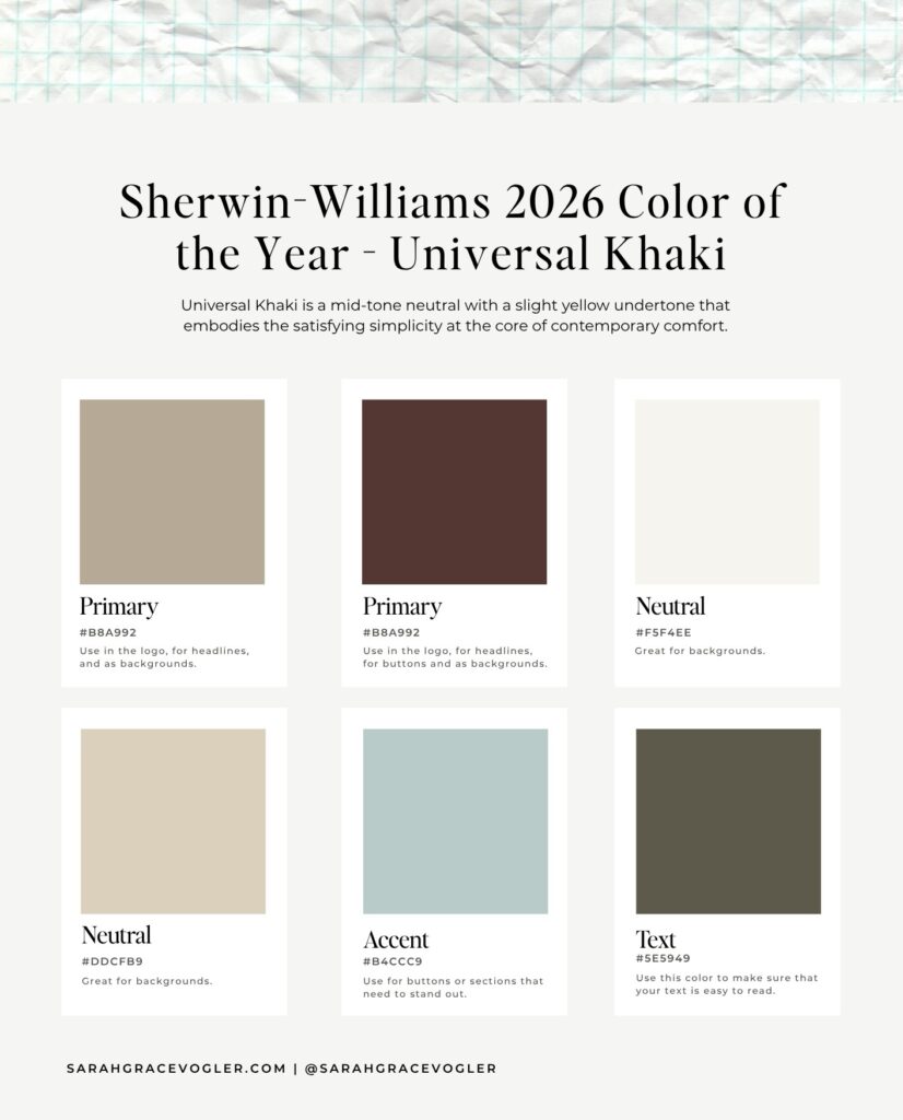
08. Sherwin-Williams: Universal Khaki
Mood: cozy neutrality with modern versatility
The Sherwin-Williams Color of the Year 2026 is Universal Khaki. This khaki shade promotes ease, comfort and adaptability, while the muted aqua accent brings connection and calm. Chestnut brown gives this complete palette a feeling of understated sophistication. This palette is it. It’s the new neutral. You’re likely to see this everywhere from interiors to brand identities that want timeless credibility.
Sophisticated Purples
Not to be dramatic, but the sophisticated purples might be THE silent power move of 2026. While purples are known for their symbolism of wisdom, intuition and higher thinking, the purples in 2026 go beyond that. These shades are moody, complex and emotionally intelligent violets that are less “look at me”, and more “meaningful success”. You can expect to see them in boutique beauty and wellness packaging, and digital branding for creatives and consultants. These purples may even replace traditional black for luxury products, as they give more warmth and less severity.
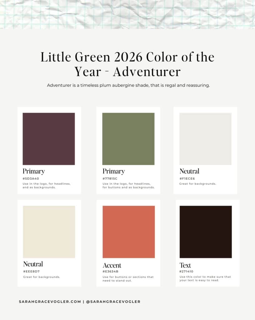
09. Little Green: Adventurer
Mood: reassuring, grounded, bold tradition
The Little Green Color of the Year 2026 is Adventurer. This shade defines 2026’s appetite for earthy sophistication. The aubergine is giving wisdom and creativity, and the coral accent sparks motivation and connection. This whole palette oozes refined heritage. Look for it in boutique hotels, brand refreshes for established labels, and fall fashion in 2026.
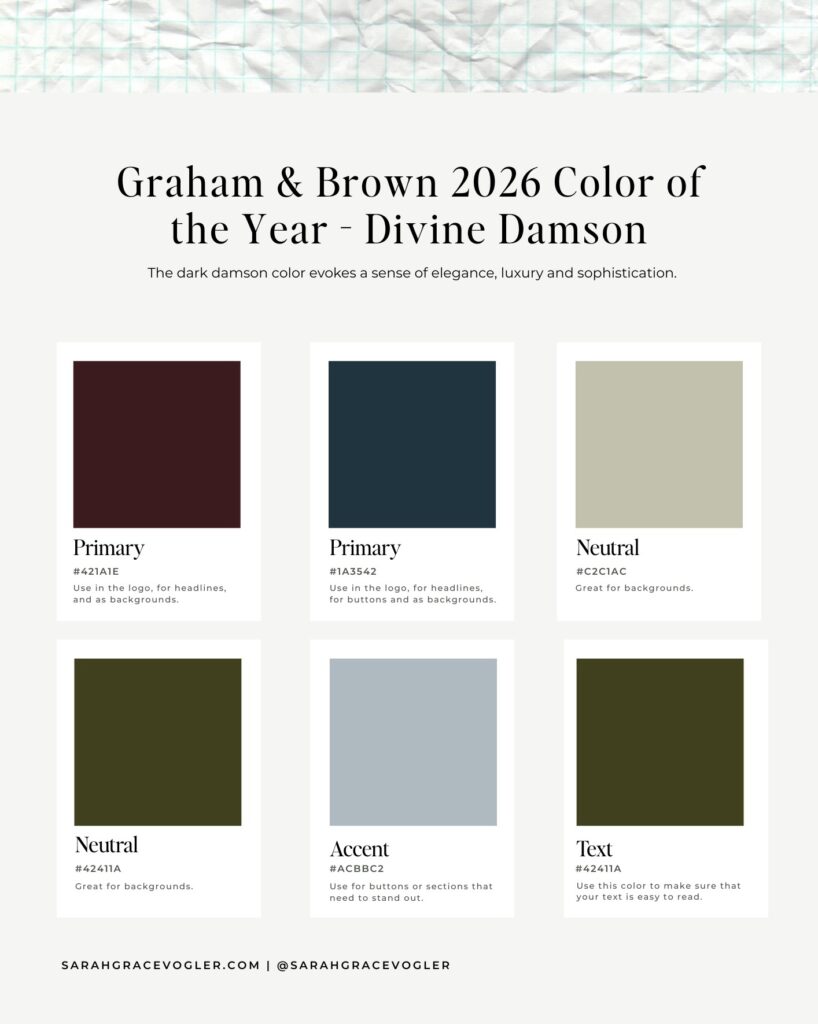
10. Graham & Brown: Divine Damson
Mood: luxe, introspective, and romantic
Graham & Brown’s Color of the Year 2026 is Divine Damson. This emerging color palette trend is anchored in deep plum and damson-a moody, red-infused purple shade that symbolizes power, luxury, and mystery. Purple tones like this one carry feelings of creative confidence and sophistication with it. It also evokes the feeling of regality without being too flashy. The complementary muted blue and olive shades bring peace and balance to this color palette. This pallete would be perfect to brands and boutiques that want to exude quiet luxury (like wine labels, moody websites, and velvet textures).
11. Pantone: [To Be Determined]
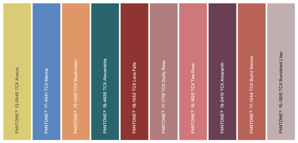
Although Pantone has not yet released its Color of the Year 2026, it has released its color trend reports for Spring/Summer 2026 Fashion Week. The New York Fashion Week trends feature the Pantone shades Acacia, Marina, Muskmelon, Alexandrite, Lava Falls, Dusty Rose, Tea Rose, Amaranth, Burnt Sienna, and Burnished Lilac. They are right on target with 2026’s obsession with emotional connection and sensory balance. These shades feel emotional, sun-warmed, and alive. Let’s look at the themes and color psychology for this bright color palette.
The browns in Lava Falls and Burnt Sienna symbolize stability and the return to being ‘real’, after years of digital overload. The soft floral shades like Dusty Rose, Tea Rose, and Burnished Lilac all feel warm and intimate. They would be perfect for brands in 2026 that want to feel inviting, yet sophisticated. The optimistic shades Acacia and Muskmelon bring playfulness and vitality to 2026, giving energy to minimalistic aesthetics. And the deep jewel anchors Alexandrite and Amaranth add a layer of depth and luxury for branding that is elevated calm.
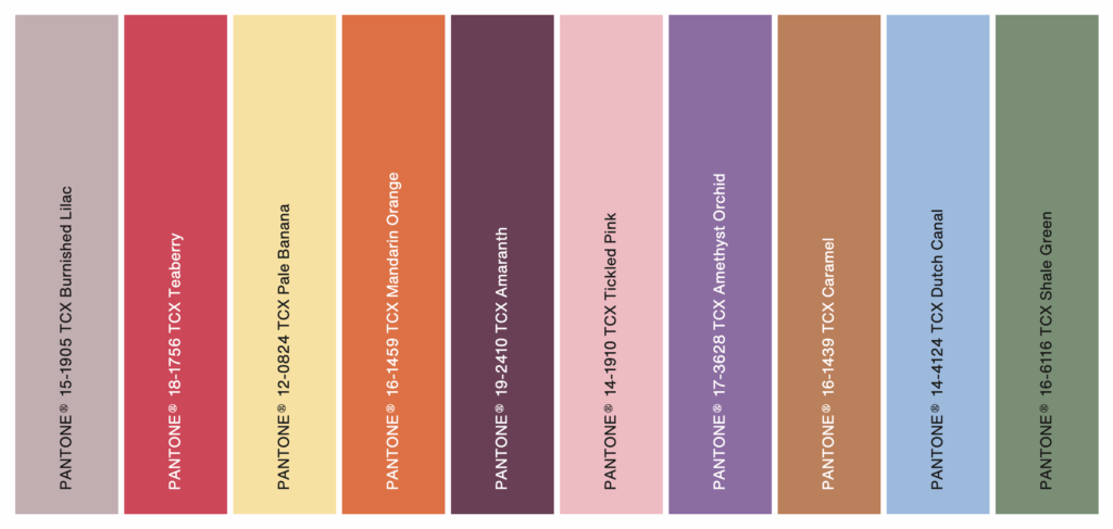
The London Fashion Week trends feature the shades Burnished Lilac, Teaberry, Pale Banana, Mandarin Orange, Amaranth, Tickled Pink, Amethyst Orchid, Caramel, Dutch Canal, and Shale Green. This color palette differs from New York’s, in that it exudes soft modern maximalism. These shades are more digitally friendly, but are still emotionally warm.
The nostalgic pastels like Tickled Pink, Pale Banana and Amethyst Orchid are a reflection of self-expression and individuality wrapped in serenity. Doesn’t that just sound like something you want to envelop yourself in? The muted brights like Teaberry and Mandarin Orange give life and spontaneity to digital spaces and editorial visuals. Balancing Neutrals like Caramel, Shale Green and Burnished Lilac create a bridge between technology and nature, bringing serenity to chaos. The cool respite shade Dutch Canal is a reminder of mental clarity, simplicity and calm living.
Color is one of the most important elements of design, because different colors evoke different emotions and feelings. And that’s what we are after isn’t it? To create an emotional connection with our audience? Yes!
What do you want our overall brand to convey? It’s important to research color psychology, and to match colors with your business goals. Will you try one of these brand palettes out in your web design or branding in 2026? If you do, drop a link in the comments. I would love to see what you come up with.
References
Silva, J., Abebe, W., Sousa, S. M., Duarte, V. G., Machado, M. I. L., & Matos, F. J. A. (2003). Analgesic and anti-inflammatory effects of essential oils of Eucalyptus. Journal of Ethnopharmacology, 89(2-3), 277-283. https://doi.org/10.1016/j.jep.2003.09.007
Hey, I’m Sarah Grace— registered nurse turned blogging mentor, mama, and founder of sarahgracevogler.com. As a certified digital marketer and graphic designer, I help aspiring bloggers (just like you!) cut through the overwhelm and turn their passions into profitable online businesses. I’ve been where you are—Googling how to start a blog at 2 a.m., wondering if anyone would ever read my posts—and now I teach others how to do it with clarity, confidence, and heart. Thank you for reading this blog post and make sure to pin it to Pinterest, so you can reference it later.
04
Oct


VIEW THE COMMENTS
11 Emerging Color Palette Trends You Need in 2026