


Before someone reads a single word on your site, their brain is already making snap judgments based on what they see. High-end or… deeply unfortunate. And most of that decision? Happens because of color.
The problem is most people choose brand colors like they’re picking throw pillows. “I like this one.” “This is trending.” “This matches my vibe today.” And then they wonder why their website looks pretty but doesn’t convert.
Color isn’t decoration. It’s communication. It sets the tone, shapes perception, and quietly tells your audience whether they’re in the right place or not.
In this post, we’re breaking down the psychology of color in branding and how to actually use it on your website in a way that feels intentional, strategic, and aligned with your audience.
Disclaimer: This post may contain affiliate links. If you click on them, I may earn a commission, at no additional cost to you. See my disclaimer page for more information.
What is the Psychology of Color in Branding?
Color psychology is the study of how color influences human behavior, decisions and emotions. In marketing, color can impact how buyers perceive your brand and products, so it’s important to pick the colors that align with your business’s goals and target audience.
Color is processed at a speed of 70-100 msec by our brain, faster than
Table of Contents
The Science Behind Color Perception
Now just settle down. If science makes your eyes glaze over, stick with me here, it will be over soon. Perceived colors can be defined on a three-dimensional space of hue, saturation and brightness (Jonauskaite & Mohr, 2025). Hue is the actual color itself, it’s basically the name of the color. Saturation is how intense or vivid the color looks. High saturation means the color is bold, bright and rich in color. Low saturation means the color is muted, dusty, and grayish in color. Brightness is how light or dark the color is. High brightness gives a lighter, color and low brightness gives a darker color.
Emotional associations with color are influenced not just by hue, but also by saturation and brightness, which change how a color is perceived. However, research also makes it clear that colors don’t directly cause emotions, they’re more like subtle psychological cues shaped by context and experience (Alanazi, 2016).
Why Color Matters in Branding
Research shows that up to 90% of a customer’s first impression is based on color alone, before they even read the first word (Pedersen, 2025). Colors are used to evoke emotions, influence human behavior, define brand personality, improve brand recognition and impact product perceptions. Color is visual communication and it can also be used intentionally to influence buyer decisions. So it is important to align your brand’s personality with the appropriate colors to create a cohesive message about your brand.
How Color Influences Buyer Behavior
The Role of Color in Conversion
Color affects consumers affinity for a brand, influences their purchasing habits, and impacts their brand loyalty. While no one color has been proven to drive sales more successfully than others, the use of color psychology does appear to impact a brand’s ability to make itself stand out. Many brands make use of the Isolation Effect, a principle that suggests that a unique color in a field of uniform hues will stand out more.
Brands that apply this psychological principle to brightly colored call-to-action buttons on their monochromatic landing pages, or to bold packaging that stands out among competitors on store shelves, may have much more success in driving consumers to purchase.
The Psychology of Color in Branding
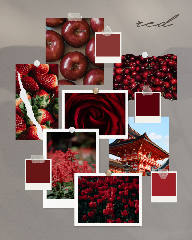
Red-the most emotionally charged color
Red grabs attention fast, making it one of the best colors for advertising, and is often used in sales. However, it can be overwhelming if overused. Red has been shown to reduce analytical thinking (as it speeds up and intensifies our reactions). It has the longest wavelength of all the colors, making it appear to be nearer than it is. Red evokes feelings of passion, romance, energy, urgency, anger, warning and aggression. It is known for its ability to elicit a physical response and can rush people to make decisions faster and increase their appetite.
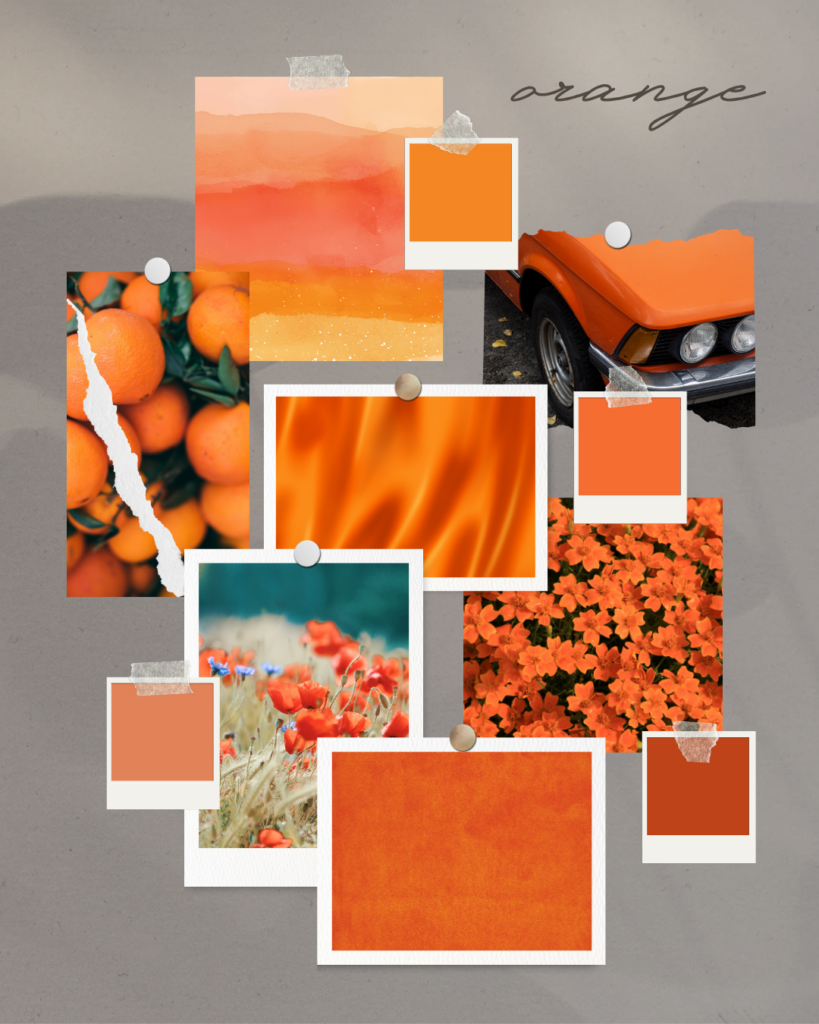
Orange
Orange is stimulatory and used to draw attention. It combines the friendliness of yellow, and the excitement of red. Consumers associate this color with value, so it’s a great choice for personal brands. Orange evokes comfort, courage, innovation, playfulness, confidence, energy or even immaturity. It pops out against other colors, so this is common choice for CTA buttons or navigation.
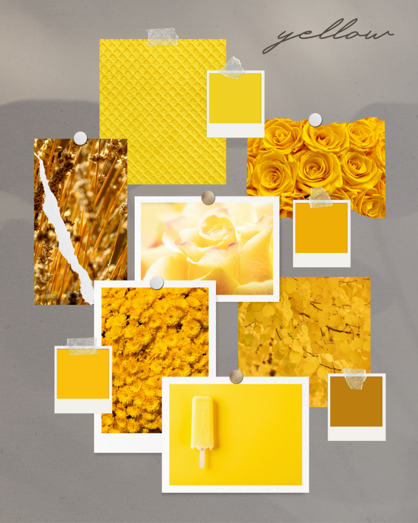
Yellow-the cheerful hue
Yellow is also stimulating and it is known to grab attention faster than any other color. Adding yellow to your branding can draw people in and make items stand out. It elicits feelings of optimism, warmth, happiness, creativity, extraversion, but can also make you feel frustration, fear, or anxiety if used in excess. Yellow is known to increase metabolism and lift self-esteem.
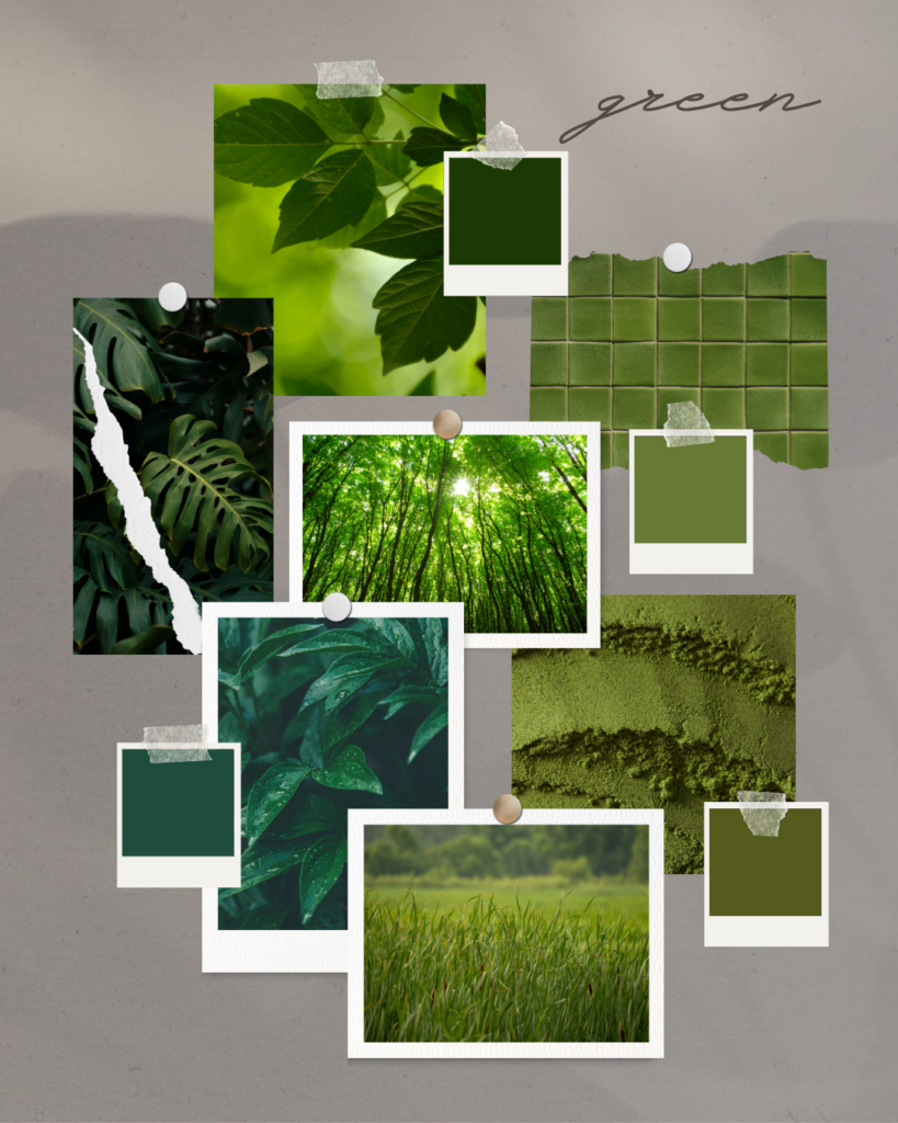
Green-the easiest on the eyes
When the color green hits your retina, no adjustment is needed, making it the easiest color on the eyes. Green is known to calm the nerves and improve vision. As a result, it is the color used in night vision because our eyes can discern most shades of green. Green elicits a calming, restful, healthy, hopeful, freshness that we associate with nature, fertility, prosperity, and lushness. It can also be the color of envy, sickness, and jealousy.
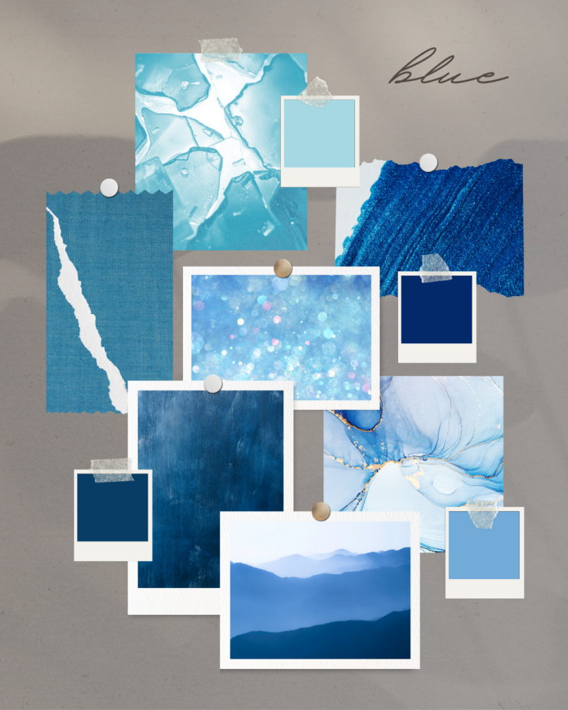
Blue-evokes the mind
If red evokes the body, then blue evokes the mind. Did you know that blue is the most common “favorite color” cited by the world’s population? It’s my favorite color too. It’s a popular hue with brands too, as 33% of brands use blue as their primary color in their logo (Hubspot, 2022). And did you know that people are known to be more productive in blue rooms? Blue’s popularity and environmental omnipresence (think about it, skies are blue, oceans are blue, it’s everywhere) make it feel non-threatening, conservative and traditional. Blue elicits trustworthiness, security, trust, loyalty, serenity, and trust. It also can bring about feelings of sadness, coldness, and emotionlessness.
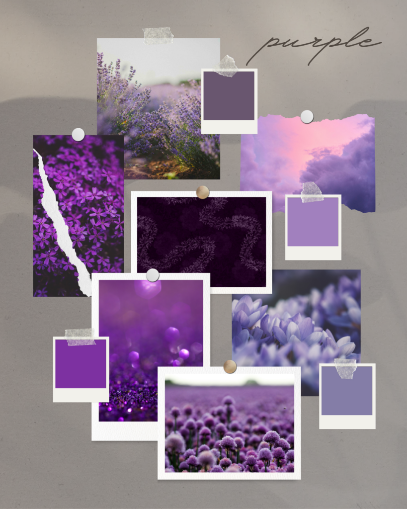
Purple
Purple is the hue with the shortest wavelength (visible light waves are the only electromagnetic waves we can see. The color we see depends on the colors wavelength). It melds blue’s calmness and red’s stimulation, so bluish purple is read as cool and reddish purple is red as warm. In the Roman Empire, purple was worn by royalty more than even gold was. As a result, purple exudes royalty, bravery, wealth, luxury, sophistication, and wisdom. It’s also giving decadence, extravagance, moodiness, creativity and contemplation.
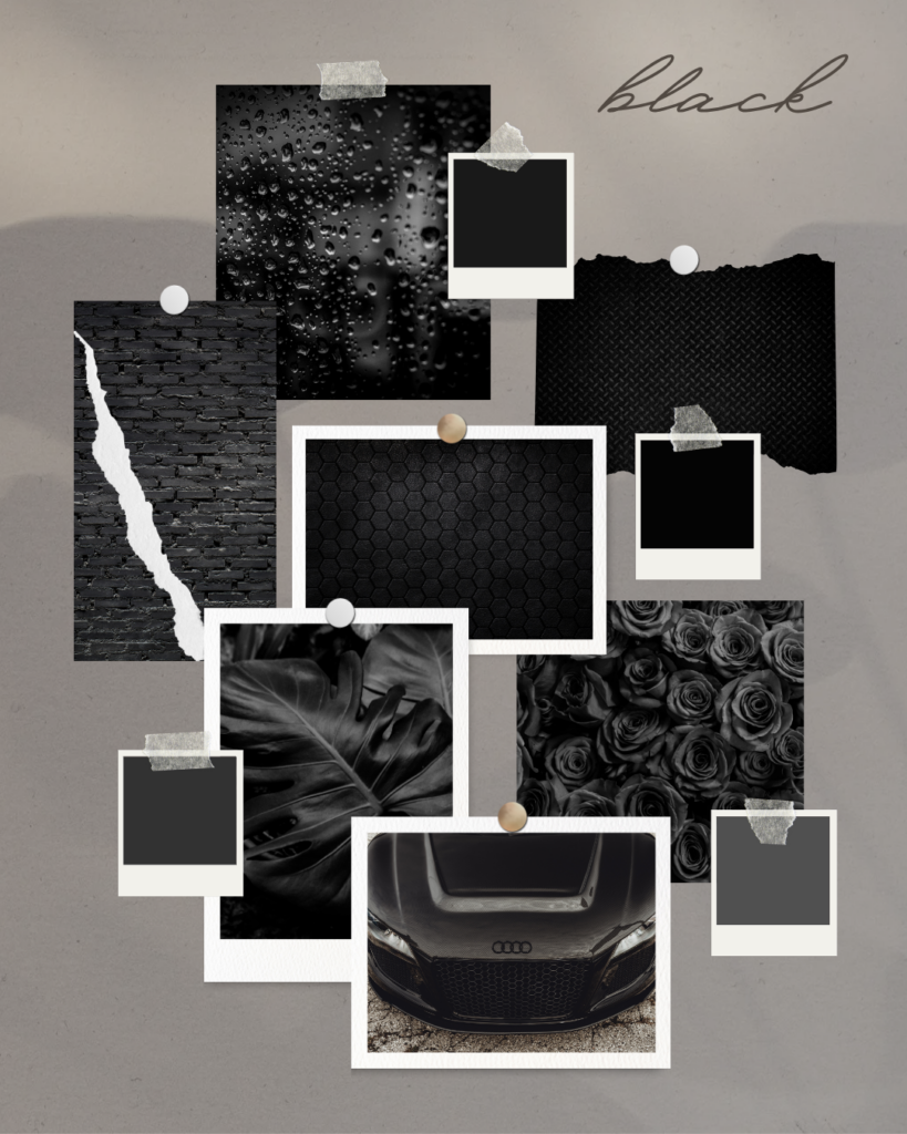
Black-the total absorption of all color
Black is a barrier color, which absorbs energy and attention. It symbolizes power, sophistication, weight, seriousness, timelessness, and is effortlessly stylish. Many brands use it to make their brand appear sleek and refined. In the absence of light, black can have ominous overtones, giving elegance, severity, coldness, evil, and mourning.
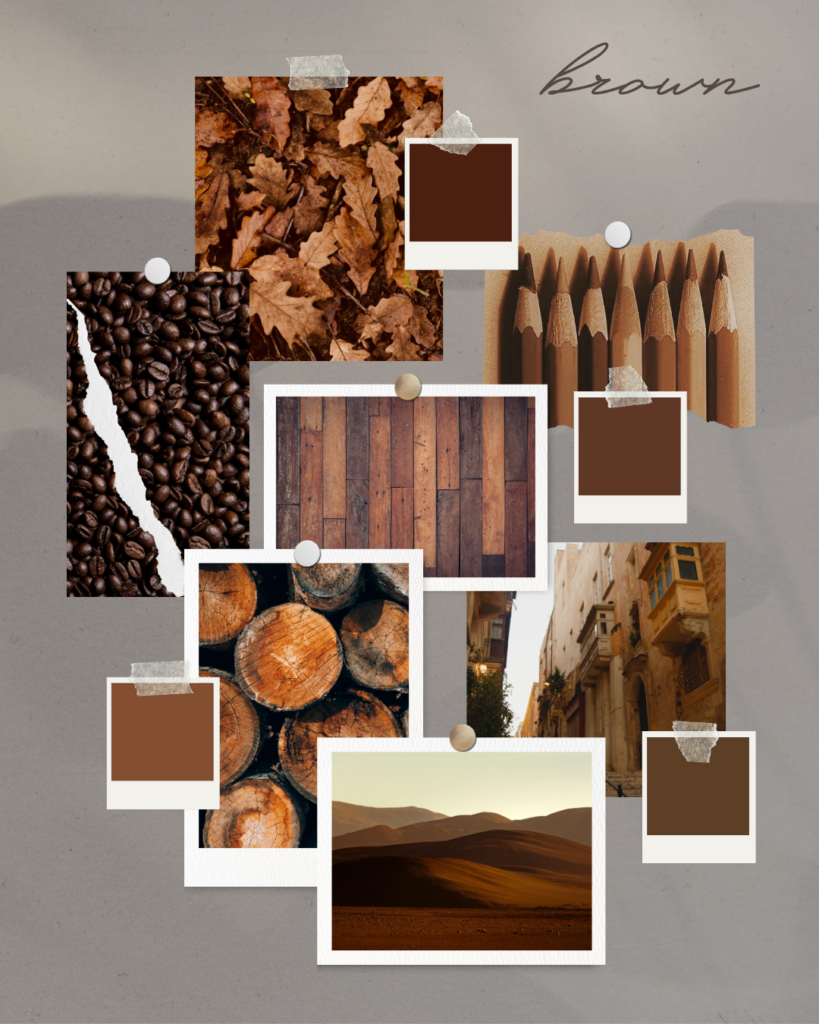
Brown
Brown gives off the same seriousness as black, but with a warmer, softer edge. Brown is the color of the earth and is abundant in nature. As such, it evokes the dependability and authenticity of wood. Brown is sturdy, reliable, earthy, reliable, authentic, and warm. But it can also symbolize dirtiness or conservativeness.
White
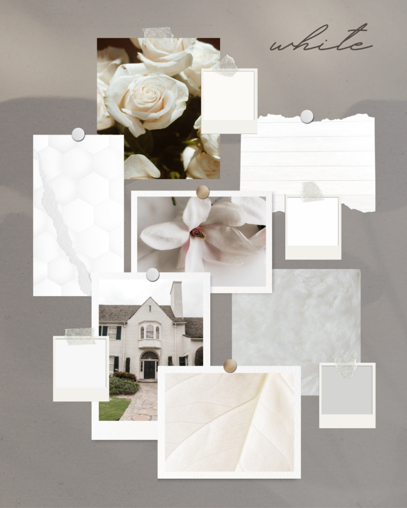
White is the reflection of all light and the absence of color. As such, it symbolizes purity, cleanliness, sterility, minimalism, innocence, new beginnings (think blank slate), clarity, and simplicity. But it can also give off coldness, isolation or emptiness. White allows brands to into simplistic, universal appeal.
How to Choose Brand Colors Strategically
Step 1: Define your Brand Personality
Before you select your brand colors, you need to decide what you want your brand to feel like. The colors you select for your brand need to align with how you want your brand to feel so you aren’t giving off mixed messages. Ask yourself the following questions about your brand to figure out what you want it to feel like:
- What adjectives describe your brand best?
- How do I want someone to feel 5 seconds after landing on my website?
- If my brand were a person, how would they act in a room?
- What do I NOT want my brand to feel like?
Decide how you want your brand to feel and match those feelings up with the color communication explained above. Ask yourself:
Step 2: Understand Your Audience
Listen, you can’t just select colors off what suits your fancy. Just because you like a color doesn’t mean it’s what your audience needs to see in order to trust you, connect with you or buy from you. Ask yourself:
- What emotional state is my audience in before they find me (because you need to meet them where they are)?
- What do I want my audience to feel after working with me?
- What would stand out but still feel aligned?
Coordinate the answers to these questions with the emotions evoked by color theory.
Step 3: Analyze Your Industry
Check out the colors your competitors use. Not so you can copy them, but so you can stand out!
Step 4: Build a Color Palette
Select a primary color, secondary color, 1-2 neutrals and 1-2 accent colors (that you use sparingly). Check out the blog post on 11 Emerging Color Palette Trends You Need in 2026 for some inspiration.
Step 5: Use Color Hierarchy Intentionally
Use colors to intentionally guide the viewers eye through your website. For instance, if you want to guide their eyes to your CTA button for them to take an action, make that button an attention-grabbing color! Good contrast on your website also increases readability and conversions.
Color Psychology Mistakes That are Hurting Your Brand
- Choosing Colors Based on Personal Preference: Cool, you like pink. I didn’t even go over that color, but pink has feminine properties. It is nurturing, playful and makes people think of passion, love and youth. And you want a professional, sleek brand. Well, your brand identity and color scheme aren’t communicating the same things. That means people are just going to bounce off your website if it feels “off”.
- Using Too Many Colors: You want to limit your brand colors to 5-7 colors. More than that and you website isn’t going to look cohesive to your brand. It’s going to look like your chose your colors based on a mood swing. Choose one primary color that leads the brand, 1-2 secondary colors that support it, 1-2 neutrals to keep everything a balanced, and an accent color to use sparingly, like for CTA buttons.
- Ignoring Accessibility: Low contrast colors are difficult to read when text contrasts poorly with background colors, while high-contrast colors are easier to read when paired together. If you aren’t sure if your brand colors meet accessibility standards, you can check tools like Adobe’s contrast checker (note: this tool does not work on mobile, so if you are having trouble opening it, try it on your desktop).
- Following Trends Without Strategy: Trendy is not effective marketing. Your brand color palette should last longer than just a pretty Canva template that you found one day (Ask me how I know. I used to change my colors with every single Canva graphic, just because I liked the way it looked. 😑)
How to Apply Color Psychology to Your Website
Applying color psychology to your website isn’t just about making things look good, it’s about using color on purpose depending on what each page is supposed to do. On your homepage, your colors should immediately set the tone and make people feel like they’re in the right place. On your about page, you want colors that feel a little more personal and grounded so people can actually connect with you. Your services or sales pages should use color to guide attention, especially toward things like testimonials, key points, and your call-to-action buttons (aka the stuff you want people to click). And on your blog, your colors should keep things clean and easy to read, not distracting or all over the place. When your colors match the purpose of each page, your whole site just feels more put together.
At the end of the day, your brand colors aren’t just there to make things look cute. They’re doing a job. They’re shaping how people feel about your brand, how quickly they trust you, and whether they stick around long enough to actually take action.
And here’s the part no one loves to hear… there’s no “perfect” color palette that guarantees sales. What actually works is choosing colors on purpose. Colors that match your brand, speak to your audience, and support what you want people to do on your website.
When your colors are intentional, everything else gets easier. Your site feels more cohesive, your message feels clearer, and your brand starts to feel like something people can recognize and remember.
References
Alanazi, A. (2016). Color Psychology. American Research Journal of Humanities and Social Sciences, 2, 1-6. https://doi.org/10.21694/2378-7031.16009
Jonauskaite, D., & Mohr, C. (2025). Do we feel colours? A systematic review of 128 years of psychological research linking colours and emotions. Psychonomic bulletin & review, 32(4), 1457–1486. https://doi.org/10.3758/s13423-024-02615-z
Railo, H., Salminen-Vaparanta, N., Henriksson, L., Revonsuo, A., & Koivisto, M. (2012). Unconscious and conscious processing of color rely on activity in early visual cortex: a TMS study. Journal of cognitive neuroscience, 24(4), 819–829. https://doi.org/10.1162/jocn_a_00172
V, Vijaya. (2023). Psychological Effects of Colour. Journal of Biotechnology & Bioinformatics Research. 1-2. https://doi.org/10.47363/JBBR/2023(5)157

Hey, I’m Sarah Grace— registered nurse turned blogging mentor, mama, and founder of sarahgracevogler.com. As a certified digital marketer and graphic designer, I help aspiring bloggers (just like you!) cut through the overwhelm and turn their passions into profitable online businesses. I’ve been where you are—Googling how to start a blog at 2 a.m., wondering if anyone would ever read my posts—and now I teach others how to do it with clarity, confidence, and heart. Thank you for reading this blog post and make sure to pin it to Pinterest, so you can reference it later.
30
Mar


VIEW THE COMMENTS
Psychology of Color in Branding: How to Choose Colors Proven to Monetize