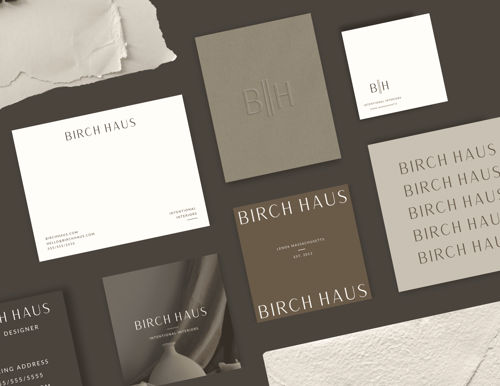



Birch Haus is a semi-custom brand design suite for interior designers and creative studios who want a calm, elevated brand that lets their work do the talking.
Birch Haus feels like a quiet evening in a well-edited room: smoky taupe, toasted walnut, soft oatmeal, and a touch of green olive, paired with a tall, airy serif wordmark. It’s minimal without being cold, sophisticated without trying too hard, and built for businesses that want to look established from day one.
The result is a complete brand you can open in Canva and make yours.
Disclaimer: This post may contain affiliate links. If you click on them, I may earn a commission, at no additional cost to you. See my disclaimer page for more information.
| Purpose | Birch Haus Semi-Custom Brand Suite |
| Concept | Fictional modern Scandi-minimal interior design studio |
| Designed For | Established interior designers who want a calm, high-end brand that attracts homeowners investing in intentional spaces |
| My Role | Concept, Logo Suite, Color + Font Palletes, Canva Templates |
| Format | Fully editable Canva files |
The Backstory
I’d wanted to break into the brand design industry for a while, but I wasn’t sure where to begin. As with all design services, no one is going to book your services unless they see your work first. So that meant I needed to design some passion projects to begin a brand design portfolio for my clients to view. But I also decided to turn these passion projects into semi-custom brand kits that clients could purchase if they wanted the feel of a custom branding project without the investment of custom design.
Without an actual real client to work with, that meant I needed to create a fictional business name, and I used an AI prompt on Claude to generate business name ideas. I took one of the ideas that AI created and tweaked it a little bit to come up with Birch Haus: Intentional Interiors.
The Process
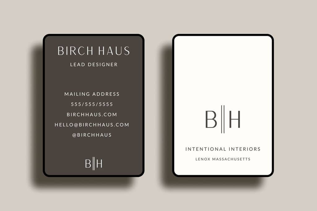
I let the name Birch Haus, and its modern, Scandi-minimal implications, dictate the whole project, from the color palette to the fonts. I wanted this brand design to be modern and minimal, but professional.
The Colors
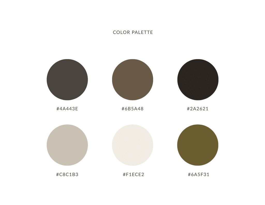
Color palettes associated with Scandinavian Minimalism are typically neutral, light hues. I wanted to make the color palette for Birch Haus more moody and cozy. I wanted this brand to feel lived-in, instead of sterile.
The three deep tones give this brand an aesthetic that feels like a candlelit room in the evening. The colors in this palette are pulled from nature, like wood, stone, coffee, oats, and olive. These are materials you would actually see in a client’s home, so the brand emulates the interior designer’s work.
Lastly, this color palette only has one accent color-green olive. This restraint makes sure nothing shouts in this combination of colors. They just feel calm, edited, and quietly expensive.
Smoky Taupe
#4A443E
A signature background color that can be used for the signature background color, like on the website hero and social media posts. This should be a color that people remember when they think of the Birch Haus brand.
Toasted Walnut
#6B5A48
A perfect shade for secondary background colors that can also be used in section breaks, icons, and subheadings. Toasted Walnut adds depth to the design so Smoky Taupe isn’t working alone.
Espresso
#2A2621
The preferred color for body text on light backgrounds, the footer, and high-contrast moments. It’s softer than pure black, so it ties in well with the Birch Haus aesthetic.
Oatmeal
#CBC1B3
A shade to use for dividers, borders, card backgrounds, and secondary text on dark backgrounds. Oatmeal is a quiet, supportive player in this color palette.
Eggshell
#F1ECE2
This color is best used for the logo and headlines on dark backgrounds. It can also be used as the main background on light pages and for long reading.
Green Olive
#6A5F31
The accent color. Use for buttons, links, CTAS, and the occasional highlight. Use this color sparingly so it stays special.
The Type
The Birch Haus brand needed a font that felt as elegant, uncluttered, and confident as the interiors the business designs for its clients.
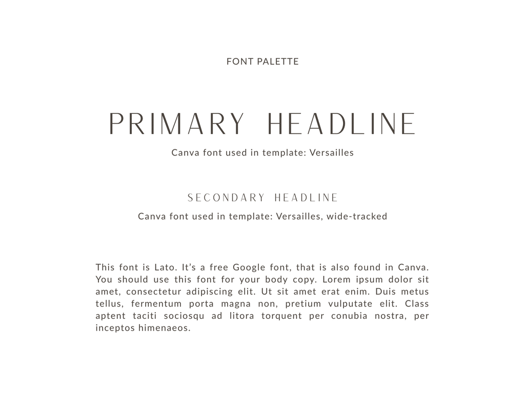
I chose the headline font Versailles, because it is a free Canva font, and customers who purchase the Birch Haus semi-custom brand will not have to purchase a separate premium font to make it look like the demo. Versailles is a tall, thin-stroke serif that gives this brand its quiet sophistication.
The supporting font, Lato, is also a free font found in Canva. It is a clean, simple sans-serif that can be used for subheadings, body text, and the tagline of the brand. It stays out of the way so the Wordmark can do the talking, and it reads clearly on a business card.
These two fonts work together because Versailles brings the warmth and personality, while Lato brings the clarity. One sets the mood, and the other gets the job done.
The Wordmark
After selecting the fonts and the color palette, the brand’s wordmark could be designed. A wordmark logo is one that only includes the company name, with no additional icons, symbols, or elements. Birch Haus’ wordmark is created with the Versailles font, in all capital letters, with wide letter spacing. Serifs usually read as traditional, so I spaced the letters out wide in the Wordmark. That extra breathing room gives the brand a modern, calm feel instead of something stuffy. It’s the equivalent of a well-edited room.
The Logo Suite
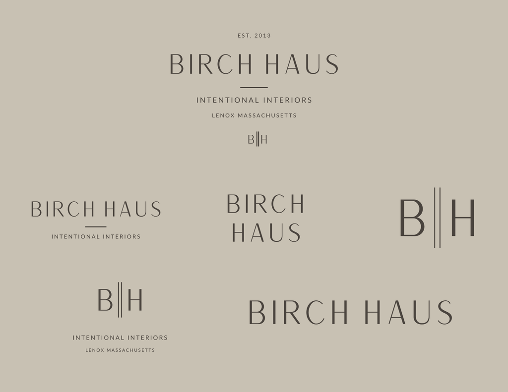
The Birch Haus brand suite is a curated collection of logo styles that can fit any size or situation. This flexibility is a must-have element for semi-custom brand design, because you want to know that what you are buying can actually be used without limits. The logo suite includes:
- A primary logo (top center): EST. 2023, BIRCH HAUS in Versailles with wide letter spacing, a divider line, and Intentional Interiors small tracked underneath in Lato. The business location is listed under that, and the small B||H monogram is listed at the bottom. It’s best used for the website header, proposals, and anywhere with room to show everything.
- A secondary logo (middle left): BIRCH HAUS with the divider and tagline, minus the location and date. It’s a simpler horizontal version best used for social graphics, email headers, and documents.
- A stacked wordmark (middle center): BIRCH on top and HAUS below. This logo is built for square or narrow spaces, like Instagram posts or signage.
- The monogram (middle right): B||H, where the double lines stand in for the space between two doors or two walls of a room. The monogram is built for small spaces like profile photos, favicons, and the back of a business card. It’s simple enough to read at 16 pixels.
- Submark (bottom left): B||H with the tagline and location underneath. This is a badge-style mark that can be used in packaging, stickers, and footers.
- Wordmark (bottom right): Just BIRCH HAUS. This logo is the cleanest option for places where the tagline would be too small to read, like a business card or a watermark.
What I Learned
I learned that the key piece to a truly memorable brand is consistency. Not just consistently using the logos across all platforms and mediums, but also maintaining consistency across different versions of the logo to maintain the overall aesthetic of Birch Haus. Does that sound too ambiguous? Basically, what I learned is that just because something looks pretty doesn’t mean it belongs in this brand suite. Every piece of this logo suite needs to relate back to the Birch Haus aesthetic.
I also learned that restraint can be a design strategy. If you’ll notice, I did not include a script font in the font palette, because it simply would not have fit in the modern, minimal Scandi-look I was going for with this brand. The hardest part of minimal design isn’t adding the right things. It’s being brave enough to leave things out.
Make It Yours
Birch Haus was designed for an interior designer that doesn’t exist. Which means it can belong to anyone who does.
As soon as you purchase the Birch Haus semi-custom brand, the files are instantly delivered to your inbox. From there, you can open your brand templates in Canva, edit your brand name, and pick the logo versions you like best. Edit the colors and fonts if you want to. In no time at all, you’ll have a brand that looks custom, without the timeline or the price tag.
Pro Tip from Me: You can change the words, but I recommend keeping the structure. The spacing, the fonts, and the restraint are what make it feel high-end.
Purchase Birch Haus!
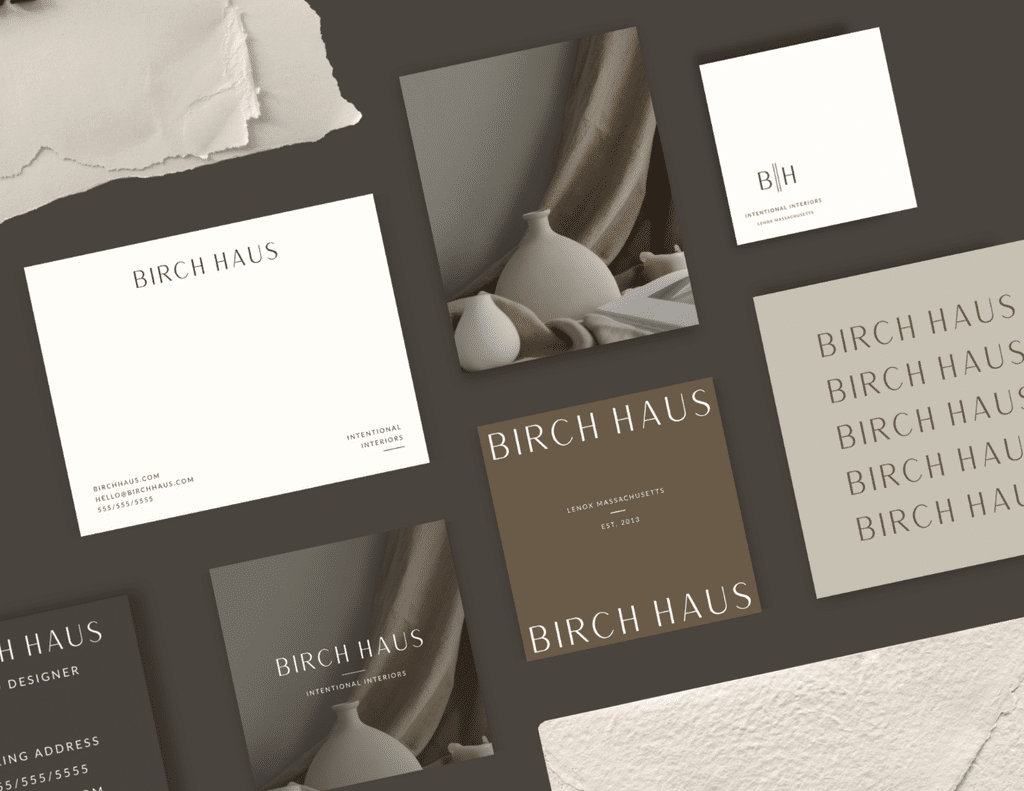
Click image below to purchase Birch Haus semi-custom brand design. ⤵️
27
Oct


VIEW THE COMMENTS
Add A Comment