


TL;DR: Typography for design isn’t just about “looking pretty” — it’s strategy, and your audience notices whether they clock it consciously or not. Know your three main styles: serifs (classic, credible, great for headers), sans serifs (clean, modern, best for body text), and scripts (feminine, high-end, use sparingly as accents only — never for long text). You don’t have to pay for fonts to get this right (Google Fonts has 1,800+ free options), but the real secret is pairing: contrast thick with thin, serif with sans serif, limit yourself to 2-3 fonts max, and create clear hierarchy between headlines, body, and buttons. Bottom line: the right fonts quietly build trust and make everything else — your design, your message, your conversions — easier.
- Fonts are strategy, not decoration. The right typography quietly signals “professional and worth your money,” while the wrong choice whispers “found this in the Canva clearance bin” — and your audience picks up on that vibe even if they can’t name why.
- Know your three font types and where each belongs. Serifs feel classic and credible (great for headers), sans serifs are clean and modern (best for body text and readability), and scripts feel high-end and feminine (use sparingly as accents only — never for long blocks of text, because nobody can read cursive at paragraph length).
- Pairing comes down to three rules: contrast, limits, and hierarchy. Combine thick with thin and serif with sans serif, cap yourself at 2-3 fonts total across your whole brand, and make sure your headlines, body text, and buttons each have a clearly defined, consistent style.
“Why in the fresh hell does anyone spend money on fonts when there are plenty of free options out there?“
This is a question I asked myself many times before I started to learn graphic design. Since then, I have learned that fonts and font pairing are an art. But more than just making your website pretty, it’s about strategy. The fonts you choose can quietly scream “professional, polished, and worth your money”—or whisper “I found this in the clearance bin of Canva.” And if you think your audience doesn’t notice? Oh, they notice.
Here’s the good news: you don’t need to be a design snob or a typography nerd to get it right. You don’t even have to pay for fonts (unless you want to, and I’ll explain why you might want to). You just need to understand a few simple rules, a handful of go-to pairings, and how to avoid the kind of font crimes that make your brand look messy instead of magnetic.
So grab your coffee, park the ‘Brittany’ font in a retirement home, and let’s make your typography work harder (and prettier) for your brand.
Disclaimer: This post may contain affiliate links. If you click on them, I may earn a commission, at no additional cost to you. See my disclaimer page for more information.
Table of Contents
What is Typography for Design?
Understanding typography for design is crucial for creating visually appealing content. So let’s start with some common typography terms to get you started learning about what you should consider when choosing fonts.
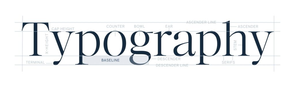
First of all, typeface vs. font:
Think of typefaces like a family, and the fonts are like the family members. So, Montserrat is a typeface, and Montserrat Light is a font. In design, there are a few font styles that you need to know, and when to use them.
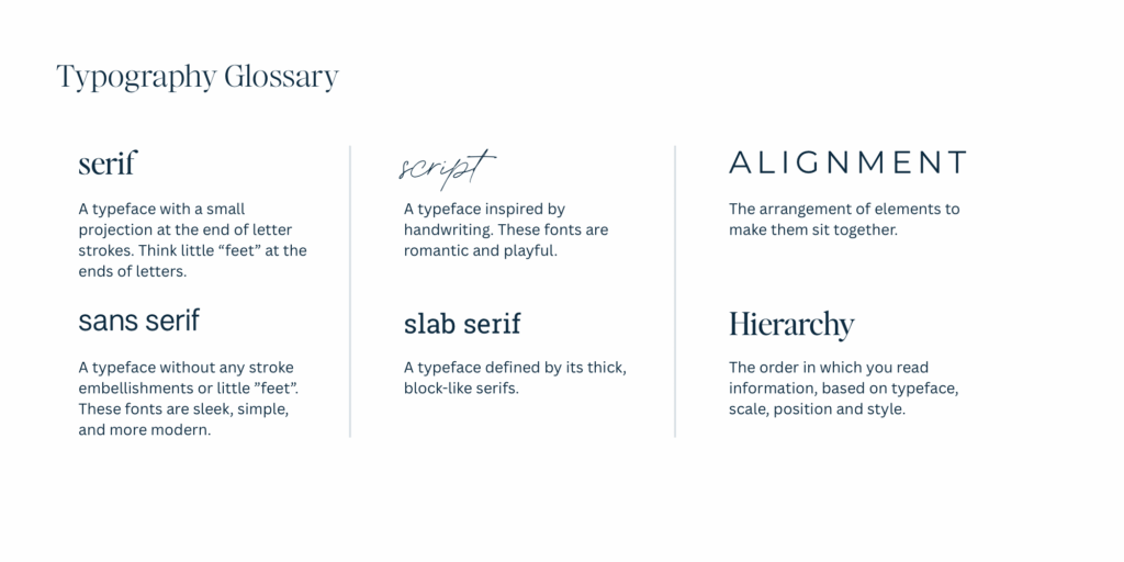
Serif Fonts
Serif fonts have little “feet” or tails (see the image below to see what I’m talking about).
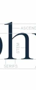
Serif fonts give a classic, elegant, and credible vibe that is best used for editorial brands and headers. The serif fonts are also easier to read digitally with large font sizes, like headers and subheaders. The font of my headings in this blog post is a serif font, Ivy Ora Display Regular.
Sans Serif Fonts
Sans (meaning ‘without’) Serif fonts are exactly what they say:
They are fonts without the little feet or tails found on the serif fonts. These fonts give a modern and clean vibe and are best used for startups and bloggers. The sans serif fonts are easy to read digitally in both large and small font sizes. They are the best choice for paragraph text, because the missing serifs make it clearer to read in smaller formats. The font of my paragraph text in this blog post is a sans serif, Montserrat.
Script Fonts
Script fonts were created to emulate cursive or handwritten text. These fonts give a feminine and high-end feel, and are best used only for large text and accent fonts. These fonts can be difficult to read, so don’t really make them part of your blog posts at all. They are better as an accent, like in the sidebar of this blog post, the words “the quiz”. This font is Printed Moments and is used sparingly across my website.
Typography for Design Tools
The three fonts that I mentioned that I use on this website are all premium fonts. But listen, you do not have to pay for your fonts. Until I started learning graphic design, I thought the whole premium font business was a racket, and not a good reason for me to spend my money. Now I completely get it – I have a font fetish with the rest of them.
Premium fonts are a good way to distinguish your website from everyone else out there, because premium fonts are rarer. But if you are just starting out, I completely understand not wanting to pay for a font. Here are some good sources of free and premium fonts for you to peruse and find the best one for you:
- Google Fonts: over 1,800 font families that are FREE to use and web-safe. I have some great font pairing examples with Google fonts further down this blog post.
- Jen Wagner Co.: Her premium fonts are *chef’s kiss*. I own so many of them. Check out her fonts here. Get 15% off your font purchase with coupon code: ‘SARAHGRACE15’.
- Creative Market: This is where I got my script font, Printed Moments from. Creative Market has a ton of beautiful premium fonts from a variety of creators. Check out their fonts here.
How to Pair Fonts
The Three Rules for Pairing Fonts
- Contrast is good! Combine thick with thin, and serif fonts with sans-serif fonts.
- Limit yourself to 2-3 fonts across your branding. No more. Promise me.
- Create hierarchy. Your headlines, body text, and buttons should all have a defined style.
Font Pairing Mistakes (and How to Avoid Them)
- Avoid using too many fonts. Stick to 2-3. Set the global font styles in Showit or your website builder to remain consistent with font style and sizing.
- Choosing hard-to-read scripts for long text. Sometimes I see realtors using the ‘Brittany’ font (eyeroll) from Canva on their signs, and you can hardly read the text from the road when you are driving by. Think about readability when choosing your fonts.
- No visual hierarchy (everything looks the same). Readers will click off your website as fast as they clicked on, if you don’t make it easily readable.
- Ignoring mobile formatting. Everybody uses their phones. This should not be an afterthought.
- Following trends with no brand strategy. You need to use the fonts you choose consistently across all platforms to make your brand consistent and feel reliable.
Google Font Pairing Examples
Experimenting with styles is a vital part of typography for design.
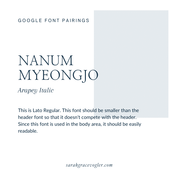
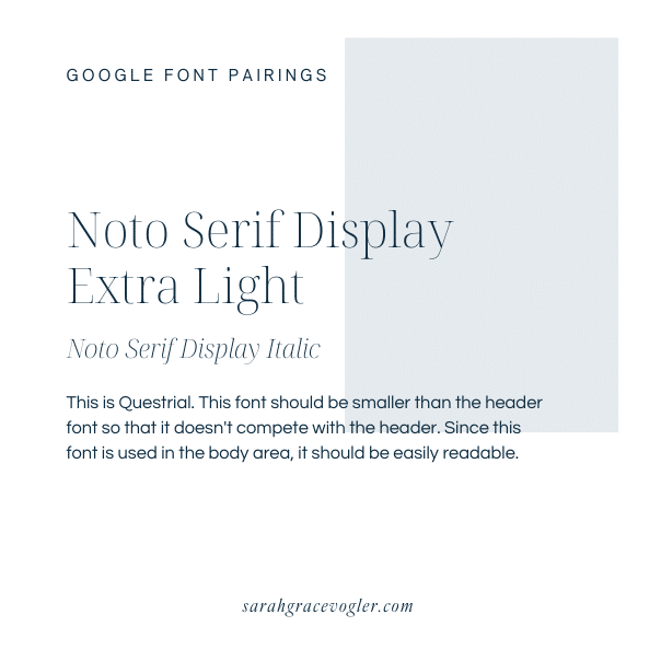
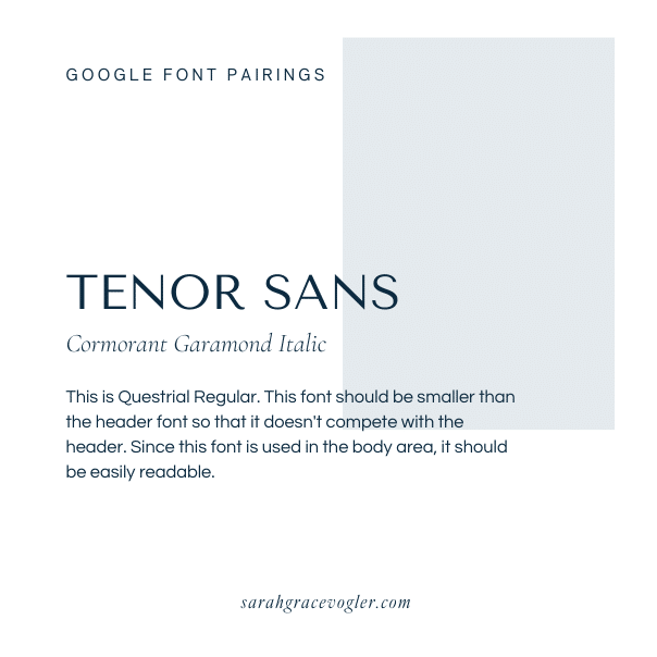
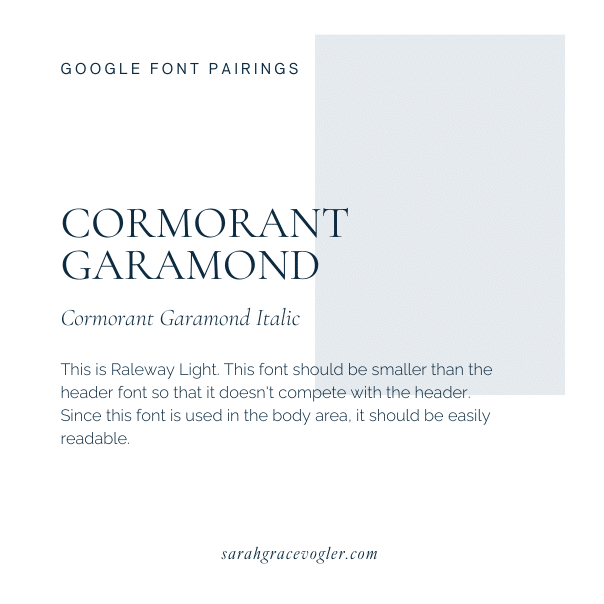
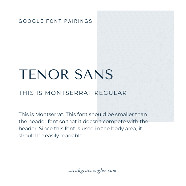
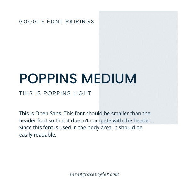
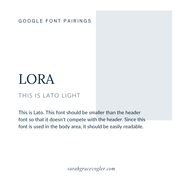
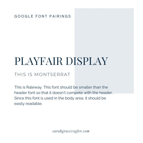
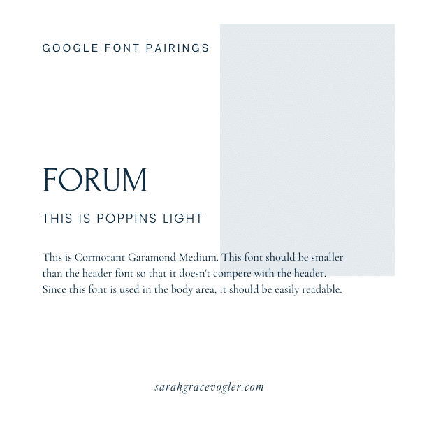
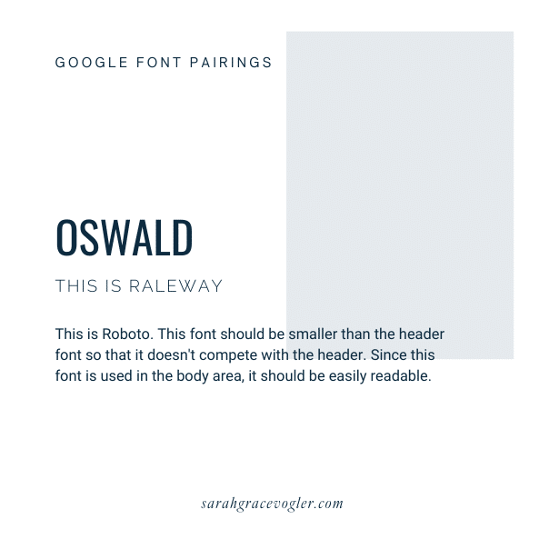
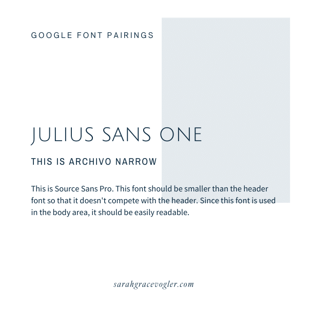
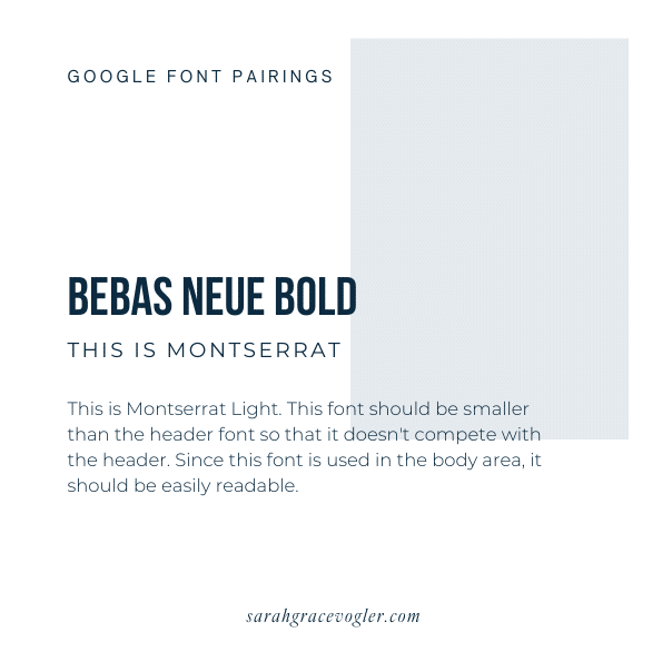
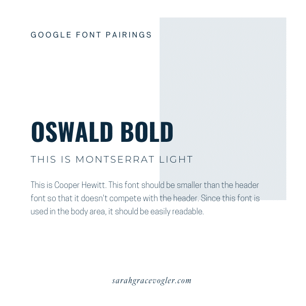
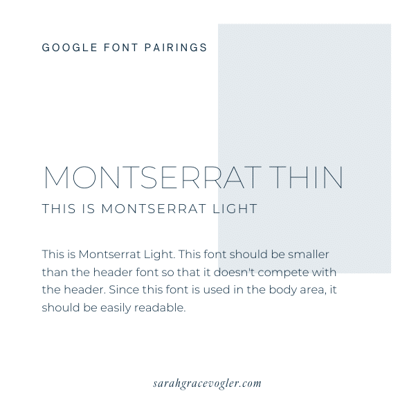
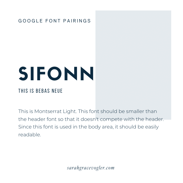
Here are some great examples of paired free Google fonts, with heading, subheading, and body text examples. Which one of these do you like the best? Hit me up in the comments and tell me if you decided to use one of these font pairing examples for your website.
At the end of the day, typography for design isn’t just about “looking pretty”—it’s about speaking your brand’s language without saying a word. The right fonts make people feel trust, excitement, curiosity, and connection. Because when your fonts are aligned with your brand, everything else—your design, your messaging, your conversions—gets a little easier (and a whole lot prettier).
Now go forth and type responsibly. Your future clients—and your inner design snob—will thank you.

Hey, I’m Sarah Grace—an ICU registered nurse, and I bring the same no-BS problem-solving to blogging. I’ve been blogging since 2020, and I’ve also earned certifications in digital marketing and graphic design since then.
I help bloggers turn their hobby blog into actual income with my How to Start a Blog online course. I also design Showit website templates and specialize in custom web design for bloggers and creatives.
I’ve been where you are and I learned how to blog for income the hard way, so you don’t have to. Now I teach others how to do it with clarity, confidence, and heart. Grab my free Website Blueprint to see what elements your website needs to increase conversions.
12
Aug


VIEW THE COMMENTS
Add A Comment